Why you can trust TechRadar
Huawei's made three main contributions to customising Android here, the first of which is rather controversial. It's still sticking with the idea of binning the traditional app drawer that all other Google OS phones use, instead taking an iOS-like approach to apps by shoving everything on to the Home screen.
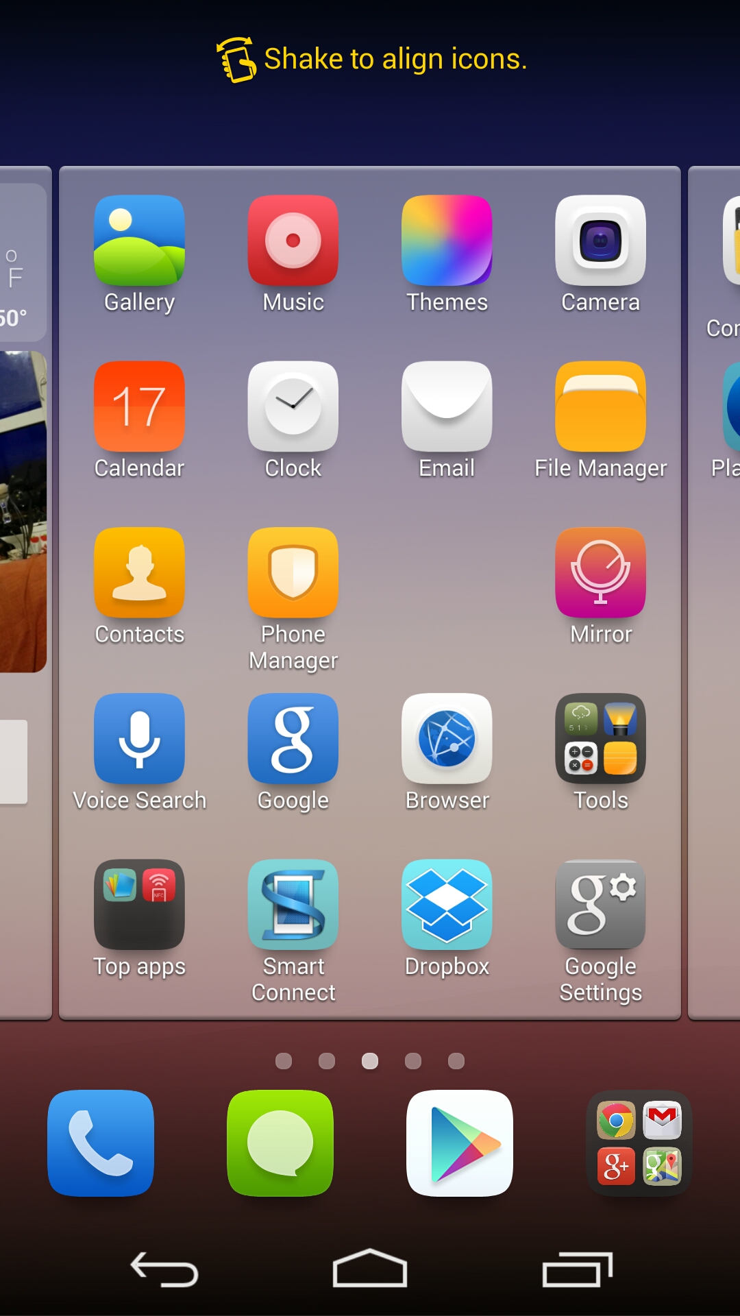
The plus side to this is there's only one place to look for apps, which simplifies the Android experience somewhat. The downside is it means we should compare Huawei's icon design decisions to those of Apple, where there's only going to be one winner.
The Huawei icons are a bit odd. The Ascend P7's music player icon is a pink circle on a red background.
It's presumably meant to represent one of those CDs people used to listen to music on back in the 1930s, but this, and many of Huawei's other icons like the vague green hill that represents the Gallery, don't stand out.
You have to learn what each icon means, such is the lack of obvious visual clues.
The second big feature is an oddity. This is Huawei's Simple Home screen option, an entirely separate replacement UI its chucked in here for a laugh. It's a simplified Windows Phone-like option, which adds massive icons to apps and features.
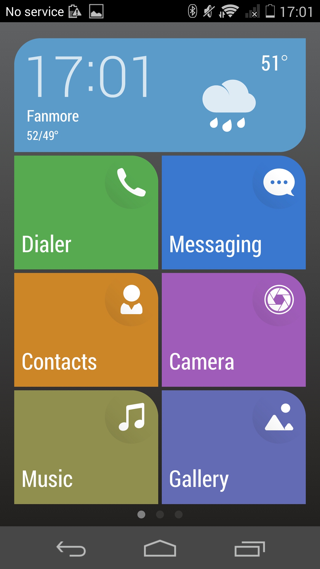
It's not particularly customisable in that all you can do is add and remove the chunky icons, but we could see it being a good way to introduce a child or elderly relative to a smartphone without leaving them utterly confused.
The third strange little Huawei feature is the floating launch that Huawei calls the Suspend Button.
That's a weird name for it, as it's more like a shortcut to a few housekeeping tools: a memory cleaner, screen lock manager and odd duplicated Back and Home buttons, along with a second menu that spins in some other mini apps.
These little apps are similar to the floating mini apps that feature in Sony's Android skin, popping up the messaging window, music player, calculator and a notes app in a stylish little window that floats atop the Home screens.
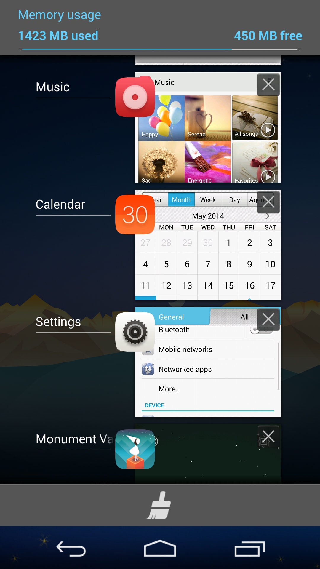
Multitasking is accessed in the usual Android manner, with the right-hand on-screen button pulling up a list of recently used apps.
From here you can swipe some away to free up memory (or hide your tracks), plus there's a brush icon that dismisses everything. The Huawei Ascend P7 informs you how much RAM the process has just cleared up, something enthusiasts will enjoy knowing.
The pull-down notifications tab is the other core pillar of the Android universe, and here Huawei's fiddled just a little.
A customisable collection of five toggles sits at the top when you first pull down the notifications blind, with another pull on the button area revealing more controls - and useful quick access to a screen brightness slider. A separate menu lets you rearrange the order in which this appears.
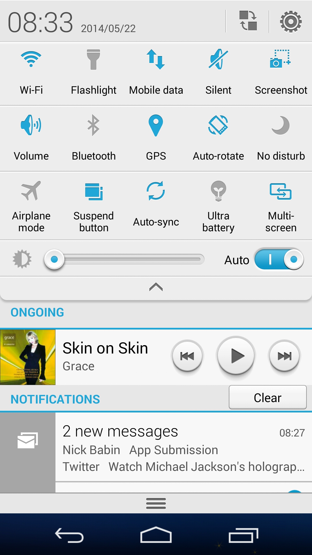
Huawei's given this a clean white look that's rather swish, although it often struggled to scroll into view smoothly, especially when pulled down from the lock screen.
The Geekbench 3 scores are underwhelming too. The Huawei Ascend P7 scored just 1,792 in the multi-core test, quite a bit lower than the 2,579 pumped out by the Nexus 5.
In reality, the only performance issues I noticed was a glitchy notifications menu, which tends to pull itself down less than smoothly.
There was also the occasional Home screen scroll jerk when the phone was stressed with updating apps and some choppiness on the viewfinder when recording video clips, although the clips themselves came out fine. For the most part, it's a quick and reliable phone.
