Why you can trust TechRadar
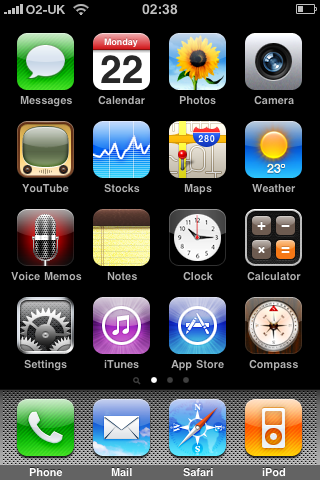
A lot of those reading this will be familiar with the iPhone interface, with the standard 'all icons together' layout making it easy to search for applications without having to trudge through a gallery of menus.
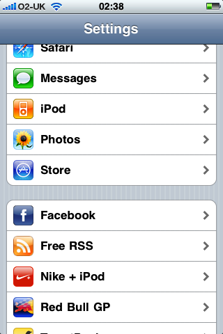
There isn't a great amount of depth in the sub-menus either, with the likes of the iPod, Safari and Photos all managed from one central Setting icon rather than a great degree of control from within each application.

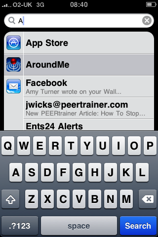
The new iPhone 3.0 software brings a few new things to the interface, namely the addition of Spotlight, which allows you to search comprehensively through the phone, meaning typing in the first two or three letters of a name will bring them up from your contacts, as well as any email messages you have from them in your linked mailbox and any Apps with the same letters in the title.

Accessed by pressing the home key once on the home screen, swiping left from the same place or being set as the function for double tapping the home screen, the search is good, but doesn't let you perform any actions from the search list such as actually replying to a message, instead asking you to enter the contact / message before you can interact with it.
As anyone with an older iPhone will know, the screens can get pretty filled up with applications, to this new feature certainly helps you find Ultra Tetris faster than if you had to scroll through loads of screens.

Where the iPhone interface is slipping behind its high powered rivals is the inability to multi task. Nokia (and other's) Symbian system, Google's Android and Palm's webOS all allow multi-tasking, and in the Pre's case, the 'cards' system fully allows you to see which applications you have open at any one time, and simply throw them off the screen.
What is strange is that the webOS' cards feel very much akin to the way we navigated through multiple tabs in the Safari internet browser, so Apple has the functionality and system in place, just not the OS power to actually execute multi-tasking, meaning any third party Apps that use music cannot be shut down should you wish to keep listening, making the iPhone 3GS very one dimensional in these instances.
That said, it's surely only a matter of time before it does appear on an iPhone, with Apple's excuse that it 'drains the battery too badly' a poor reason in the face of the power-friendly Palm Pre.
Current page: Apple iPhone 3GS - Interface
Prev Page Apple iPhone 3GS - design Next Page Apple iPhone 3GS - calls/contacts
Gareth has been part of the consumer technology world in a career spanning three decades. He started life as a staff writer on the fledgling TechRadar, and has grew with the site (primarily as phones, tablets and wearables editor) until becoming Global Editor in Chief in 2018. Gareth has written over 4,000 articles for TechRadar, has contributed expert insight to a number of other publications, chaired panels on zeitgeist technologies, presented at the Gadget Show Live as well as representing the brand on TV and radio for multiple channels including Sky, BBC, ITV and Al-Jazeera. Passionate about fitness, he can bore anyone rigid about stress management, sleep tracking, heart rate variance as well as bemoaning something about the latest iPhone, Galaxy or OLED TV.
