Why you can trust TechRadar
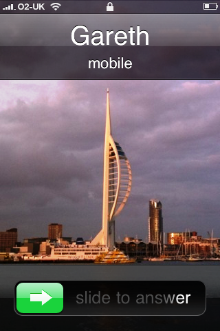
A 'hilarious' thing is often said about the iPhone by some customers: it shouldn't really have such an iName given the poor call quality on it.
The first 3G iteration was certainly in a lot of hot water over the strength of its signal after a number of customers complained they simply couldn't access the high speed data when needed, with calls often dropping or not connecting at all.

Unfortunately the new iPhone 3GS doesn't really manage to improve on the problems brought by previous iPhone iterations, as signal was once again patchy. In fairness, the call quality was good and fairly regular when signal was present, but that's not really the kind of top level quality you're expecting with a device as high-end (and expensive) as the iPhone.
Whether it's O2's network in the UK or just a general problem with the iPhone (we'd be tempted to believe it's the latter given other countries have reported similar problems) we don't know, but either way we'd hoped this problem would have been fixed.
The problem was at its worst on the train, with the iPhone very quickly defaulting to the EDGE network on multiple occasions (not a problem for calling, but data suffers) but for the most part dropping off radar completely.
We know that this isn't just a train problem as we were also carrying an HTC Touch Pro2 (not particularly known for its signal reception) on the Three network, and it managed to keep a few bars going when the iPhone had simply given up.
Contacts
Sign up for breaking news, reviews, opinion, top tech deals, and more.
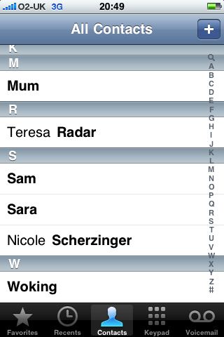
Contacts themselves have barely changed in all three iterations of the iPhone, with the same layout and interaction present in all three versions (bar the new Spotlight searching functionality).

However, this isn't a bad thing, as Apple has the knack of making things that other manufacturers find difficult seem blindingly easy. When faced with the problem of having a list of names and only a touchscreen to help you interact, manufacturers took a strange variety of options.
Samsung used the volume key to scroll, LG divided up the list into letter groups and Nokia implemented a text input, all of which were a little convoluted. Apple lets you simply select a letter from the list on the right and flick through the list using a touch swipe when you get to the right place.
HTC employs a similar method in its Windows Mobile and Android models, as well as Apple's practice of giving you the option to send a message or add to a favourites list, with all the options laid out nicely in front of you, so it shows that simplicity works best when you have a decent touchscreen to work with.
Current page: Apple iPhone 3GS - calls/contacts
Prev Page Apple iPhone 3GS - Interface Next Page Apple iPhone 3GS - Messaging
Gareth has been part of the consumer technology world in a career spanning three decades. He started life as a staff writer on the fledgling TechRadar, and has grew with the site (primarily as phones, tablets and wearables editor) until becoming Global Editor in Chief in 2018. Gareth has written over 4,000 articles for TechRadar, has contributed expert insight to a number of other publications, chaired panels on zeitgeist technologies, presented at the Gadget Show Live as well as representing the brand on TV and radio for multiple channels including Sky, BBC, ITV and Al-Jazeera. Passionate about fitness, he can bore anyone rigid about stress management, sleep tracking, heart rate variance as well as bemoaning something about the latest iPhone, Galaxy or OLED TV.


