Why you can trust TechRadar
Wallpaper
Legacy iPhone users will be used to the plain old black background – so now being allowed to customise however they see fit is going to be a real treat.
There's no reason Apple hasn't allowed this so far, and it feels a little childish that this has only popped up (unless you were one of the unruly kids and jailbroke your iPhone – perfectly acceptable then).
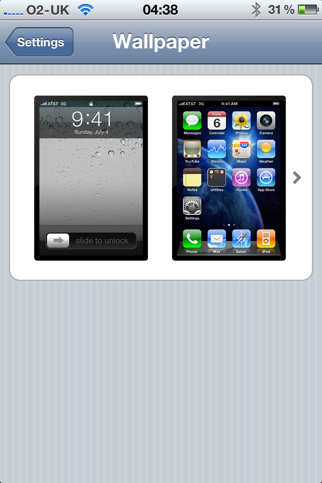
However, being able to have it as both the lock screen image and the background is a nice touch, or to have two separate images if that's your bag.
Folders
The only other new and interesting feature to the interface is the addition of folders – if you're fed up of being forced to see row after row of icons you're going to find life just got a lot simpler.
Simply long press an icon, and rather than moving that little picture to a new place, dump it on top of another one, automatically creating a folder with the two applications in there.
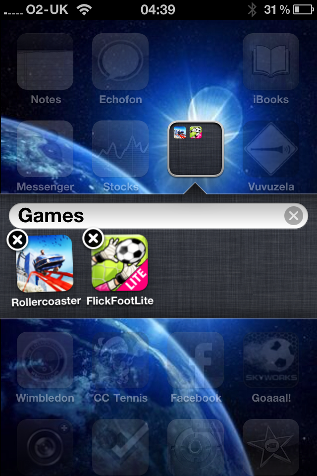
You can even name it whatever you want – Apple is really letting you go nuts here.
Of course, there are older elements from previous iPhones on offer as well swiping left to access Spotlight search for instance.
This offers the chance to simply type in a search term, and Spotlight will search out messages, applications, contacts or media files containing that name.
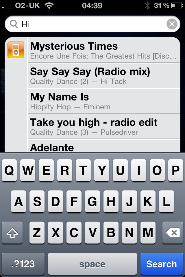
If it can't find them then it will offer the chance to hit up the likes of Google or Wikipedia to get more information – but you can probably work out how to do that yourself.
It's not the most intuitive search – other platforms will let you perform functions like sending a message reply from the search results, but it's still jolly handy for things like finding a certain song.
Voice control is also on offer too – hold down the home button and a little blue screen pops up.
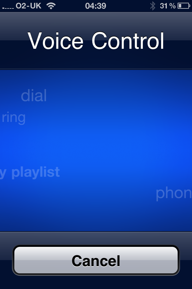
The idea is saying things like 'Play Album Immersion' or 'Dial Marc's Mum' will do such a thing – in reality, it was useless.
We swear it's worse at working out what we're trying to say than the iPhone 3GS – so many times it decided to dial a random number instead of playing a song.
But the schizophrenic robot voice control aside, iPhone 4 interface is simply immense – from the super-smooth and responsive swiping to the instant opening of applications and animations, the reasons so many people like the iPhone is evident under the touch.
It doesn't have the instant zip of the Desire or Samsung Galaxy S, but that's more to do with the animated transitions than any kind of judder.
We're still gutted that elements like widgets aren't present – you don't hang a picture of a fridge in your kitchen to keep your milk cold, so why should you have to open an icon to access information from an application?
Current page: Apple iPhone 4: Interface part 2
Prev Page Apple iPhone 4: Interface part 1 Next Page Apple iPhone 4: Calling, FaceTime and contacts
Gareth has been part of the consumer technology world in a career spanning three decades. He started life as a staff writer on the fledgling TechRadar, and has grew with the site (primarily as phones, tablets and wearables editor) until becoming Global Editor in Chief in 2018. Gareth has written over 4,000 articles for TechRadar, has contributed expert insight to a number of other publications, chaired panels on zeitgeist technologies, presented at the Gadget Show Live as well as representing the brand on TV and radio for multiple channels including Sky, BBC, ITV and Al-Jazeera. Passionate about fitness, he can bore anyone rigid about stress management, sleep tracking, heart rate variance as well as bemoaning something about the latest iPhone, Galaxy or OLED TV.
