Why you can trust TechRadar
The technology on offer from Apple with regards to the 4-inch display is impressive – but only on a scale that matches that seen with the launch of the Retina Display in 2010.
There's such a temptation with new technology to bash it for not always innovating and pushing things further, especially when Apple's announcements are so full of hyperbole that it's often hard to tell what's actually exciting.
However when Steve Jobs took to the stage to announce the Retina Display, he said it was sharper than the human eye could discern – and he was right, as despite other far-reaching efforts to up the sharpness nothing has really made us squint at a display in awe than that first shown on the iPhone 4.
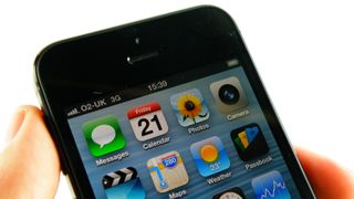
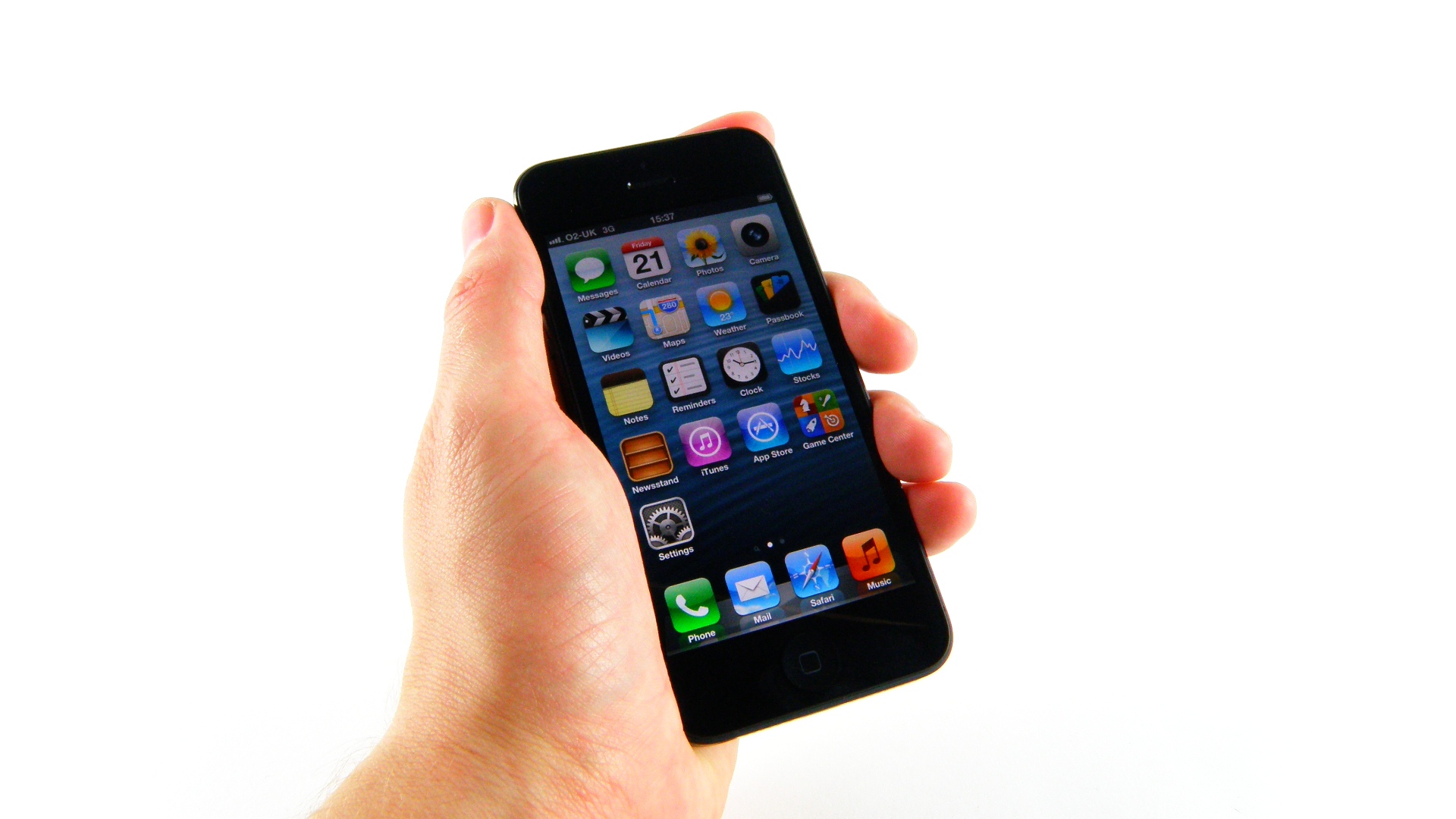
So we're not going to berate Apple for sticking with the same 326ppi resolution, nor 'only' extending the iPhone 5 display to 1136 x 640 pixels - it's the look that matters, and overall effect of the screen is very pleasing indeed.
There are black bars to the side of older iPhone apps that haven't been optimised for the screen, and this is particularly noticeable on the white iPhone 5. Apps are being regularly updated, but there are noticeable usability issues with those that aren't: older games in landscape can be irritating to control, and portrait apps have the virtual keyboard higher than you'd like it. Muscle memory gets a solid and regular kicking unless the apps you favour have developers who've been willing to put in extra leg work.
For those apps that have made the leap to widescreen (or 'tallscreen'), the experience is superior. Reading apps provide more information at any given time, and video apps are better on a widescreen display. Surprisingly, even many games benefit from the change. Return to an iPhone 4S after using an iPhone 5 for any length of time and the older device feels stubby and cramped by comparison.
Apple has done away with layers of technology below the screen to bring the display as close to the glass as possible, something it says will bring increased brightness and sharpness to the user's eye.
In practice, it's quite different from the iPhone 4S in quality and brightness, although tilting the phone to extreme angles lacks the impressive look we've seen on phones like the HTC One X. However, just because you can't see the colours as accurately at acute angles isn't really something to criticise a phone for, unless you're in the habit of letting your friends watch films from two seats away from you.
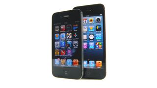
But enough of the comparisons: how does the screen look to the new user? Well, the answer is crisp, clear and bright with no discernible over-saturation when watching movies or browsing the web. We noticed no obvious discolouration - some people say the iPhone 4S had a slight greenish tint to it - so it's clear this is the best Apple display yet.
It's a lot better than the iPhone 4S in side by side comparisons, with the new phone definitely looking brighter, crisper and more true to life than its predecessor.
However, for all the reality on offer, it's not got the snap and pop that still wows us on the Samsung Galaxy S3, with its Super AMOLED HD display with superb contrast ratios. If asked to choose which handset we'd like to watch movies on, browse the web or go navigating in the car with, we know we'd pick the Galaxy S3 every time.
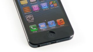
Both displays have the same 'painted on' effect when looking at the home screen that makes you wonder if you're looking at a dummy model with a sticker on, but those that say 4.8-inches of screen is too big haven't played with the S3 very long. Apple proved that larger screens are the way forward, even for it, with the launch of the iPhone 6 and 6 Plus a couple of years later.
That's not to say the iPhone 5 display is too small, as for many it's the most they'd accept in screen evolution. It's just that if 3.5-inches was the perfect one-handed size, 4-inches is a little too big (try getting your thumb up to the top-left corner to head back through apps) so if that's the case, a little bit bigger wouldn't make much difference and would give an improved experience to the apps so crucial to a smartphone user today.

Gareth has been part of the consumer technology world in a career spanning three decades. He started life as a staff writer on the fledgling TechRadar, and has grew with the site (primarily as phones, tablets and wearables editor) until becoming Global Editor in Chief in 2018. Gareth has written over 4,000 articles for TechRadar, has contributed expert insight to a number of other publications, chaired panels on zeitgeist technologies, presented at the Gadget Show Live as well as representing the brand on TV and radio for multiple channels including Sky, BBC, ITV and Al-Jazeera. Passionate about fitness, he can bore anyone rigid about stress management, sleep tracking, heart rate variance as well as bemoaning something about the latest iPhone, Galaxy or OLED TV.
