Why you can trust TechRadar
When it comes to the interface on the iPhone 5, well, there's not a lot new about it at all. It launched with iOS 6, but Apple has stayed true to supporting past models and you can now get the latest software, iOS 9, on the iPhone 5.
We're currently sourcing an iPhone 5, so we can update this review with all the goodies it provides, so for now here's our original findings on the interface.
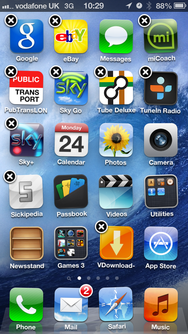
For the uninitiated, Apple's iOS is designed to be all about simplicity, which is why you're presented with a grid of apps that can be easily sorted into folders by long pressing on any one and dragging on top of another.

This method will also uninstall apps too, making it a much simpler system than anything you'd find on Android, where you have to jump through a few more hoops generally to create folders and get rid of unwanted software.
However, the downside to this trick is the fact it's been there so long. If this is your first smartphone (or first iPhone) then you'll be impressed by the simplicity - but then again, you may wish you had a bit more power under your fingertips.
For instance, where Android is so strong is in its customisation - meaning if you want to have one home screen full of widgets and another full of icons and a third with a massive widget for your music player, that's as easy to do as just filling the whole thing with icons.
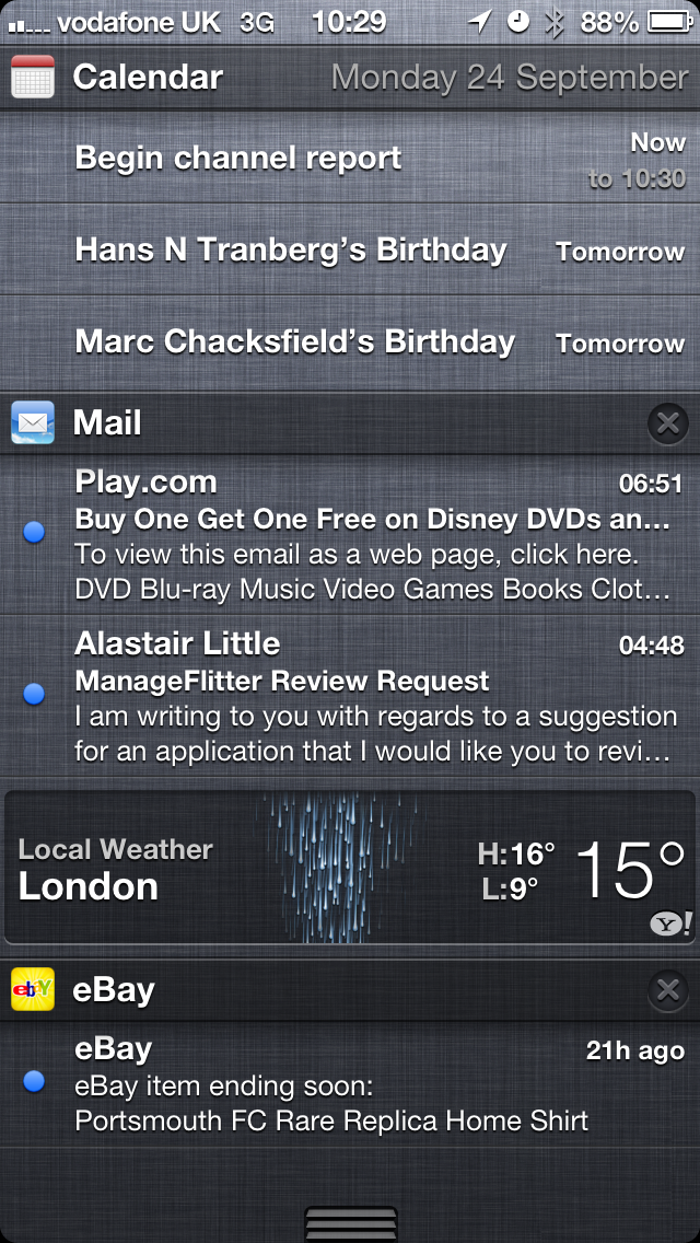
With iOS 6 you've only got weather and stock widgets in the notifications bar, which is accessed by pulling down from the top of the screen to give information on apps or message that have come through.
It's similar to that seen on Android phones, but with Jelly Bean (Android 4.1) we're offered the chance to see larger message previews and interact with important parts of apps without having to open them - impressive and a much more intuitive way of doing things.
However, let's not get caught up with fancy tools: Apple's iOS still has a gloss and sheen to it that other phones lack. It's still the best for organising apps, still impressive in its stability and overall still really works - and don't forget when iOS 7 lands, it's going to get a lot more advanced again.
We are looking forward to the platform update, as intuition is the thing iOS 6 now lacks. Where Apple wowed the world with the simple nature of the original iPhone, the current set up isn't really that far removed from that first iteration, at least visually.
Things like many app settings being placed within the Settings app, meaning you have to jump in and out of the apps to simply do things like alter the amount of days to sync in Mail, is ridiculous. Contextual menus have been absent from the iPhone ecosystem for far too long.

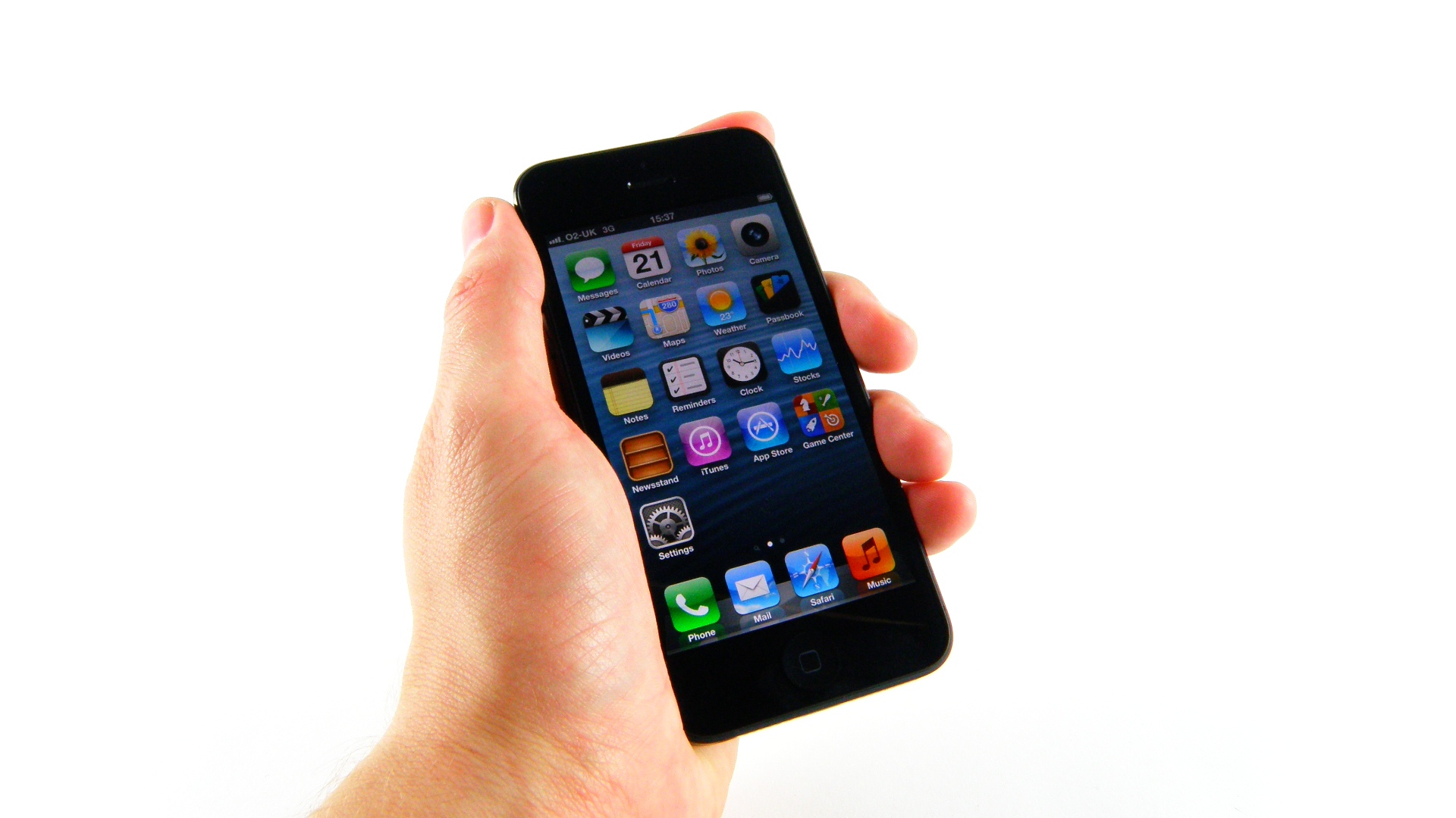
Another issue is the fact Apple isn't able to work out how to do live icons effectively. While some show new information, such as the Calendar, the likes of Weather still say the same 23 degrees with a sunny outlook.
We know you can do better than this Apple, and when you look at the awesome Live Tiles on offer from Windows Phone, it beggars belief that the Cupertino firm seems to think users wouldn't appreciate the chance to take a glance at the screen and know who that missed call was from, see what the temperature is outside or simply attach a contact as an icon for quick access.
It's also extremely frustrating to not at least have the option to have the icons auto-arrange still. When you delete an app all the others don't automatically line up to fill the space, which hurts the OCD nature in many of us.
We get that Apple knows some people want to keep icons in familiar places, but the auto-arrange option should be there.
But let's talk hardware here: the A6 chip on offer in the iPhone 5 may only be dual core, but it's certainly ridiculously snappy. It's meant to be much faster than the A5 chip powering the iPhone 4S, and in practice it really is, with GeekBench telling us than the clock speed is 1.1 to 1.3GHz on each core.
It manages to nab a score of around 1450 on GeekBench, which is over twice as fast as the iPhone 4S - impressive given they're both dual core phones.
And that's the beauty of Apple's iPhone strategy, and one that pays dividends for users: it doesn't play the numbers game, as it will only end in criticism. Sure, a quad core CPU would have been a good marketing tool, but at the expense of battery life and design Apple knows that consumers will get an equally great experience with just the two cores.

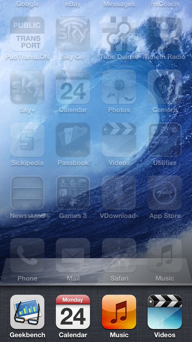
We didn't notice anything approaching lag during our time with the iPhone 5, with everything snapping back and forth with the kind of speeds we'd hope to see. Holding down the home key to access Siri was instant every time, and double tapping to bring up the list of apps running was equally fast.
This may all sound obvious, but some smartphones will introduce some delay into oft-used tasks, where the iPhone was happy to keep chugging along with no problems.
There was one issue we encountered during an iCloud backup to bring all the apps and settings from our previous phone, and that was during the repopulation some apps wouldn't delete, and would sit there installing forever until the phone was forced into a restart.
This was irritating as it stopped other apps from downloading at the same time, meaning we had to keep turning the blasted thing on and off again just to actually get all the apps we wanted on it.
There are those that have criticised the 'multi-tasking' window in the iOS system, stating that it's not true multi-tasking... which is true.
But try keeping all those apps running at once and using the phone for more than half a day, and you'll realise that Apple's strategy of putting some apps in stasis or shutting them down (but still showing them as recently used for easy access) is a good move on the whole.
We do wish more apps were able to run in the background (Skype would be a great start, as would many social networks) but on the whole we're fans of battery life, and there's every chance Apple will refine the process in the future.
After a couple of weeks' use, we slipped easily back into the familiar iPhone routine with iOS 6 and the standard interface. It does feel irritating at times, especially when having to jump in and out of the settings menu, but the new visual touches permeating the device mean that you won't feel thoroughly short changed by iOS.
Additionally, although Android users used to customisation might feel hemmed in by iOS, there's no denying that Apple's penchant for simplicity makes it an elegant choice for newcomers and for anyone who hasn't got the time or patience for endless customisation and tweaking.
And of course there's the debate of not getting to have a clean slate when you get a new phone, with iCloud / iTunes backup meaning you've got exactly the same experience as before on your device. It's a poor argument though - stop being lazy and mess around with your phone like a good little technology addict.

Gareth has been part of the consumer technology world in a career spanning three decades. He started life as a staff writer on the fledgling TechRadar, and has grew with the site (primarily as phones, tablets and wearables editor) until becoming Global Editor in Chief in 2018. Gareth has written over 4,000 articles for TechRadar, has contributed expert insight to a number of other publications, chaired panels on zeitgeist technologies, presented at the Gadget Show Live as well as representing the brand on TV and radio for multiple channels including Sky, BBC, ITV and Al-Jazeera. Passionate about fitness, he can bore anyone rigid about stress management, sleep tracking, heart rate variance as well as bemoaning something about the latest iPhone, Galaxy or OLED TV.
