Why you can trust TechRadar
Update: The iPhone 5C now comes with iOS 9 - we'll be updating this review with the new phone software soon!
As well as sporting an all new form factor the iPhone 5C also launched with Apple's updated mobile platform, iOS 7, and has since been updated to iOS 8.1. Well, iOS 8.3 actually, but those extra two numbers don't add much beyond Apple Watch support, new emojis and bug fixes.
Announced back in June 2013 at WWDC, iOS 7 actually made its way onto the likes of the iPhone 5 and 4S a couple of days before the 5C went on sale, but along with the iPhone 5S it was the first handset to actually ship with the new operating system.
iOS 7 was arguably the biggest overhaul Apple has given its mobile software since its inception in 2007, and in this post-Jobs era the design was left up to Jony Ive. iOS 8.1 has brought further refinements, better Mac integration and a few bug fixes, but it's not a major leap and it looks much the same as iOS 7.
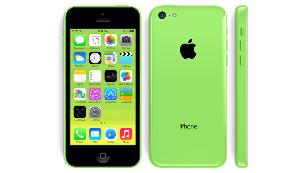
If anything the bright new iOS suits the colourfully clad iPhone 5C more than the iPhone 5S which sports three rather muted shades of grey, more grey and gold - and when you fire up your new 5C you'll note Apple has already set up a colour-matched background to tie the whole package together.
Of course we've already seen this colour trickery on Windows Phone devices where the live tiles of the homescreen are set to match the colour of the handset - and it's a nice touch which makes the hardware and software feel more connected.
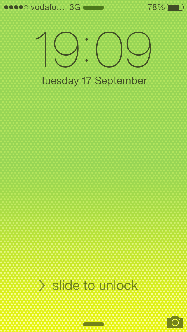
Starting at the lockscreen and you'll immediately realise the iPhone 5C is running a new version of iOS, with the famous slide-to-unlocked bar replaced with a simple text prompt.
It's a far more understated approach and if you have a pin set up - there's no Touch ID fingerprint scan here - then the swipe will take you to a numeric keypad which demands your secret combination before allowing you access to the handset.
There's also a camera app quick launch option on the lock screen in the bottom right corner. Just place your finger on the camera icon and drag up to launch yourself straight into the redesigned application.
If you're coming from an Android handset you may be disappointed to find Apple hasn't implemented more quick launches on the lockscreen - you'll have to go through the unlock routine to access anything else.
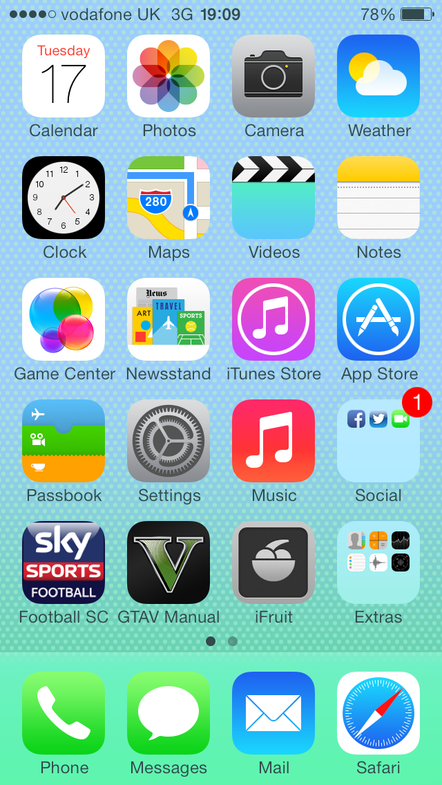
Once you are past that stage you're taken to the homescreen which is still just the first page of your app list, with the same side scrolling motion required to flip through the pages.
Your standard options of dragging and dropping apps onto one another to create folders and the pull down notification bar persists, although with some slight updates.
The notification bar has been tweaked by Apple and now includes two tabs in the pull down panel; today and notifications.
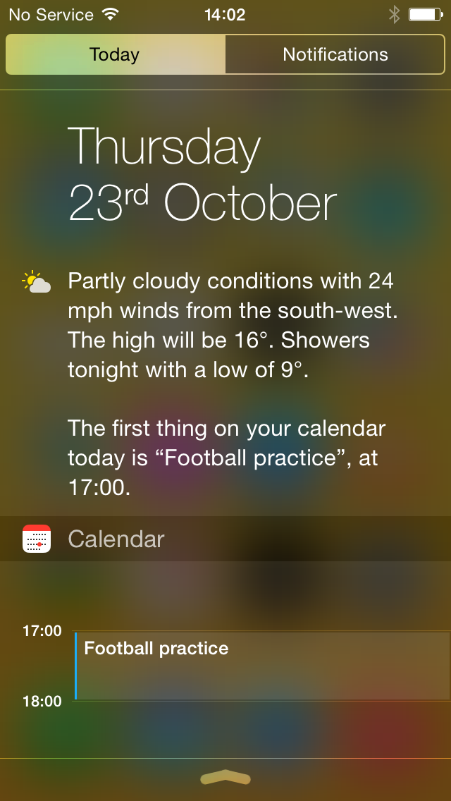
By default you're shown the "Today" tab, which displays the weather, reminders, any calendar entries for the day and stock information.
Scrolling down a bit more and there's also a bar which gives you a quick overview of what exciting events or meetings you have planned for the next day.
Tap "Notifications" and you'll be able to view all your notifications from missed calls, text messages and emails to social media and app alerts.
You can adjust what is displayed in the notification bar by diving into settings, so if you couldn't care less about stocks, or are getting irritated about how popular you are on Twitter you can turn off individual settings.
Something which was completely new on iOS 7 is the Control Center, accessed by swiping up from the bottom of the screen on the iPhone 5C.
This is a welcome addition to iOS as Control Center provides you with quick settings for Wi-Fi, Bluetooth, airplane mode, do not disturb and rotation.
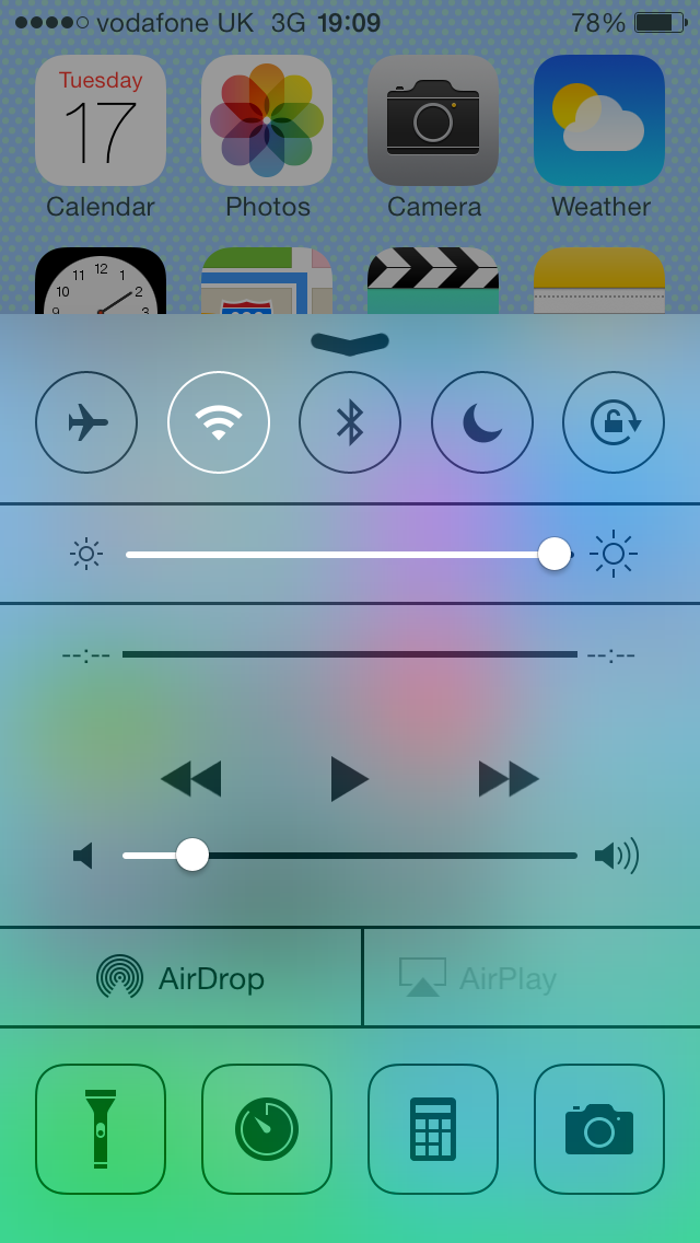
There's also a screen brightness bar, music controls, Air Drop shortcuts and quick launch icons for the torch (using the LED on the rear of the iPhone 5C), timer, calculator and camera apps.
You can access the Control Center while in any menu or application, making it a really useful feature to have if you quickly want to toggle something as you don't have to leave the page you're viewing.
Both the Notification Bar and Control Center can be accessed from the lock screen, although if you fear this will give too much control to outside users you can disable both - forcing a pin to be entered before being able to get to them.
I found iOS 6 ran seamlessly on the iPhone 5, which had the same processor as the iPhone 5C and iOS 8.1 is just as smooth here. Upgrade an iPhone 5 to iOS 8.1 and the on screen experience between the two will be almost impossible to tell apart.
That really contrasts with iPhone 4S experiences in which upgrading to iOS 8 has introduced lag and other problems on the older handset. Apple had to issue a patch to address the glitches.
The iPhone 5C may be seen as a cheaper version of the iPhone franchise, but Apple hasn't skimped on the internal grunt, giving you the same, high quality user experience you've come to expect from the firm.
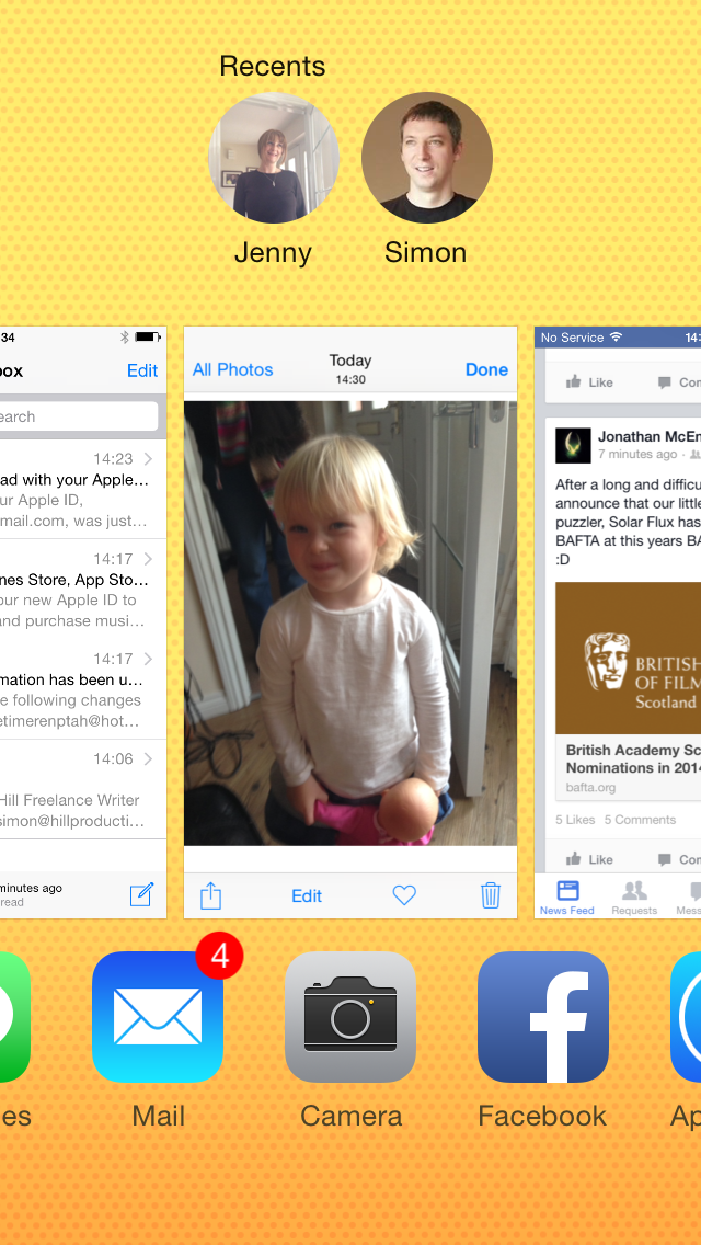
Multi-tasking was given an overhaul with iOS 7, and Apple tweaked it a little more with iOS 8.1. Gone is the bar which appeared at the bottom of the display when you double tap the home button.
The double tap action now sees the screen you're viewing minimised to a thumbnail in the centre of the screen, and a horizontal list to the right of it made up of small panels of all the other apps running in the background.
Each screenshot has the corresponding app icon beneath it. In iOS 8 you'll also find that recent contacts have been added along the top of this screen, making it a handy shortcut to contacting people.
The layout reminds me of the multitasking menu on HTC's Sense UI, and you can scrolling through the various applications, swiping up over thumbnails to close certain applications.
I'm not overly keen on the new design as the interface does break things up when flicking between apps, where on the iPad you've got the great five finger swipe to move between open apps – could this have not been repeated on the iPhone?
Apple has continued to shy away from the calls of some for the introduction of widgets into the iOS ecosystem, and while a couple of app icons display live information - with the clock and calendar app sporting relevant data - the majority are static images.
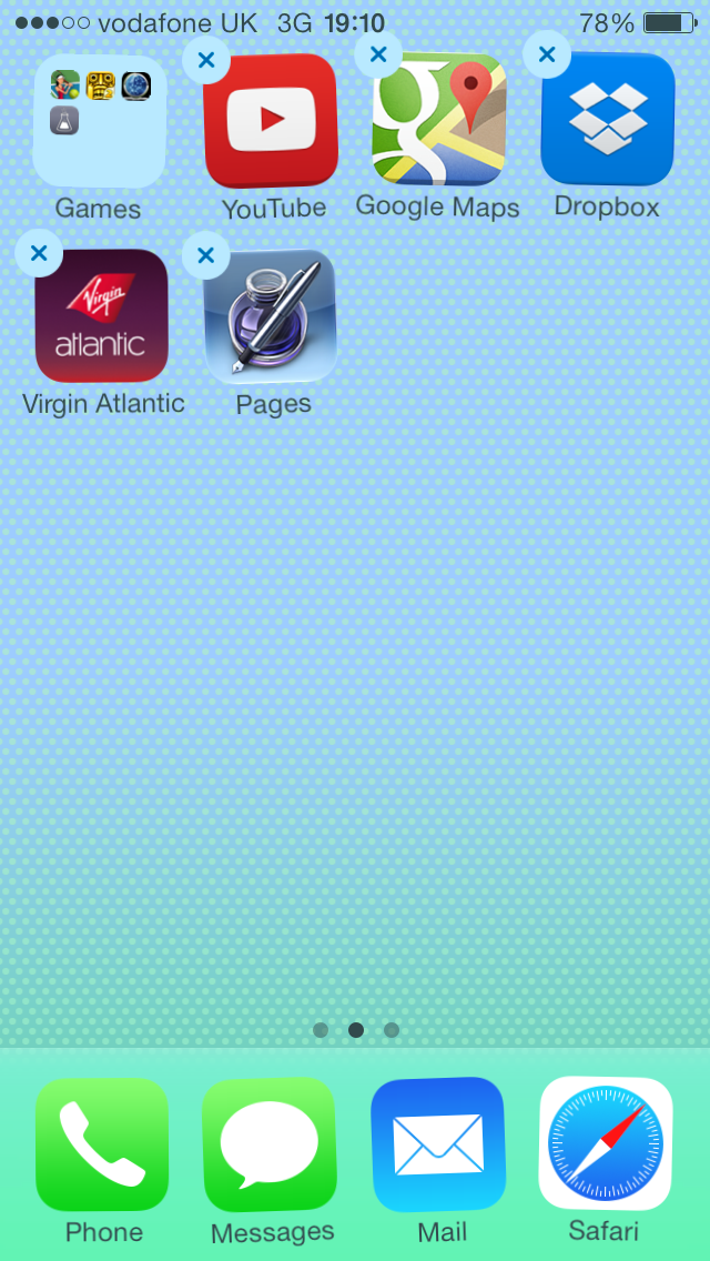
The weather app suggests it's always sunny with a chance of cloud, while the compass icon thinks I'm always facing North North West.
It would have been nice to see Apple make a few more of these icons smarter, as I'm pretty sure it's up to the job and going by the slickness of the rest of the interface the processor could probably cope with it too.
I found that the 4-inch screen was always responsive to my various pokes and prods and the 1136 x 640 Retina display provides clean and crisp visuals with a 326ppi pixel density.
That does mean the screen on the iPhone 5C, on paper at least, doesn't match the similarly priced, top Android and Windows Phone devices.
It's not really an issue though as Apple's Retina technology still provides an excellent display which is more than good enough on the smaller 4-inch screen size.
The viewing angles are still good on the iPhone 5C and the display sits just under the glass, making it look like it's actually printed on the glass instead of residing beneath it.
Hold the iPhone 5C next to a smartphone sporting a full HD display though and you will notice it doesn't quite hit the same heights in terms of clarity, but in isolation you won't be disappointed.
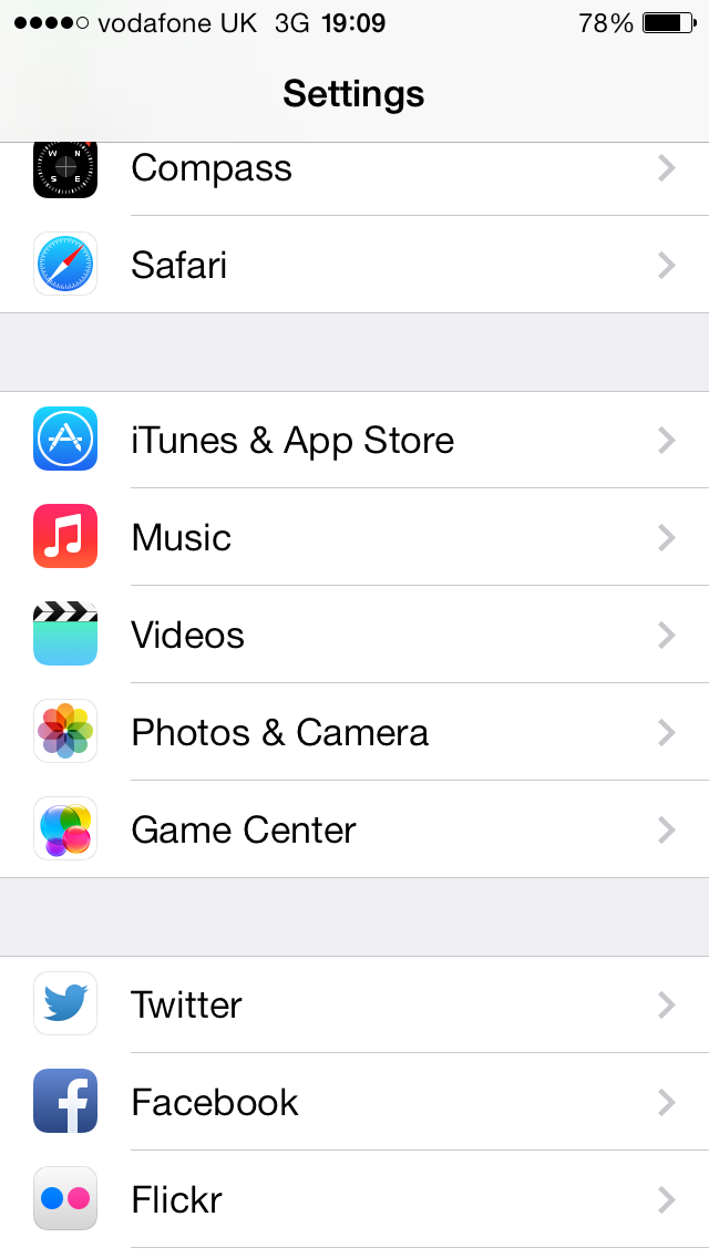
Opinion on the new colour scheme for iOS 7, which is unaltered in iOS 8.1 and beyond, is less spilt than it was and the brighter, fresher look certainly makes it look more enticing on screen, catching your eye and actually pulling you into the operating system - where as iOS 6 had become rather mundane.
What I do find frustrating in iOS 8.1 and its previous iterations is the dependence it has on the settings menu, with various app controls all housed here instead of within the apps themselves.
It's annoying if you're in the Facebook app for example and want to adjust the notification settings, you have to exit the app and navigate to the setting menu instead.
iOS 8 (and formlery iOS 7) is a great improvement on the previous version on Apple's interface and coupled with the colourful iPhone 5C it makes for a pleasing package.
It runs smoothly on the 5C and although some may take issue with the colour scheme, it's still easy to use with the addition of features such as the Control Center provide a huge benefit to the end user.

TechRadar's former Global Managing Editor, John has been a technology journalist for more than a decade, and over the years has built up a vast knowledge of the tech industry. He’s interviewed CEOs from some of the world’s biggest tech firms, visited their HQs, and appeared on live TV and radio, including Sky News, BBC News, BBC World News, Al Jazeera, LBC, and BBC Radio 4.
