Why you can trust TechRadar
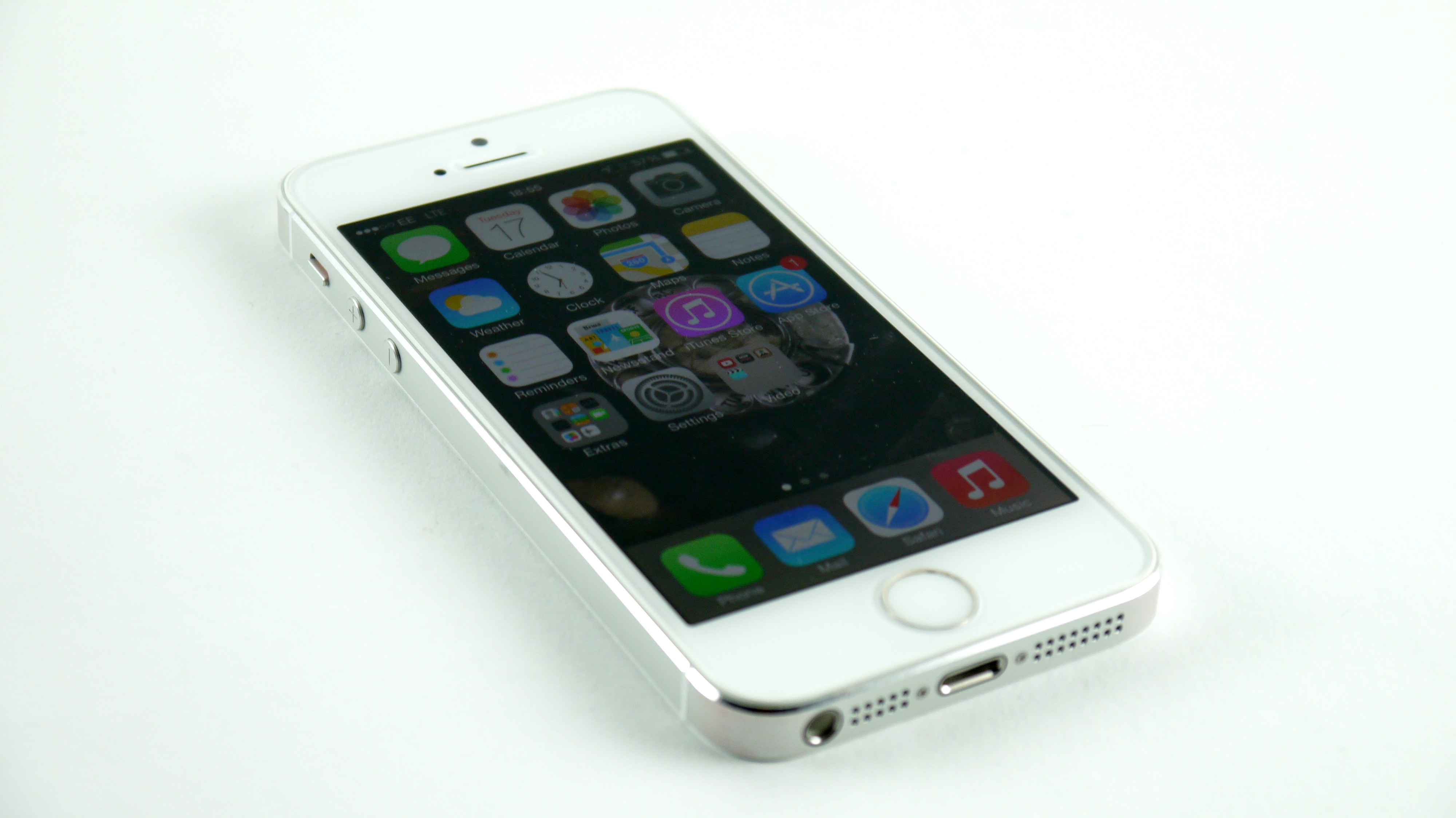
One big change on the iPhone 5S was the fact it arrived with iOS 7 with 2013. This was clearly the flagship device for the new operating system, and it showed off the UI redesign superbly.
Now we're all the way up to iOS 10, bringing a few new refinements and extra features. It broadens the usefulness of Siri, the robustness of Messages, ways in which you interact with the lockscreen. New apps like Apple Health and Apple News were also added to iOS 9 in between 2013 and now.
The newest iPhone operating systems since then also finally open up things like the keyboard. This means you're able to customize your phone in ways you couldn't before.
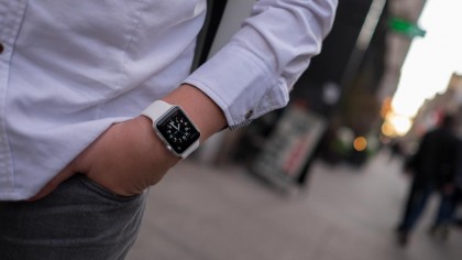
Unfortunately Apple Pay, a new way of paying for goods and services in store and online, is not going to work on the iPhone 5S because it lacks NFC, but pair with a new Apple Watch and you're laughing all the way to the bank (until you see your balance anyway).
The colors on offer are fun, fresh and most importantly distinctive, giving a real unique feel to iOS 7, iOS 8, iOS 9 and iOS 10 that other platforms might not have. Photos, Safari and Music have all changed a great deal in the last couple of years, as well as a host of other apps too, and while some have labelled them 'childish', they're clearly indicative of the new style Apple is looking to create.
What I do find frustrating in iOS is the dependence it has on the Settings menu, with various app controls all housed here instead of within the apps themselves.
It's annoying if you're in the Facebook app for example and want to adjust the notification settings. You have to exit the app and navigate to the setting menu instead.
Look beyond the UI though and you'll see that the iPhone 5S is much easier to use than the phones that came before it, which is impressive for a phone that was already market-leading in its simplicity. The software is almost identical to that running on the iPhone 6 and iPhone 6 Plus.
Dragging upwards from pretty much anywhere on the phone will open the Control Center, giving access to the music player, brightness, quick apps such as a timer, torch and calculator, as well as allowing you to switch on and off elements like the Wi-Fi and Bluetooth.
Yes, it's a notion that's been part of Android for a number of years, but it's been done in a way that feels a lot more solid and intuitive, never changing with notifications so you can easily trust that when you need a torch you can get to it easily.
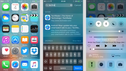
That said, the torch was an odd area of the Control Center. Whenever lifting up the tab to access said function, you'd always need to wait a second or two before being able to hit any of the quick app icons. It's not a huge problem, but one that quickly got tiring. It's like the whole drawer needs a second to boot up.
I also found an odd glitch here too: the music controls don't work over Bluetooth headphones, nor on the lock screen. This was fixed with a reboot, and hasn't happened for a while, but it didn't give me massive confidence in the device.
There's also the recently added notification area, accessed by dragging downwards. Thankfully unlike the Control Center, this can be customised: you don't need to have to look at stocks or your upcoming meetings or lack of social engagements if you don't want to, but there's always information on the weather there, which is nice when you realise you'll need a coat.
This is also the place where you'll get any missed notifications, be it a call, message or that jacket on eBay you were looking to buy when someone's outbid you on it.
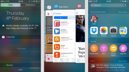
It was a bit of a wasteland, but Apple has changed that with the iOS 8 and iOS 9 updates, adding more intuitive interactions, and live widgets that update with key information – plus the ability to directly reply to messages there too.
Both of these areas are nicely designed too, with translucency that allows you to see very vaguely through to the rest of the phone. This gives the whole handset an air of completeness. It feels like a phone that's able to connect within itself and not fall apart when a new app rolls into town.
Since iOS 7.1 the phone and messaging buttons have been toned down in color somewhat, meaning less neon green and a more pleasing look to the eye, and the multitasking in the latest version of the software works much better than it used to.
The double-tap action now sees the screen you're viewing shown in a deck of cards – cards showing all the other apps running in the background. You can quickly swipe between them to find the one you're after, or swipe up to close an app.

The iOS 8, iOS 9 and iOS 10 releases we've seen since the iPhone 5S first appeared have only added to the quality of the phone (and blurred the distinction between iOS and Android even more).
Maps, Notes and Photos have received significant upgrades as Apple looks to keep pace with Google, although it feels like some other native apps, such as Mail, are being neglected.
The Low Power Mode, first introduced with iOS 9, should give you a few extra minutes of battery power when it's at a low level, and Siri and Spotlight have been upgraded too, so you get smarter assistance and results for your searches based on previous behavior.
Apple's personal assistant is now proactive, being able to make suggestions of its own, such as appointments you might want to add to your calendar.
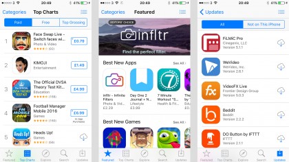
Not forgetting the brand new News app introduced with iOS 9, Apple's attempt to get publishers on its own platform rather than the wilds of the web.
There are signs that Apple is opening up iOS, with extensions now available for Photos and Safari, and those third-party keyboards we mentioned earlier; but it feels like the OS is due another major overhaul, which we'll perhaps see this year.
We're all the way up to iOS 10 now. Other highlights include improvements to Apple Maps, which now has public transport information in certain locations, plus an overhaul to Siri's functionality.
Apple's personal assistant is now proactive, being able to make suggestions of its own, such as appointments you might want to add to your calendar.
There's also a new News app, which works a bit like Flipboard, giving you a personalized feed of sources and stories you might be interested in. Plus iOS 9 improves the efficiency of devices and tweaks the keyboard to, among other things, make it easier to tell whether caps lock is on or not.

Gareth has been part of the consumer technology world in a career spanning three decades. He started life as a staff writer on the fledgling TechRadar, and has grew with the site (primarily as phones, tablets and wearables editor) until becoming Global Editor in Chief in 2018. Gareth has written over 4,000 articles for TechRadar, has contributed expert insight to a number of other publications, chaired panels on zeitgeist technologies, presented at the Gadget Show Live as well as representing the brand on TV and radio for multiple channels including Sky, BBC, ITV and Al-Jazeera. Passionate about fitness, he can bore anyone rigid about stress management, sleep tracking, heart rate variance as well as bemoaning something about the latest iPhone, Galaxy or OLED TV.
