Why you can trust TechRadar
Messaging on the iPhone has always been a tricky area to call, and this device is no exception. On the one hand, the range and stability of the options to talk to other people with your fingers have been superb, and iOS 7 takes this even further than before.

The way things look is just so much more complete, and when you're doing something simple like swiping away an email, the new blockier interface gives you so many options in such a small space.
However, the same screen is getting very cramped for typing these days, and the lack of keyboard customisation is annoying. We understand how Apple likes to lock down its devices, making sure that the experience isn't diluted by third party options, but the keyboard on the iPhone 5S simply isn't accurate enough to be considered a real winner.
If only something like Swiftkey could be enabled on the iPhone 5S (don't forget, it will be with the iOS 8 update), things would be so much more impressive, but we're left frustrated at having to pick out the letters on too many occasions.
The predictive text isn't too bad though, and seems to have improved over previous iterations of the iPhone. But not being able to simply add in a full stop without having to measure a tap and slide just gets too aggravating at times, and the fact your finger will often cover the area that lets you know when caps lock is on led to a few expletives.
With iOS 7.1 the keyboard has been mildly enhanced to make it easier to see when the shift key is pressed - in reality, it's just a bit different and many people might not even notice.
Email, SMS and iMessage
As we mentioned, email on the iPhone 5S is excellent thanks to a combination of fast speeds and a strong UI that makes it a breeze to whip through missives from your boss.
The folder organisation is fresh and easy to use, and you can simply choose the options you want in the mailbox instead of just a list of the accounts you've got on offer.

A swipe to the left or right on the message will give you the option to delete said email or quick reply without having to open the message itself – it's clean and crisp and, the smaller screen aside, it's very easy to manage your mail.
The mail app does seem to be one of the harder on the operating system, with a couple of pauses noted when jumping from one app to another. This didn't slow down the general operation of the phone though, and is something we'll keep an eye on when we update the review further over the next week.
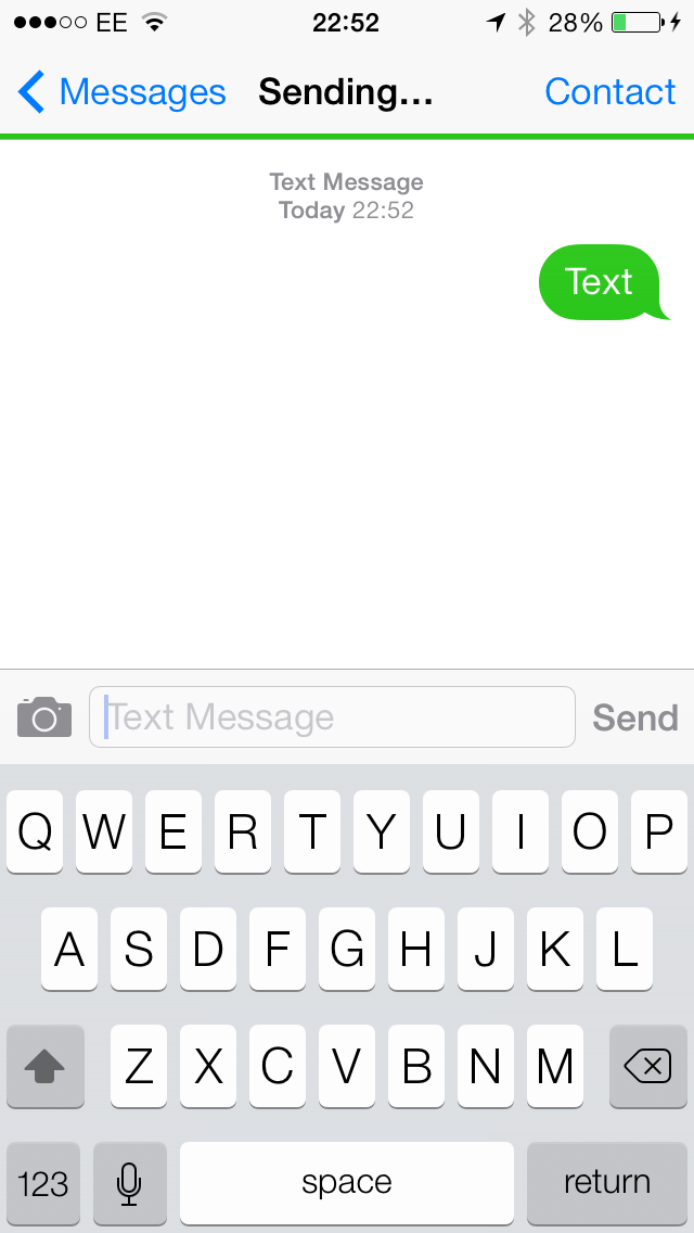
The impressive messaging experience continued when using the SMS and iMessage apps – the only real difference between the two (and thus when you know when it's a free messaging service or a paid for one) is there will be green or blue accents rolling around, including the bar that fills the screen as the message sends.
The ease with which you can send a photo is great, as a quick tap on the icon will enable it... however, it's annoying you can't send other files over iMessage as it feels like a missed opportunity when the system is so slick.
In fairness, this is being updated in iOS 8, so while for now rival apps such as WhatsApp and Skype also offer similar services while also being available on multiple platforms, they won't be better options for long unless you want to contact your Android, Windows Phone and BlackBerry buddies.
But for firing off a few messages to one another and letting people see the glory of your dinner or sightseeing extravaganza, it's very easy to manage.
Social networking
With iOS 7 on board the iPhone 5S it means Twitter and Facebook come baked into the handset - head over to the settings menu and tap the relevant social network to sign in to your account.
Signing into these social networks in the settings menu of the iPhone 5S allows you to quickly share content to both without having to jump into the dedicated applications - which aren't installed by default.

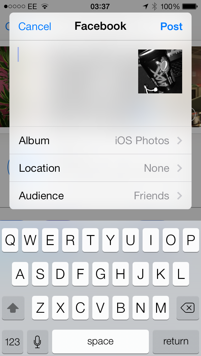
Say you want to post a photo to Facebook, just head on over to the Photos app, select the image you want, tap the share button and choose the FB icon.
Instead of taking you out of the application and into Facebook's own offering, you instead get a little pop up box allowing you to tap in your message, select an album to post the photo to, attach the location it was snapped (which are both optional) and the audience you wish to view it.
A similar pop up box appears is you select Twitter, but obviously with less options and a counter for 140 characters.
Pull down the notification bar though and the "Tap to Tweet" and "Tap to Post" buttons are not longer sitting proudly at the top of the screen - so you'll have to fire up the dedicated apps (once you've downloaded and installed them) to update the world on what you had for breakfast.
We bemoaned the iPhone 5 and iOS 6 for Apple's poor implementation of the baked in social features and sadly with the new range of iPhones and iOS 7 things haven't got much better. We're sure there's some cool stuff Apple could do with this functionality, but it's obviously yet to realise its potential.

Gareth has been part of the consumer technology world in a career spanning three decades. He started life as a staff writer on the fledgling TechRadar, and has grew with the site (primarily as phones, tablets and wearables editor) until becoming Global Editor in Chief in 2018. Gareth has written over 4,000 articles for TechRadar, has contributed expert insight to a number of other publications, chaired panels on zeitgeist technologies, presented at the Gadget Show Live as well as representing the brand on TV and radio for multiple channels including Sky, BBC, ITV and Al-Jazeera. Passionate about fitness, he can bore anyone rigid about stress management, sleep tracking, heart rate variance as well as bemoaning something about the latest iPhone, Galaxy or OLED TV.
