Why you can trust TechRadar
Display
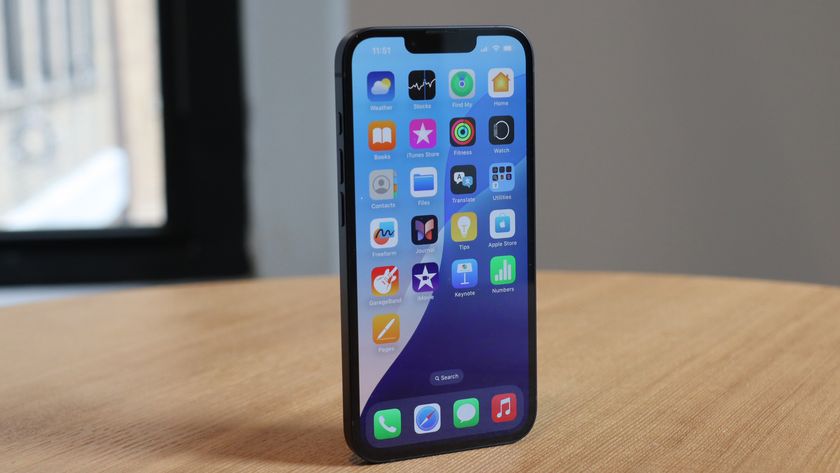
When it comes to key features on the iPhone 6 Plus there's only one you really need to know about: the screen.
It is after all, the whole point of the handset, offering Apple fans a supersized screen on their most mobile of devices.
At 5.5 inches the display on the iPhone 6 Plus is certainly sizeable, but it's not uncommon in a market where 6-inch monsters like the Nokia Lumia 1520 and Huawei Ascend Mate 7 exist.
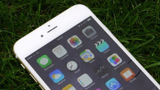
It's got plenty of company around the 5.5-inch remit too, but for Apple fans looking for a phablet-sized iOS handset, the iPhone 6 Plus and iPhone 6S Plus are the only games in town.
The 6 Plus was the first iPhone to boast a full HD, 1920 x 1080 display. The iPhone 6 only musters a still somewhat average 750 x 1334 resolution with a pixel density of 326ppi.
By contrast the iPhone 6 Plus boasts a 401ppi display, so there's only one winner when it comes to clarity. Compare it to the 5.7-inch, QHD Super AMOLED Samsung Galaxy Note 4 (515ppi) though, and the iPhone can't match its Korean rival – and that's before we get on to the ludicrous 4K resolution since achieved by the 806ppi Sony Xperia Z5 Premium.
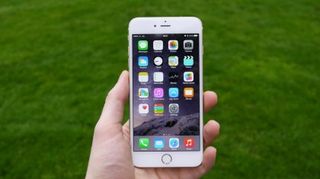
The LED-backlit display has impressive viewing angles thanks to Apple's use of 'dual-domain pixels', which makes for an excellent visual appearance – especially if there are a few of you crowded round the screen.
The IPS panel helps make colours bright and clear, and with a 1300:1 contrast ratio to boot the new screen elements combine to deliver a noticeable improvement over the screen on the iPhone 5S.
The iPhone 6 has also been run through the expert DisplayMate battery of tests, which found in its shoot-out that "the iPhone 6 Plus [has] the best performing smartphone LCD display that we have ever tested".
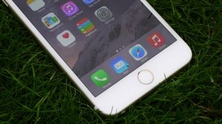
This is quantified by stating that the records it breaks are in the day-to-day elements that need to work for consumers to enjoy a smartphone, especially in terms of removing reflections and being able to display content on the screen in both bright and optimum conditions, and when the phone is tilted.
It still holds up well now, with even the screen on the iPhone 6S Plus and iPhone 7 being virtually no better – although Apple's newer handset does sport 3D Touch and wider color gamut.
Apple also claims the screen has a fingerprint-resistant oleophobic coating, although while I found the iPhone 6 Plus was much better than most at avoiding really obvious prints it certainly wasn't immune to my oily digits.
Colours obviously don't pop as much as on the Super AMOLED display of the Samsung Galaxy S7, and clarity isn't as razor sharp as either the S7 or the LG V20, both of which pack QHD screens – but the iPhone 6 Plus still has a very, very good display, and the more day-to-day elements, shown in the DisplayMate shoot-out, work very well and show that Apple has put some thought into which issues make it difficult to use your phone for general tasks.
If you're upgrading from an iPhone 4S, 5 or 5S your eyes are in for a serious treat.
Reachability
As you may have already guessed, the 5.5-inch iPhone 6 Plus isn't exactly a small handset, but Apple is determined that, when it comes to convincing users about usability, its iPhones are still perfectly usable in one hand.
For the vast majority of the iOS interface and iOS apps, navigation is located at the top of the screen; there are no back keys at the base, as with Android and Windows Phone.
This wasn't a problem on the 3.5-inch and 4-inch iPhones, as their compact size meant you could easily reach all four corners of the screen.
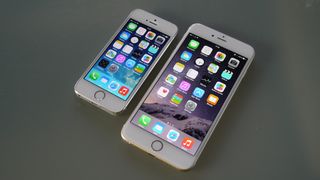
Things are different on the iPhone 6 Plus. Some serious hand shuffling is required to move up to the top of the screen, especially when exiting an app by clicking the home button below the screen and then reaching for an app icon on the top row.
To combat this Apple has cooked up 'Reachability', which aims to reduce the amount by which you need to stretch your thumb to the very top of the screen.
It's very simple to use, as you'd expect such implementation would be from Apple, although I found the execution rather less pleasing.
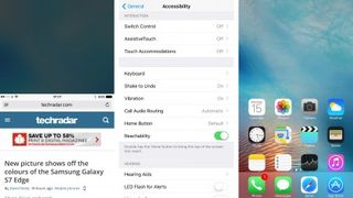
A double tap (not press) on the home key will see the screen jump down, bringing the top part of the display to the middle.
This works on any screen, from messaging and Safari to the notification bar and third-party applications. What's not to love? Well, it just doesn't look very good, like the screen has got a bug. Which for Apple, is surprising.
Unless you're enabling 'reachability' (and FYI, I already hate that term) from the home screen where your wallpaper remains in the same place, you just get a big black block in the empty space.
It makes the whole system feel like a bit of an afterthought, and to an extent it is.
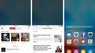
You can't scroll to the bottom of the screen in this reduced view, and the vacant space above feels ripe for a second app to be opened in it, but you can't do that.
This would allow you to take advantage of the larger screen of the iPhone 6 Plus, with two apps running side by side.
The use cases for this particular functionality are few and far between – even though Samsung tell us the opposite – so I can understand why Apple has shied away from it on its phones; although iOS 9 brought split-screen apps to the iPad range, so you never know – we might one day see it on an iPhone.

TechRadar's former Global Managing Editor, John has been a technology journalist for more than a decade, and over the years has built up a vast knowledge of the tech industry. He’s interviewed CEOs from some of the world’s biggest tech firms, visited their HQs, and appeared on live TV and radio, including Sky News, BBC News, BBC World News, Al Jazeera, LBC, and BBC Radio 4.
