Why you can trust TechRadar
3D Touch
Apple's been hard at work integrating the Force Touch technology from its Watch and new MacBook Pro into the iPhone 6S, but has decided that it needed to give it a new name: 3D Touch.
In terms of all the changes offered by the new iPhone, this is definitely the one you should pay most attention to. Not just because it's the most multi-faceted, but also because it's the only change that I feel confident in stating will alter the way we use our iPhones forever.
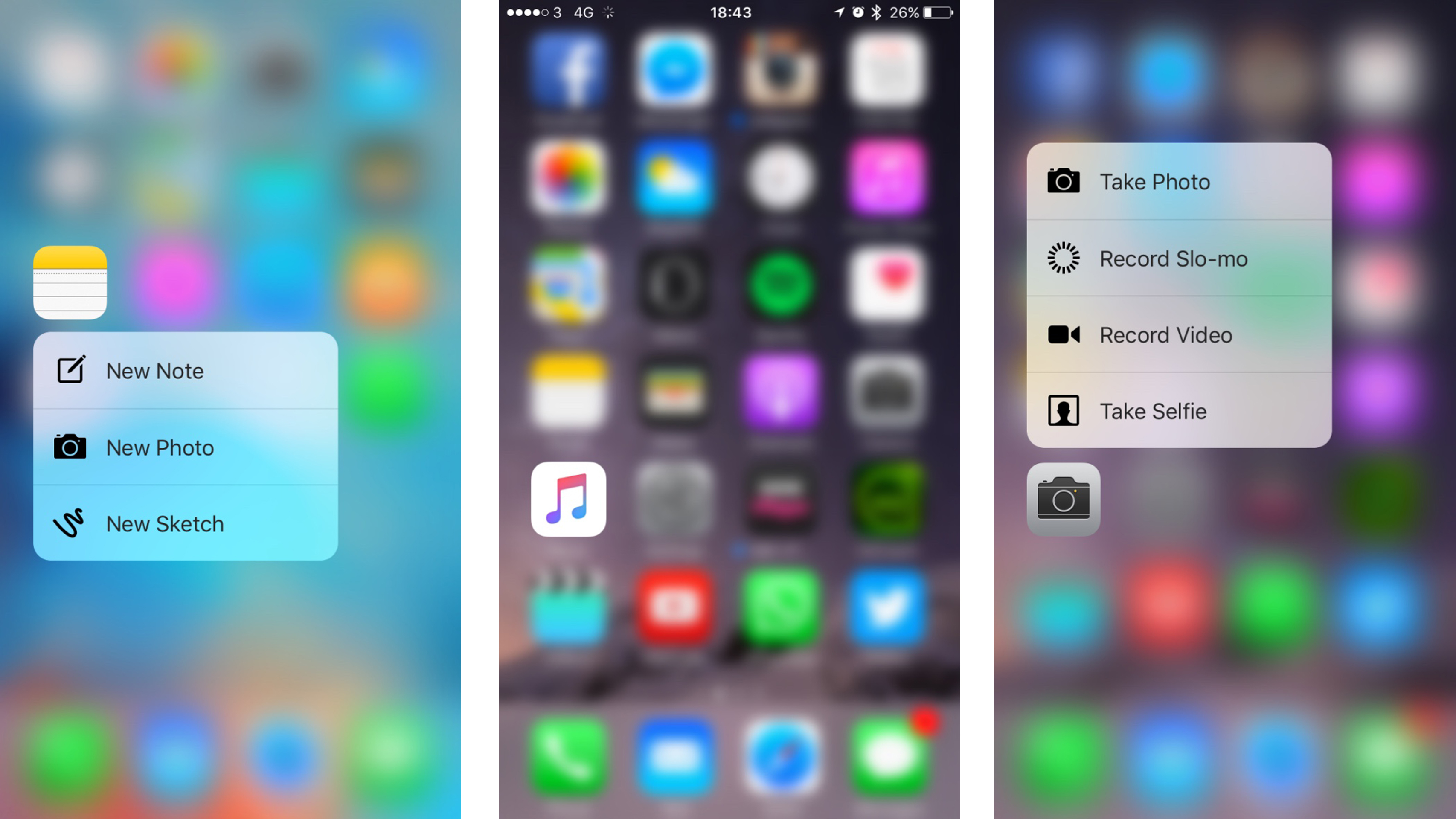
The premise sounds simple: the screen now has a third dimension, allowing you to poke 'into' the display rather than just swiping all over it. Apple's likened it to the integration of multi-touch, which ushered in pinch to zoom for navigating through the web and photos... and that definitely changed the way we use smartphones.
While the amount of things you can do with it now is slightly limited, there's no doubt that the ability to poke the screen is going to become a natural gesture over the next few years, especially as app developers get hold of the option.
It's only native Apple apps that have made use of the option for now, and while most of them have some form of 3D Touch-ability, I found myself using it most in messages and Safari.
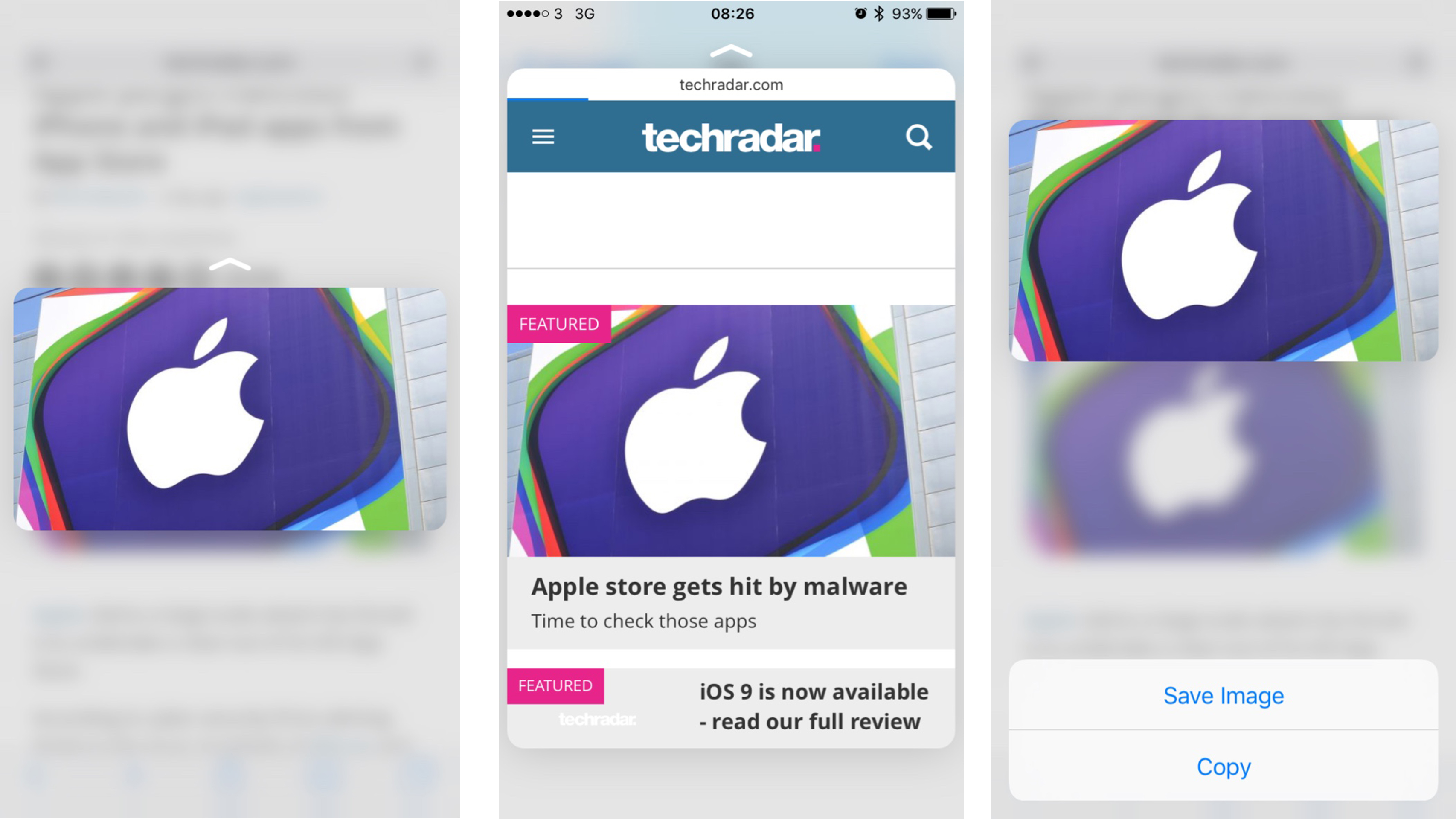
Let's say you get a message with a link in - asking you to check out a website or asking if you want tickets to 'this' gig. You can just push the link and a little window pops up, previewing the web page and giving you the info you want.
If that satisfies you, then you can just let go of the screen and return to the message. If you need to know a little more then pushing the screen harder will open up the page in Safari so you can explore further.
These actions are nauseatingly called 'Peek' and 'Pop' - but just think of them as a preview and then a harder press actually opens the app and you'll get what I mean.
The same thing for nearly every link in the phone, and the action became second nature within a few days. In fact, it became embedded to such an extent that I nearly broke the screen on a Samsung Galaxy S6 Edge trying to open a link, and got annoyed when I had to actually click a hyperlink in Gmail's web client.
3D Touch is probably the most functional in Mail, where you can preview messages then swipe up, down, left and right to do things like call up menus, archive the message or mark it as unread.
In Apple's presentation this was the headline action of the service, but I didn't find it that useful... like many things I didn't feel like the previous method (opening the email, seeing if I cared, deciding I didn't and then possibly marking it as unread) was a problem.
If anything 3D Touch made me more lazy with my mails... and if you've seen my inbox that's not a good thing.
The big issue I had with 3D Touch was that the previews were static - I couldn't scroll up to see a little more when often I wanted to just get a little more info before deciding if I wanted to open the app. This sounds like a really picky way of describing the action, but given it's meant to be all about convenience I really missed it.
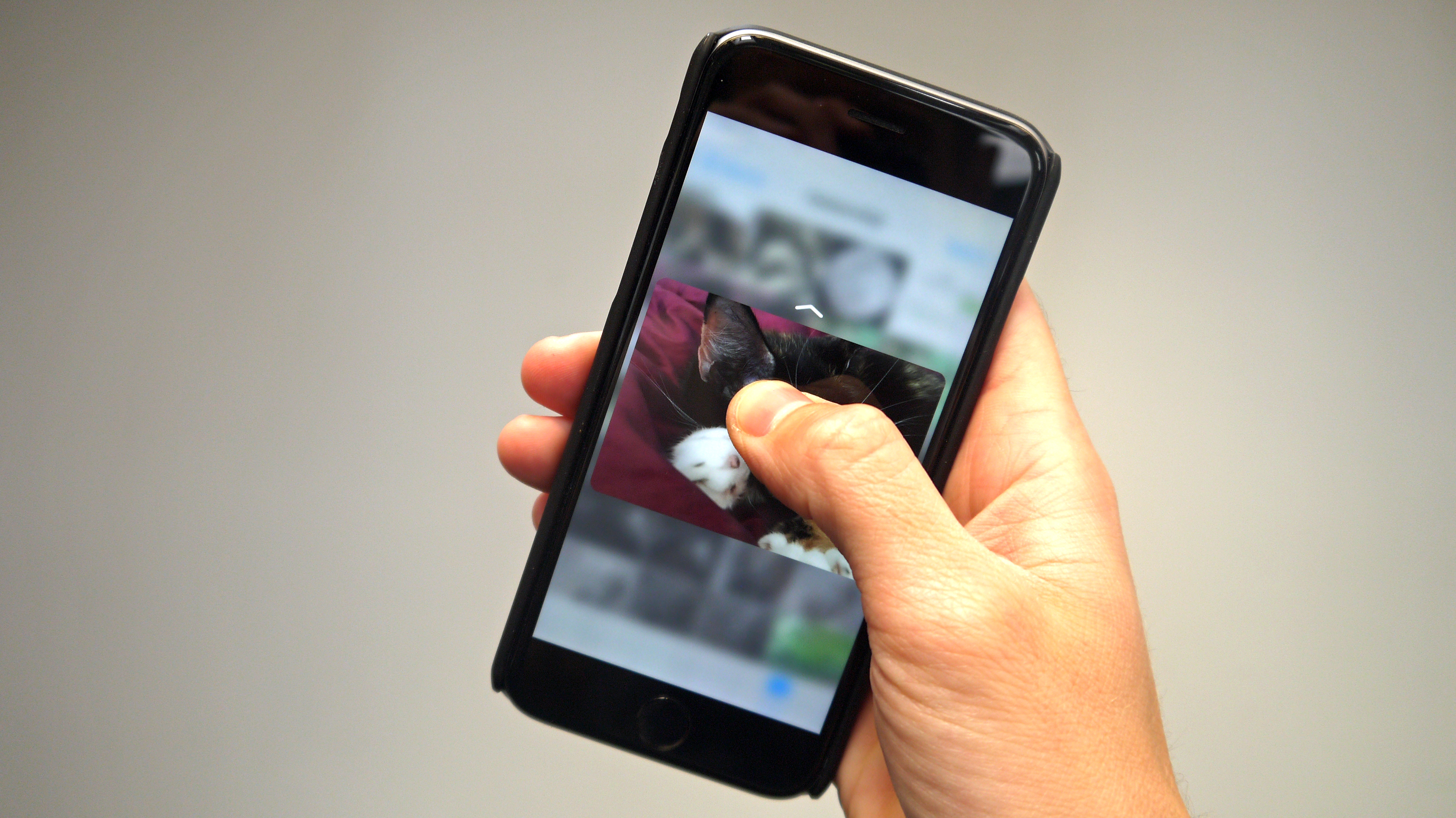
I also found, especially when previewing things like photos, that my finger was right in the middle of the screen and covered a lot of the display - thus making the preview irrelevant.
But that takes away from the excellent idea that Apple's come up with here. Sure, it's nothing more than a super-charged long press, and if anything it's highlighted that Apple should have added in such an action ages ago, given it's been in Android for aeons.
This is definitely the next level though. I've already played a racing game where acceleration and braking were now able to be subtle thanks to the pressure applied, and while it was rudimentary there was definitely a feeling of a more premium 'controller'.
But I've not used the technology much in the last month, if I'm honest. The only thing I've regularly used it for is previewing web links and viewing Live Photos - and the latter because that's the only way to see them, where a long press on non-iPhone 6S models works the same way.
I still think it will be revolutionary, but only when apps start using it. Instagram lets me preview pics this way, but who cares? Just tap and open them. I rarely use the shortcuts on the homescreen, but then again I keep forgetting I can, which is an issue of training users Apple has to overcome.
With the arrival of iOS 10, 3D Touch was given some new tricks, allowing you to do more with the pressure sensing tech. 'Peek' an app now, and for some applications you'll be able to pull through some live data into the view. For example the Activity app will show you how you're getting on with your daily goals without having to open the app.
Mighty pad
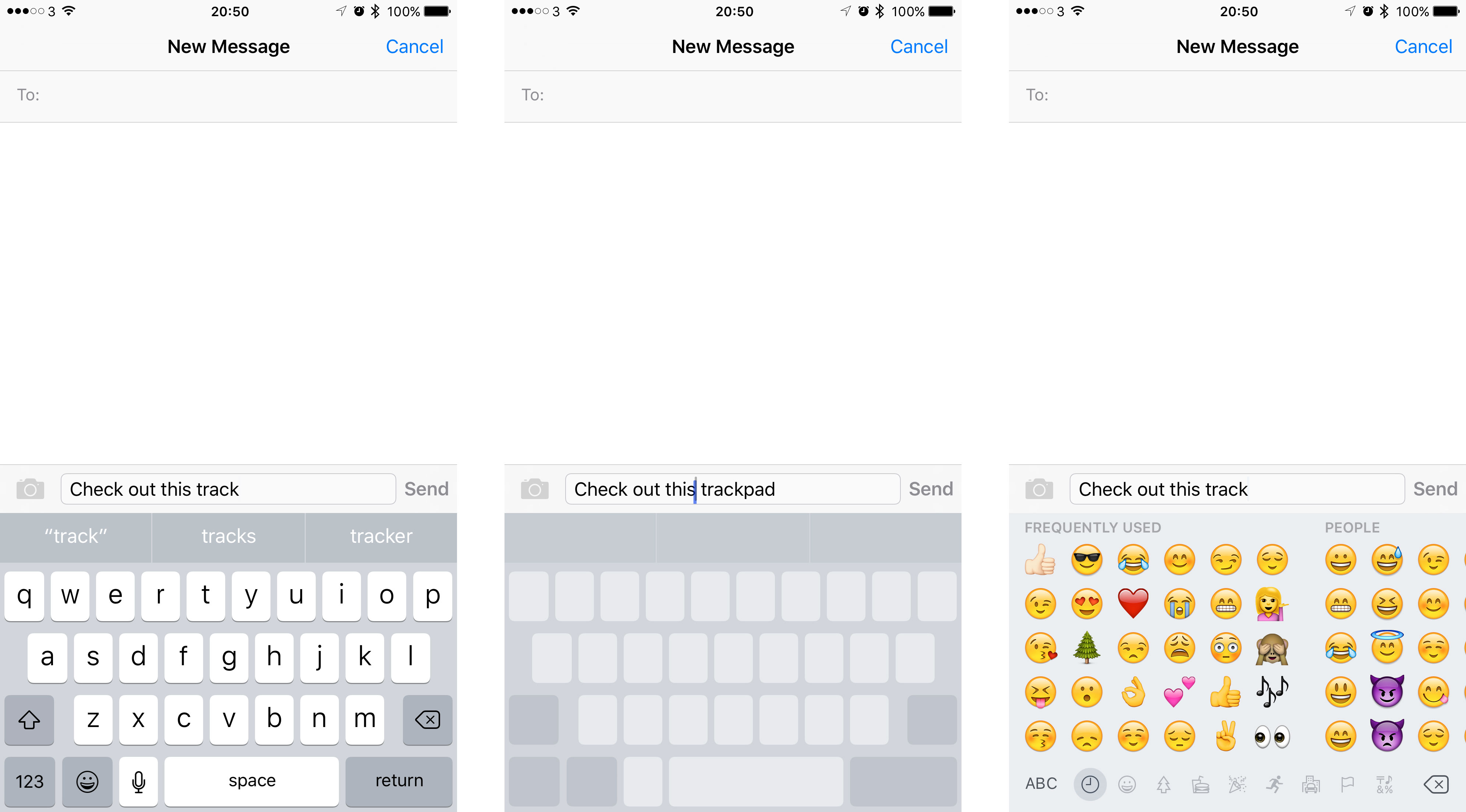
There's greater control over your cursor when typing too, with the inclusion of iOS 9 (now upgradable to iOS 12) on the iPhone 6S allowing you to use 3D Touch for precision placement. Hold down on the keyboard and the characters will fade away, leaving you with a track pad to expertly line up the blinking vertical line.
It brings a new level precision to editing text, something which has been a little hit and miss on previous iPhone and iOS incarnations.
Live Photos
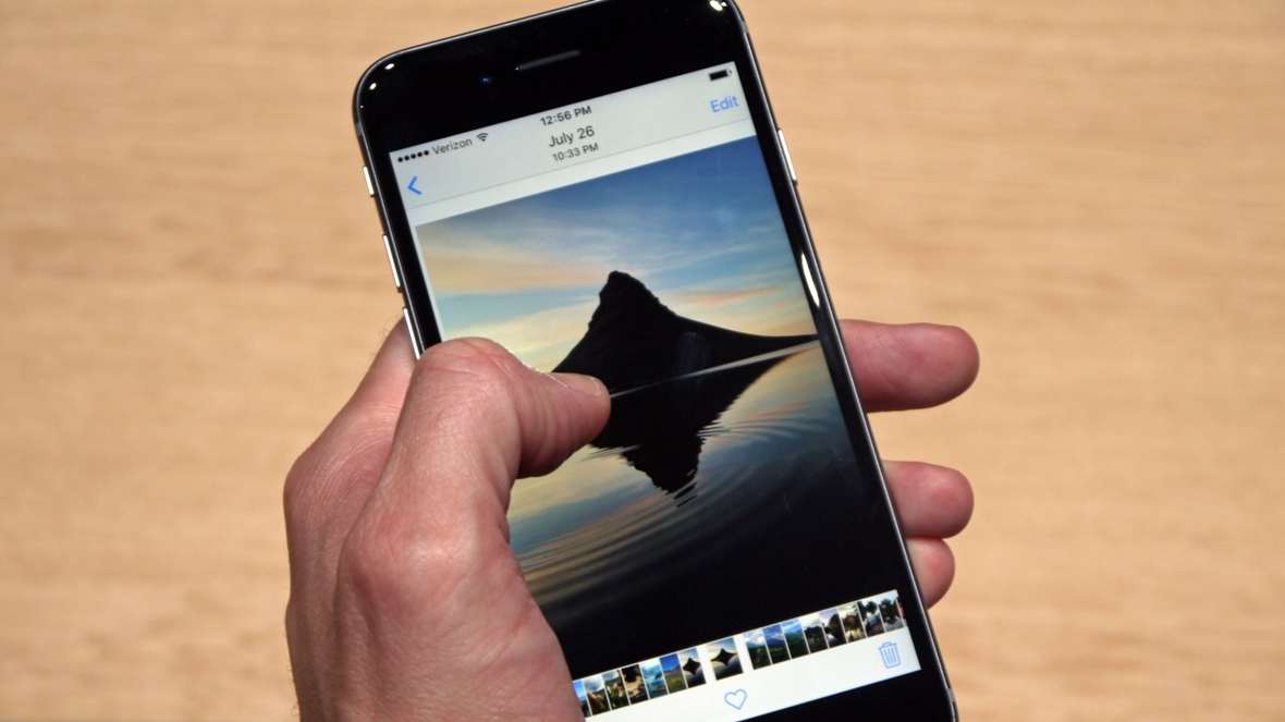
While I'll cover this in greater depth in the camera section, it's worth talking about the new function in the new iPhone 6S. While the camera has been upgraded to 12MP, it will now grab a chunk of video before and after the snap (1.5 seconds to be exact) and turn that into a little video.
With audio captured the idea is that the moment is added into the photo, and with a prod from 3D Touch you'll be able to see the story behind the photo. This isn't a new idea, as HTC, Nokia and Samsung have all tried to do it in the past (with limited success).
Nokia and HTC were probably the biggest proponents of the platform, the former using it to do great things like remove people from the photo or providing more editing effects - and HTC even spliced the video into a photos highlights reel to make memories of events like a night out.
Both of these ideas worked well, were genuinely useful and had a strong result - and yet couldn't entice users in (although HTC's now-standalone Zoe app is still being used by many). Apple's method is much simpler, almost hidden behind the photo, where the only proof that there's a dynamic picture in your snap is a little flick of movement as you swipe through the gallery.
However, it doesn't seem like something that will be a big draw - simply because the only thing people want to do is take a photo with a camera and have it come out looking crisp, in focus and full of color. They don't want gimmicks around it, they just want the phone to help them be brilliant photographers.
In fairness to Apple, the Live Photo happens quietly in the background (with only a little 'Live' box at the top of the camera viewfinder telling you what's happening) and doesn't compromise shooting speed or photo quality, and in terms of space it's less than two photographs.
If Apple had changed the 16GB model to 32GB, then perhaps this wouldn't even be questioned, but many people run out of space on their smaller iPhone capacity and doubling the amount of photos taken is going to make things even worse.
A9 chipset
As usual, Apple has upgraded the engine in the middle of the iPhone, bringing the 6S into 2015 with it fastest chipset yet. The A9 has myriad upgrades, with things like the M9 coprocessor enabling the phone to record even more motion without impacting on the battery life.
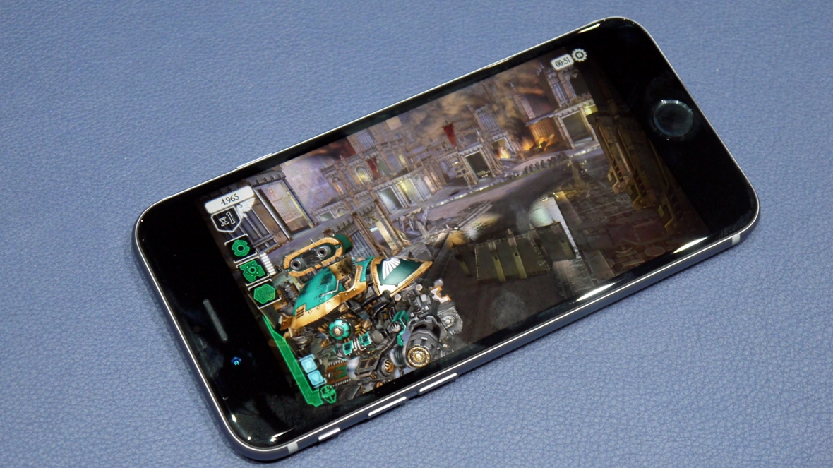
As usual it's been hard to test this out before the official launch of the iPhone 6S, simply because there aren't apps unveiled that can make use of it. The games shown off at the official iPhone debut, like the Warhammer 40,000: Freeblade game, showed that the new iPhone is capable of some truly breathtaking apps and is able to combine them with 3D Touch to enable new methods of gameplay.
But in general day to day use, there doesn't seem to be a lot of difference. Browsing through apps is a snappy as ever (albeit with a very slight delay if you've got animations enabled) and I can't fault the speeds over Wi-Fi or cellular connection.
That's just in day to day use - if you stress test this a little more, you'll see that the iPhone 6S will shave off a few seconds each day through constantly opening and closing apps (see the video in the iOS 9 section to get what I mean).
What was notably absent from the unveiling event was the claims of longer battery life, which you'd have assumed the improved CPU would have offered. However, it seems Apple has decided to use that improved power to deliver 3D Touch and more powerful graphics, rather than extending the battery life of the iPhone 6S.
Given iOS 9 was also supposed to be a bit better on the battery, this is surprising, but I couldn't see any evidence of improved battery management. Of course, you can get all the way up to iOS 12 now, so things may have improved here.
Current page: 3D Touch, Live Photos and A9 chip
Prev Page Introduction and design Next Page From iOS 9 to iOS 12
Gareth has been part of the consumer technology world in a career spanning three decades. He started life as a staff writer on the fledgling TechRadar, and has grew with the site (primarily as phones, tablets and wearables editor) until becoming Global Editor in Chief in 2018. Gareth has written over 4,000 articles for TechRadar, has contributed expert insight to a number of other publications, chaired panels on zeitgeist technologies, presented at the Gadget Show Live as well as representing the brand on TV and radio for multiple channels including Sky, BBC, ITV and Al-Jazeera. Passionate about fitness, he can bore anyone rigid about stress management, sleep tracking, heart rate variance as well as bemoaning something about the latest iPhone, Galaxy or OLED TV.
