Early Verdict
Pros
- +
Sailfish looks gorgeous
- +
solid specs for the price
Cons
- -
Lack of any buttons will annoy some
- -
Still a few bugs
Why you can trust TechRadar
In today's Android and iOS-dominated market, putting out an "indie" operating system might seem a brave move to most, but it's hugely refreshing.
Jolla is the creation of a few ex-Nokia bods who decided to go it alone when the company abandoned MeeGo for Windows Phone. As far as Nokia was concerned, the Nokia N9 was the the birth and death of that Linux-based operating system.
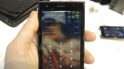
Jump forward to now and we're holding what many would consider the N9's spiritual successor. It's pleasing in the hand, nicely weighted and compact in design, with a 4.5-inch, 540 x 960 display.
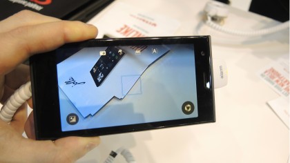
Chugging along inside is a dual-core 1.4GHz processor, 1GB of RAM and 16GB of storage. Throw in an 8MP rear camera and a 2MP front-facer, and you've got yourself a nice little proposition for €399.
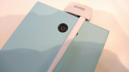
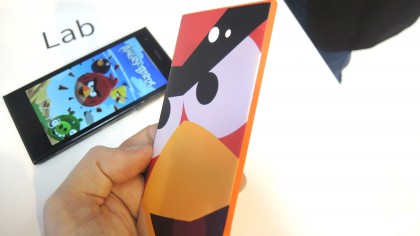
But beyond the surface-level specs and bog standard slab shape, Jolla has added some of its own personality to the handset. The phone is actually formed of two "halves", with an interchangeable backplate.
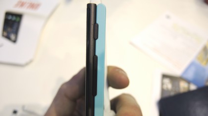
It's not just about making your Jolla Phone look nicer though. The backplates also include NFC, which will cause the OS to morph depending on what you attach. We were shown an Angry Birds backplate that gave the UI a unique touch of the avian variety, while another changed the colour themes of the Jolla's unique OS.
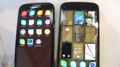
That OS is Sailfish, a Linux-based system inspired by MeeGo. With Sailfish, Jolla wanted to create an OS that was perfect for one-hand operation, and indeed there are no buttons - not even capacitive - to be found on the handset.
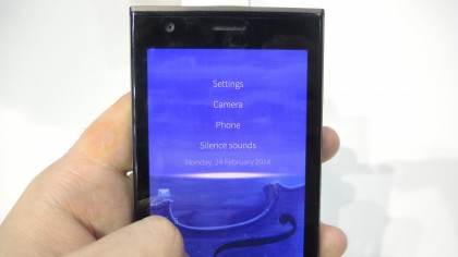
That's because Jolla wants your thumb to become the home button, each swipe a different function depending on its direction.
Swipe from left to right and the app you're currently in will be minimised and you'll be greeted with a grid of other apps that are currently open. This lets you easily jump from one app to another, or delete any you're no longer using.
Swipe from bottom to top and you'll be met with your list of notifications. You can also wake the phone up from sleep by double tapping anywhere on the screen, which is a particularly nice legacy feature from the Nokia N9.
Sailfish is really nice to look at too, with those tear-shaped icons sitting beautifully within the colourful UI.
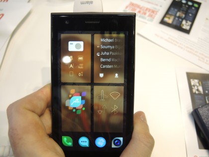
When it clicks, there's a nice fluidity to it. But it's a system that takes some getting used to, especially for thumbs used to dancing around Android, which will find Sailfish a little unintuitive at first.
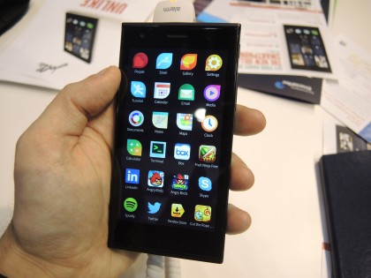
Which brings us to, well, Android. Jolla has designed Sailfish to be open, and while you can download apps from Jolla's own store, there's not enough here to satisfy. Thankfully, Sailfish can also run Android apps.
To get them, you'll need to install a third-party Android store - the one we tried during our play time was Yandex.
When those apps are running, you'll get back the Android back button and multi-tasking nav button as well. It's a work in progress, and we found that Android apps were a bit unstable at times. A couple of nasty crashes did take place.
Jolla is also in the process of making Sailfish OS available for Android-running hardware. It's a work in progress, which requires a lot of optimising for different devices, but we got to try it out on a few different third-party phones and the experience was just like on the Jolla phone, though a little more buggy.
Early verdict
It's difficult to recommend the Jolla Phone this early in the game. It's a breath of fresh air with some neat ideas that will appeal to anyone looking for a bit more individualisation in their phone, but for those comfortable with their more familiar operating system, Jolla doesn't offer anything mind-blowing enough to warrant a switch. That said, it feels like this is one team with plenty more to give.
If Samsung's Galaxy S5 hasn't got you excited, maybe it's time we found a new hero.
Hugh Langley is the ex-News Editor of TechRadar. He had written for many magazines and websites including Business Insider, The Telegraph, IGN, Gizmodo, Entrepreneur Magazine, WIRED (UK), TrustedReviews, Business Insider Australia, Business Insider India, Business Insider Singapore, Wareable, The Ambient and more.
Hugh is now a correspondent at Business Insider covering Google and Alphabet, and has the unfortunate distinction of accidentally linking the TechRadar homepage to a rival publication.
What is a hands on review?
Hands on reviews' are a journalist's first impressions of a piece of kit based on spending some time with it. It may be just a few moments, or a few hours. The important thing is we have been able to play with it ourselves and can give you some sense of what it's like to use, even if it's only an embryonic view. For more information, see TechRadar's Reviews Guarantee.

