Why you can trust TechRadar
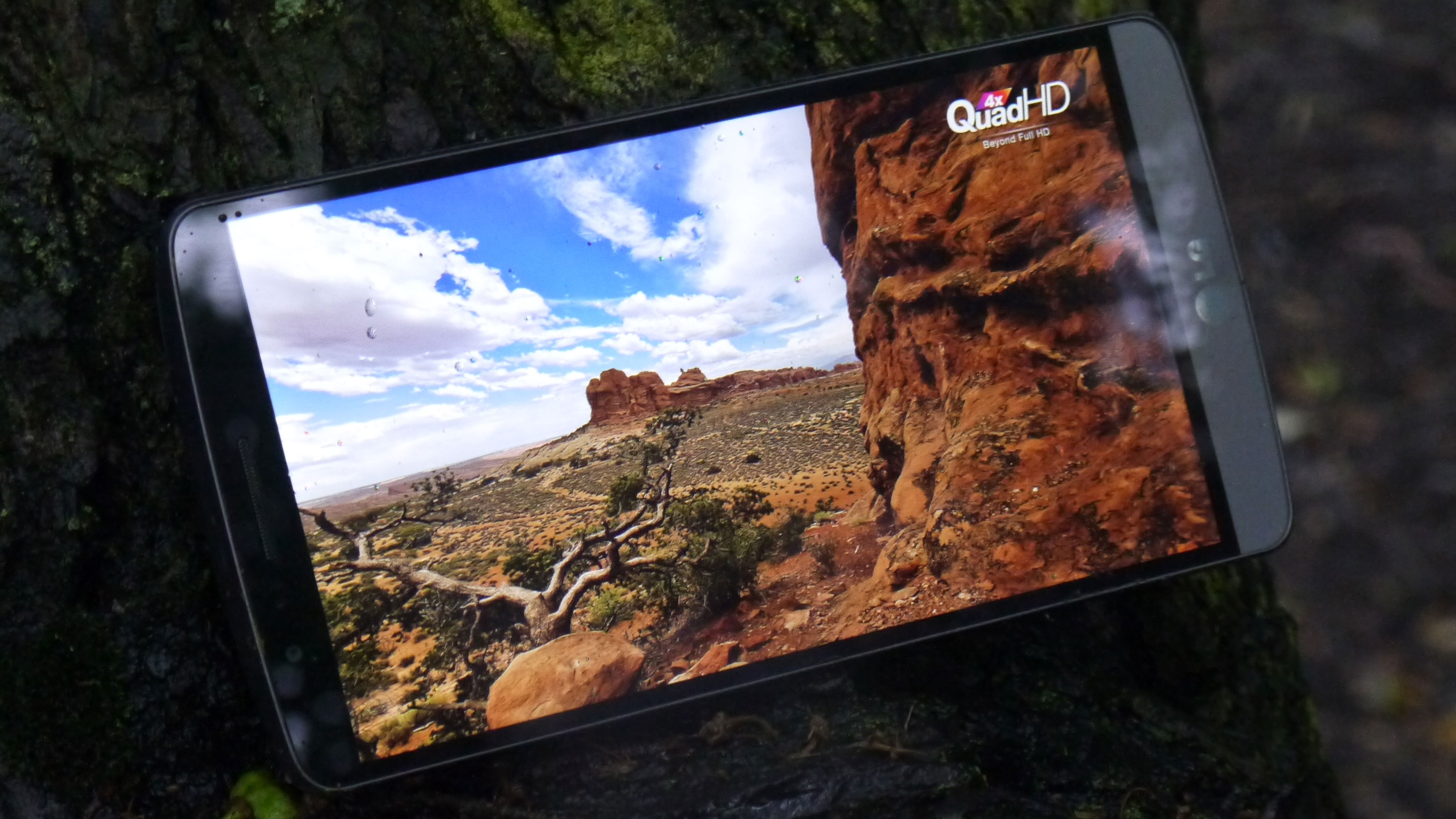
The most prominent feature of the LG is the QHD screen. Where the HTC One M9 packs in two million pixels, the G3 has 3.6 million. It's a lot sharper, sure, but it's not mindblowing.
The big question here with the screen is: why do it? LG's official line is that its research showed Steve Jobs was wrong. While it agrees with Jobs that there is a limit to what the human eye can see in terms of sharpness, LG reckons that the Retina display isn't the top end. That's obvious anyway: the display on the Samsung Galaxy S5 or HTC One M8 is significantly sharper than that on the iPhone 5S or iPhone 6, so there is more headroom.
But apparently there's another level still to attack, and that's just what it's done with the QHD screen. Where the Samsung Galaxy S5 (arguably the LG G3's biggest contemporary) offers 440ppi sharpness, the G3 has 538ppi – equivalent to high-end glossy art books, which LG used as the benchmark of sharpness.

While you might question the need for such a sharp display, it's worth mentioning that other major Android manufacturers have since adopted this QHD standard. The Nexus 6 and the Samsung Galaxy S6 straddle the LG G3 in terms of screen size, but both have since gone for the same pixel-dense resolution.
Now, here's the quandary: the LG G3's screen is brilliant, no question. Internet browsing, looking at pictures, watching high-end video all awesome. But that's the exact same feeling I had with the G2, which also had a simply stunning screen.
It feels like the QHD screen is great to look at because LG knows how to make an amazing display, rather than offering a next level of sharpness that blows me away. I didn't feel that I was looking at something superior to the G2 in terms of screen quality, and with the larger heft and hit on battery life, I believe LG has gone too early with the technology just to make an impact.
Or possibly it's not even early. Perhaps we just don't need QHD screens in our phones. Yes, the Samsung Galaxy S6's screen is arguably the best around, but that's got little if anything to do with its QHD resolution and everything to do with things like vibrancy, clarity, and colour accuracy.
The LG G3's display isn't without problems either: tilt it left or right and the brightness drops off sharply, which makes sense when you consider how many pixels are packed in there.
It's perhaps unfair to criticise the QHD screen on the G3. While not all new high-end smartphones are using this technology in 2015, as we once thought they would, it still appears to be where screen technology is heading - and LG got there first.
But as a headline spec, it doesn't seem to add a huge amount to the G3, which is a shame as I was hoping to be looking at the next generation of picture quality on a phone.
New interface
When it came to listing the criticisms of the LG G2, the biggest problem was the interface. It was so cluttered that if you had the remote activated and received a message you had to scroll down to see it.
Compare that to the HTC One M9, and you've got nothing but the missive to check. On top of that, the G2 went for a really garish and cartoony look too, meaning it was hard to evangelise about a phone that was otherwise brilliant.

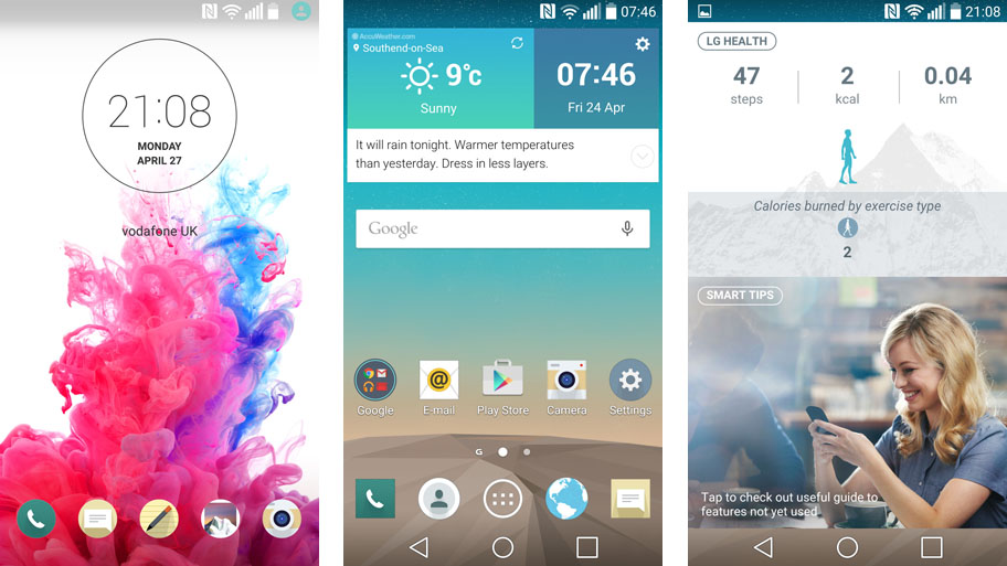
The new interface on the LG G3 is a big improvement. Gone is the skeuomorphism in favour of a new flat tile look. The icons are redesigned. The different applications have their own colour scheme for easy recognition and the colour palette is more muted than before.
It's a much more fluid system that shows LG has grown up, taking the problems of before and making it into a more intuitive way of navigating through the handset.
LG has definitely taken touches from HTC, Samsung and Apple with the new interface. The home screen features a separate section for the pedometer and tips videos (where Samsung's pointless magazine option is on the Galaxy S6), the colours are very similar to some of HTC's work, and the flatter design owes more than a tip of the hat to Apple.
The interface is still a little cluttered, even with the Android 5.0 Lollipop update (which I'll discuss a little later), but overall it's a tick for LG updating something that sorely needed a new look.
Metallic shell
As mentioned the other big problem with the G2 was the fact it had a really glossy plastic shell. The phone was well packaged, but still didn't offer the same premium quality as the HTC One M7, iPhone or Sony Xperia Z1 at the time.
So with the LG G3, the South Korean brand has gone for the best of both worlds. It's created a 'metallic skin' that supposedly looks and feels premium, but offers the lower weight and added connectivity benefits of polycarbonate.
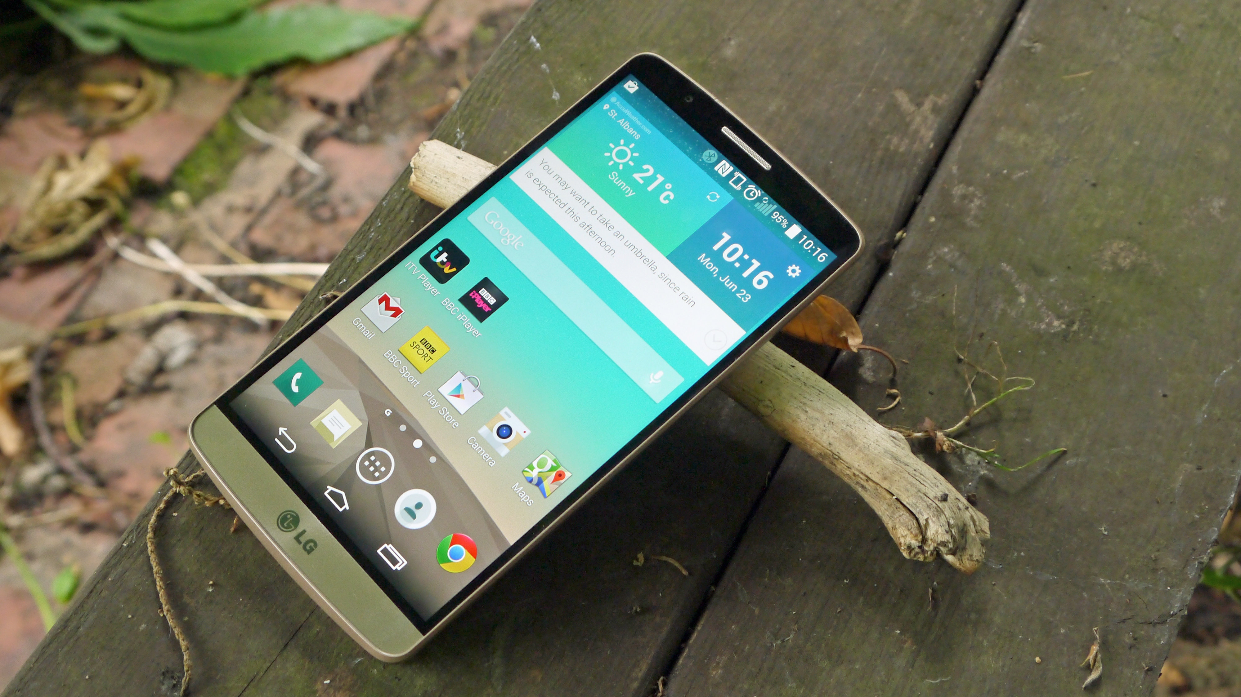
The problem is, LG hasn't really managed this lofty goal. The G3 certainly looks the business, bringing a more iconic look of brushed metal and some cool colours (black, silver and gold) to make it stand out on the shelves, which makes sense given it's mostly screen otherwise.
But the second you pick it up, the plastic nature jars with the look of the phone, which is a disappointment. It actually feels cheaper than the G2 thanks to using a removable back, which lowers the tightness of the packaging and makes it feel more hollow.
The upside of this is you've got a removable battery and microSD slot, both of which are a big win for a certain section of the customer base. That said, there are better ways of doing this, as you can easily have a slot for a microSD card without needing to remove the back.
And I know a few people disagree, but a unibody phone feels better in the hand and a portable battery pack is much more useful than being able to swap in a new battery – it's easier to charge, for one, and 98% of users will never swap the battery in and out anyway, so why bother when an integrated unit can offer more capacity and better design?
So again, LG has stepped forward with the G3 – but it's still not quite got all the pieces together when it comes to design.
Health chops
The LG G3 doesn't have the heart rate monitor that the Samsung Galaxy S5 packs, which means some will see it as less of a phone for being able to keep you on track.
That's not true though, as it features a fairly in depth stride sensor and some other elements to help you maintain a healthy lifestyle.
And now that Android 5 Lollipop is here (for most people at least), the LG G Watch R and new LG Watch Urbane are able to automatically take your heart rate at intervals throughout the day (as well as being able to unlock your phone through proximity to the smartwatch) which should give you a fuller picture of what's happening to you health-wise.
Simple camera with laser autofocus
The 13MP camera on the LG G3 is also another big talking point, both in terms of the new look to the interface and the additional technology on board.
I'll start with the latter point: the laser auto focus, which is designed to make it the fastest-focusing smartphone on the market. It seems to be true at times, but I'm not sure shaving another 100 milliseconds off makes that much of a difference when boot-up speed is more important.
It's possibly a bit unfair to say that the extra speed isn't warranted – if the system worked perfectly, chances are you'd take 10-20 more high quality pictures that capture the moment compared to the competition, but without being able to fully test the system it's hard to comment.
The laser works by sending out a conical infra-red signal (using technology nabbed from a robo-vacuum cleaner developed by LG's home appliances division) and absorbs information from the surroundings to create an instant and clear picture for the camera to use.
This means it doesn't have to look for contrast shifts like before, and offers a sharper image.
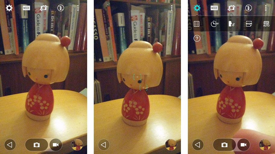
The interface is really scaled back too: it's nothing more than a back button, a menu icon and the viewfinder. Tap the screen and it focuses and takes the picture. It's designed to be simple and effective.

It also doesn't let you focus to check the shot composition before taking the photo, which would be nice – but then again, tap that menu icon and you get all you need in terms of shutter, options and video recording.
The G3 is all about simplification, and this kind of technology really works. It's a little too scaled back for the camera, but it's the right idea.
The front 2.1MP camera is now cringingly called the "selfie" camera. The lens is a wider angle, so you can get more friends into the photo (or more actors at the Oscars) and features gesture recognition to take the photo.
Hold your hand out, make a fist and it'll start the G3 self-portrait timer. It's a clever system and it works, which is great for those moments when you can't use both hands and don't want to tap the screen.
Another cool feature is the ability to have a front-facing flash, although it's not an LED light. Instead, part of the screen goes white, which illuminates faces and takes better pictures. LG has even white balanced this screen to correct skin tone imperfections – and it really gives some nice front facing snaps.
