Why you can trust TechRadar
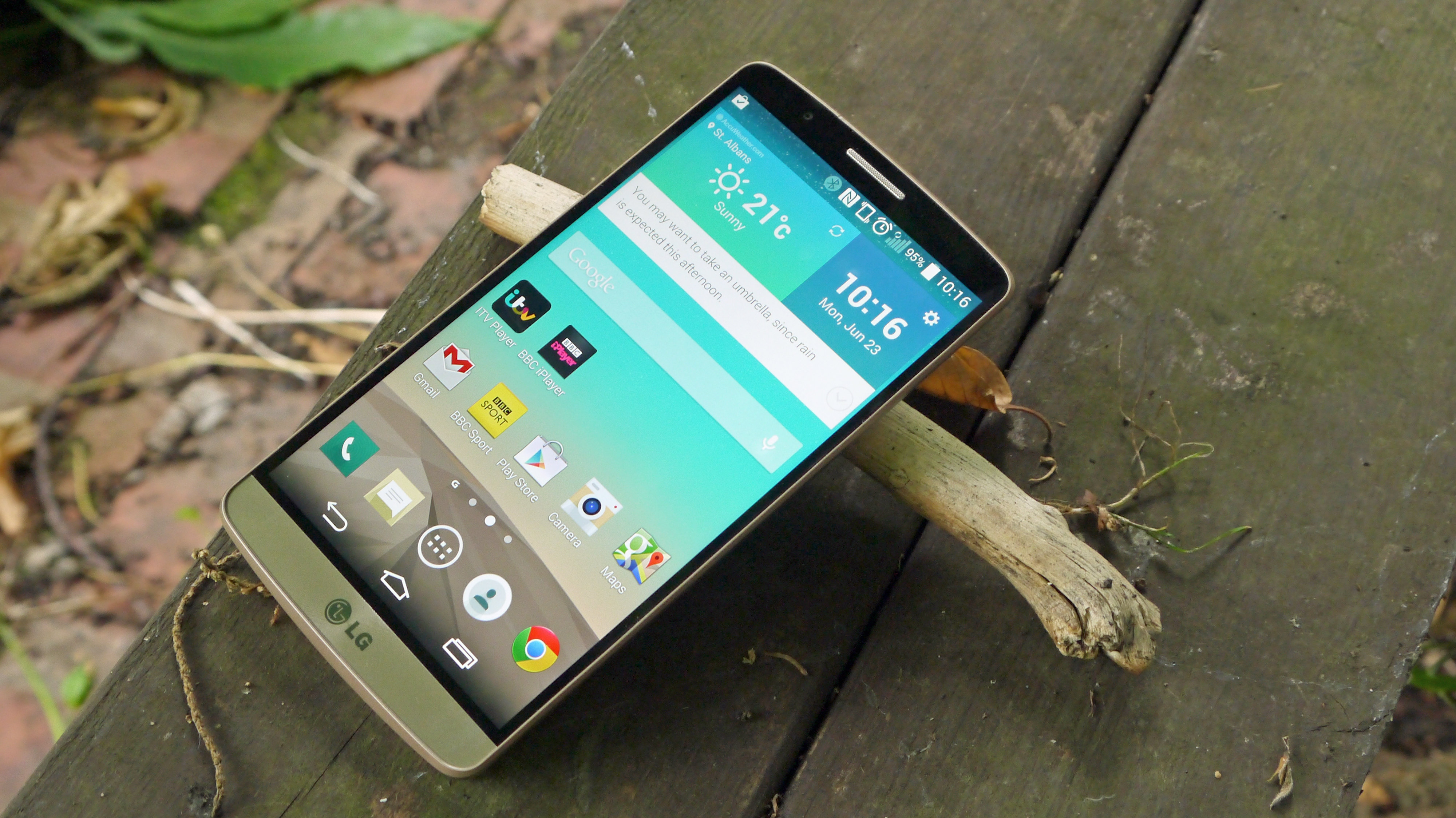
LG's theme for the G3 is "smart is the new simple" and one of the key factors in this is the new interface it put together for the new handset.
One of my big criticisms of the LG G2 was that the interface was simply awful: cartoon-like, hard to understand, cluttered and simply not up to the standard the HTC One M8 and friends offer.
So it's great to see that the brand has gone back to the drawing board and made something that's more fitting with a top-end handset. The garish colours are replaced with more muted and mature hues, meaning out goes the bright yellow and purple to be replaced with softer greens and autumnal burnt reds.
Each core app, such as contacts and messaging, has its own colour to help you discern where you are in the phone – if that was a confusing problem for you – and the notifications bar has been stripped right back to simply pack a row of quick settings and the stuff you want to know about.
By default you do have a brightness bar and the option to control volumes (which is useful when you're using the phone in landscape) but these can be toggled on or off, depending on your preference, which allows for a very clean notifications zone.
If you think of it as somewhere between Samsung's new TouchWiz and native Android 5.0, you'll be pretty close. It's not as close to standard Android as some would have you believe, as the notifications area and menu systems are different, but the ethos is there and it's very similar.
The interface is visually a triumph for LG, a new look that brings a freshness that sends a statement that the South Korean brand is finally looking to make the step up to top-tier manufacturer.
To that end, there have been a couple of extra features added in to help with day to day living – these include helpful video tips that alter throughout the lifetime of the phone (so start-up tips in the first few weeks, app tutorials for the programs you're not using a bit later on, and then information about new LG products as the G3 nears the end of life).
The idea is clever, but not one you'll use that often. The same can be said of Smart Notice, a constant label that hangs beneath the weather widget on the home screen.
This is meant to be the companion in your phone, allowing you to see the truth behind the weather by prompting you when you'll need an umbrella or offering to save a contact that you call multiple times but isn't in your phone book.
The thing is more often it tells you when there's a new video to watch, or adding helpfully that when it's foggy outside 'it's very foggy'. The idea is cool, but it's more annoying than helpful.

In terms of improvements brought about by the recent Android 5.0 Lollipop update, it's perhaps not as extensive an overhaul as I would have liked.
The home screen look and layout is pretty much identical, as is the app tray and the app icons themselves. Indeed, the only thing on these home screens that betrays the fact that Google's new OS is beating at its heart is the new software keys.
The back, home, and multitasking keys are now represented by the triangle, circle, and square symbols found in stock Lollipop.
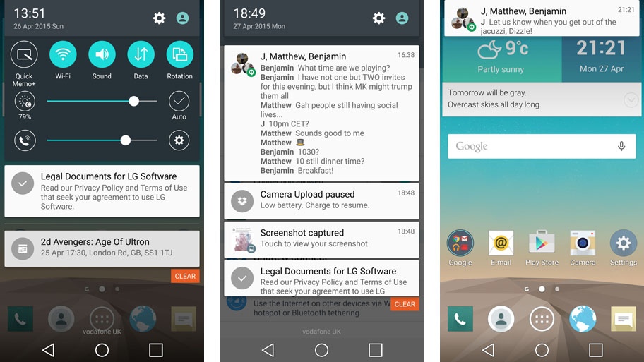
Slightly more noticeable is the change in look of the drop-down notification menu. In terms of function and layout it's identical to before, but it now has more of a solid, physical feel in keeping with Google's Material Design language. The notifications, too, will look familiar to anyone who's used a Nexus device.
That change carries through to the lock screen notifications, although they don't have the same tactile springiness as on stock Android Lollipop, which is a shame.
We're disappointed in the lack of improvement to the look of LG's custom UI, then, but Lollipop appears to have done wonders for the feel of the LG G3. Whereas in Android 4.4 I experienced lag and numerous stutters simply flicking through the G3's home screens, now everything moves with a real snap. It's much more fluid simply moving through the home screens and app menus.
So, onto the performance of the LG G3; as you can guess with the Snapdragon 801 CPU on board and up to 3GB of RAM (if you buy the 32GB iteration of the phone) this handset performs well on standard benchmarks.
While the interface performance is better than it was, however, general performance doesn't compare well with other handsets. Dig deeper and there's a definite lag under the finger that's simply not present when using the HTC One M9 or iPhone 6, and it's quickly noticeable.
In side-by-side tests, opening and closing apps was markedly slower on the LG G3, and while we're talking nanosecond differences it does all add up. I definitely felt the G3 wasn't as slick as other handsets on trial, and the problem didn't resolve itself between getting the European version of the software and the pre-production Korean handset.
This hasn't improved with the introduction of Android 5.0. I had the opportunity to use two cleanly installed LG G3 handsets side by side, one with Android 4.4 and one running Android 5.0, and apps tended to take a fraction longer to boots up on the model with the newer OS.
It's not deal-breaking, but I'm confused as to why a firm that prides itself so much on engineering would let something like this slip through.

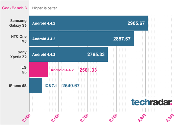
The benchmark GeekBench 3 results could give a clue as to why - the LG G3 doesn't perform as well as the rest of the competition, which could be partly down to the extra pixels needing to be driven. It's surprising, given LG usually bosses these tests, but GeekBench is designed to replicate real life use as much as possible, and the results tally with the way I found using the phone.
To give a more specific example, the average multicore score I got with the LG G3 was 2,307, which compares badly with the Samsung Galaxy S5 and its score of 2909. We'll say it again: there's a hefty price to be paid for a QHD resolution, and last year's best processor can't quite cover the bill.
Knock On/Knock Code
LG's proprietary way of unlocking the phone is back for a second round – and it's as good as it was before.
The notion is simple: you tap the screen twice when turned off to unlock the phone (if you've not got lockscreen security set up) and can then tap the notification bar twice in quick succession, or any empty area on the home screen, to shut it down again.
It worked really well on the LG G2 to the point where, as with the rear buttons, I often tried the same trick on other handsets. Others have since attempted something similar, as with the Sony Xperia Z3 or the HTC One M9, and of course Nokia invented the technique in the first place.
But none do it as well as LG, and it's a real boon.

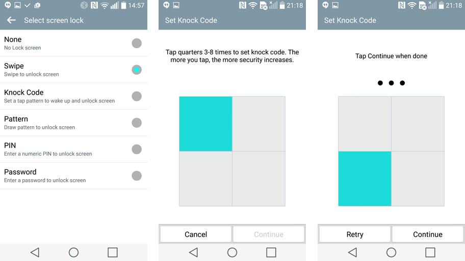
The brand arguably reached a little too far by adding in Knock Code. It's a clever system where you can simply tap the right quadrants of the screen with the screen turned off and it works the same as an unlock code or pattern.
It used to be that this didn't register 80% of the time, but LG has improved it dramatically since launch. Now, even if you've just touched the screen repeatedly in the process of getting the phone out of your pocket, the Knock code will register.
The things is, tapping the display twice to wake it and entering the pattern is pretty much as simple, and arguably still more reliable. Still, we're not going to complain too much about having the option here, and when it works Knock Code is second only to the iPhone's TouchID as a simple way to open the phone.
