Why you can trust TechRadar
In the UK, the LG G4 is now running Android 6 Marshmallow software, although there's a worrying silence over whether this phone will get an Android 7 Nougat update - however, if it were to happen, early 2017 would be the best guess for when the update would be coming.
Back in 2014, with the G3, LG brought out a more mature, flat and altogether less cartoonish interface than seen in previous mental splatterings for its user experience.
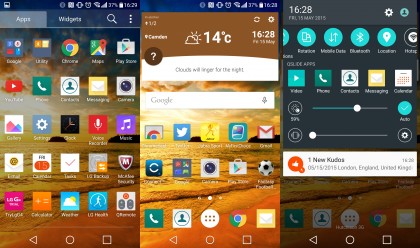
That option has been refined well again in the LG G4 - it's pretty colourful (in a pastel sort of way) but looks refined and takes Google's Material design language to present cleaner icons.

The notification bar in particular is cleaned up, with fewer things showing there when you're pulling the shade down to see what's happening in your world. Where before there were a million sliders and icons on here, there are fewer now so it's more usable.
Q Slide apps are still on there, and I still can't really find a reason to use them. In theory, the idea of being able to float a calculator or contacts list over the top of the screen, resizing as you go and reducing the opacity to see what's behind seems like a good idea.
It means I could be browsing something on the internet, suddenly need a calculator, and then not have to drop out of the app just to do my slick sums.

But even at 5.5-inches, there's not enough space for this. Every time I end up just opening the app full screen and then flicking between the two... I feel things like Q Slide just get in the way of what's good about the phone.
Actually, it's not super easy to flick between apps, as pressing the 'all running apps' button (a lovely minimalist square on the bottom set of navigation icons) takes a second to open, which is infuriating when this phone is supposed to have a powerful processor at the heart.
It's not as fast as I'd hoped either. The camera takes a couple of seconds to load from sleep (at least) and the homescreen rebuilds when you've used a couple of apps quickly, with the wallpaper, icons and widgets all disappearing to be flashed back up again - although now we're at retail software this is rare, and occurs less often than Samsung.
In practice, it's slightly slower at opening and shutting apps than the Galaxy S6 or iPhone 6, but ahead of the clunky HTC One M9 or Sony Xperia Z3.
Like the design, this is unbecoming of a phone that's supposed to be absolutely cutting edge.
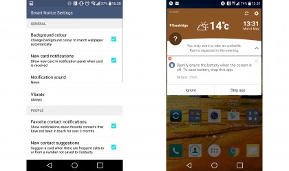
Smart Notice was the big news from LG last year, with the phone able to tell you important things when you needed to know them, clue you in on the weather and generally be your fun-time buddy on the go.
It was rubbish.
Highlights included: 'FRIEND had a birthday today' and 'The shipping forecast for New York is...' - not exactly the cutting edge information we've all been waiting to hear.

This year things are a lot better though. While there were a friend / birthday incidents again, in just a few days there were many more instances where I got a lot of useful hints, with questions about adding frequent callers to my contacts and genuine insight into the weather, telling me it would be windy later that day and a coat would make a lot sense.
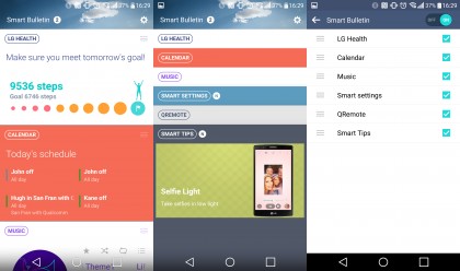
The left homescreen, where HTC houses Blinkfeed and Samsung its weird Flipboard info, is no longer just the pointless 'tutorial videos' that we saw last year. It's now myriad widgets for things like LG Health, a music player and updates to your calendar. It looks nice enough, but it's pretty useless unless you're using your phone to track your health.
I wouldn't recommend it though - you won't get accurate step data, and you'll need to keep adding bits and pieces to the app to work out how healthy you're being.
The rest of the widgets are fine, but I didn't find anything was particularly useful - the calendar and music widgets both appear contextually in the notification panel, and are more useful there.
It would be great if I could have things like a Spotify widget in there - or other options I want - but apart from Smart Settings (which open apps or start certain actions when you enter a certain zone or connect something to the phone) I barely used this panel at all.
Overall, I'd say LG has once again taken a massive step towards being seen as a relevant choice to being your next smartphone by making the user interface more mature and useful - like all brands, it's thrown in some 'differentiators' to help market the phone but you can turn off most of these, as they can obscure the good bits of the phone.

Gareth has been part of the consumer technology world in a career spanning three decades. He started life as a staff writer on the fledgling TechRadar, and has grew with the site (primarily as phones, tablets and wearables editor) until becoming Global Editor in Chief in 2018. Gareth has written over 4,000 articles for TechRadar, has contributed expert insight to a number of other publications, chaired panels on zeitgeist technologies, presented at the Gadget Show Live as well as representing the brand on TV and radio for multiple channels including Sky, BBC, ITV and Al-Jazeera. Passionate about fitness, he can bore anyone rigid about stress management, sleep tracking, heart rate variance as well as bemoaning something about the latest iPhone, Galaxy or OLED TV.
