Why you can trust TechRadar
If you've read other reviews of Windows Phone 7 handsets such as the HTC HD7, HTC 7 Mozart and Samsung Omnia 7, or our already mentioned review of our Windows Phone 7 itself, you'll be familiar with how the operating system stacks up.
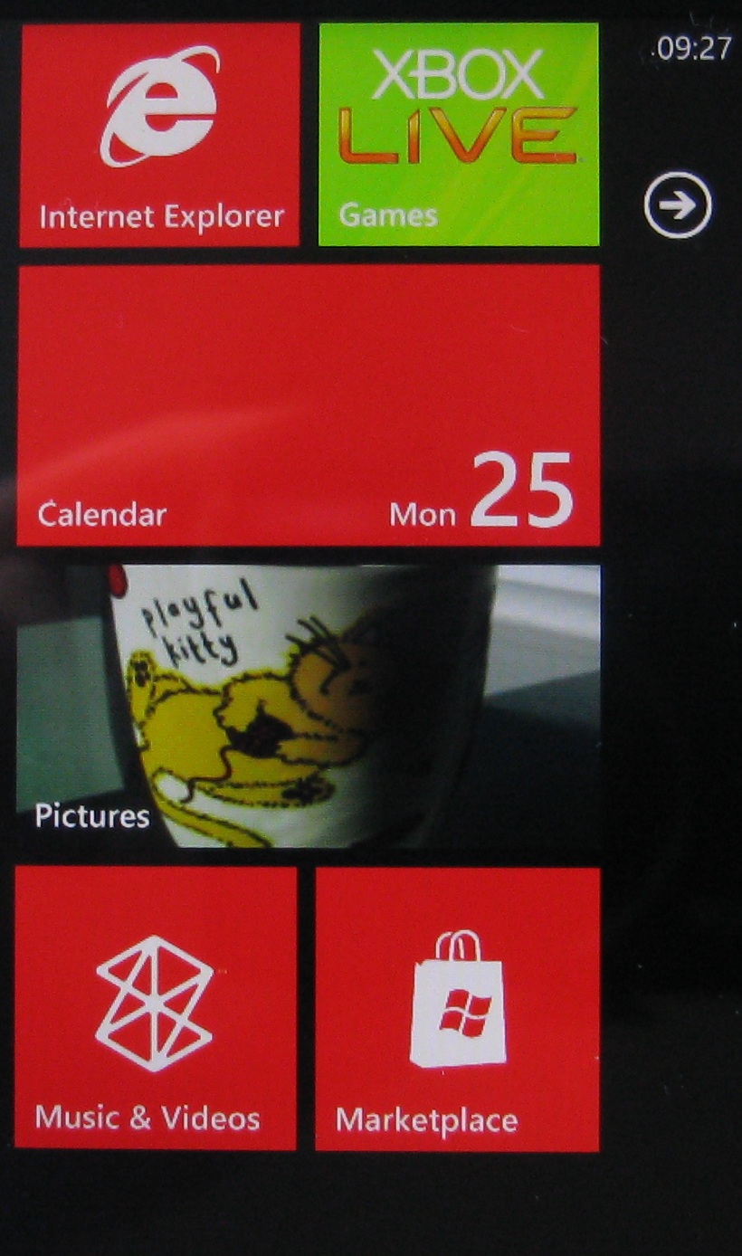
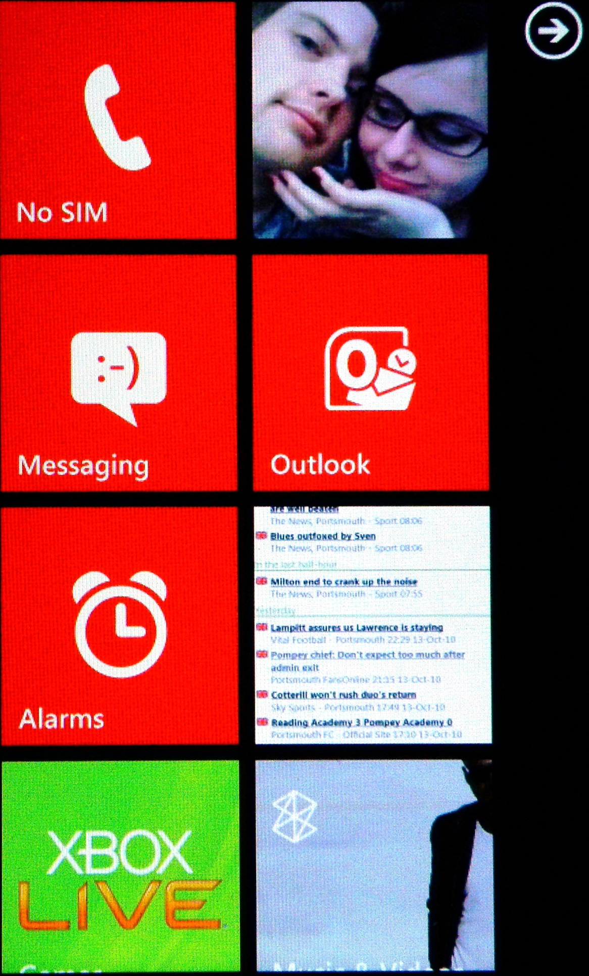
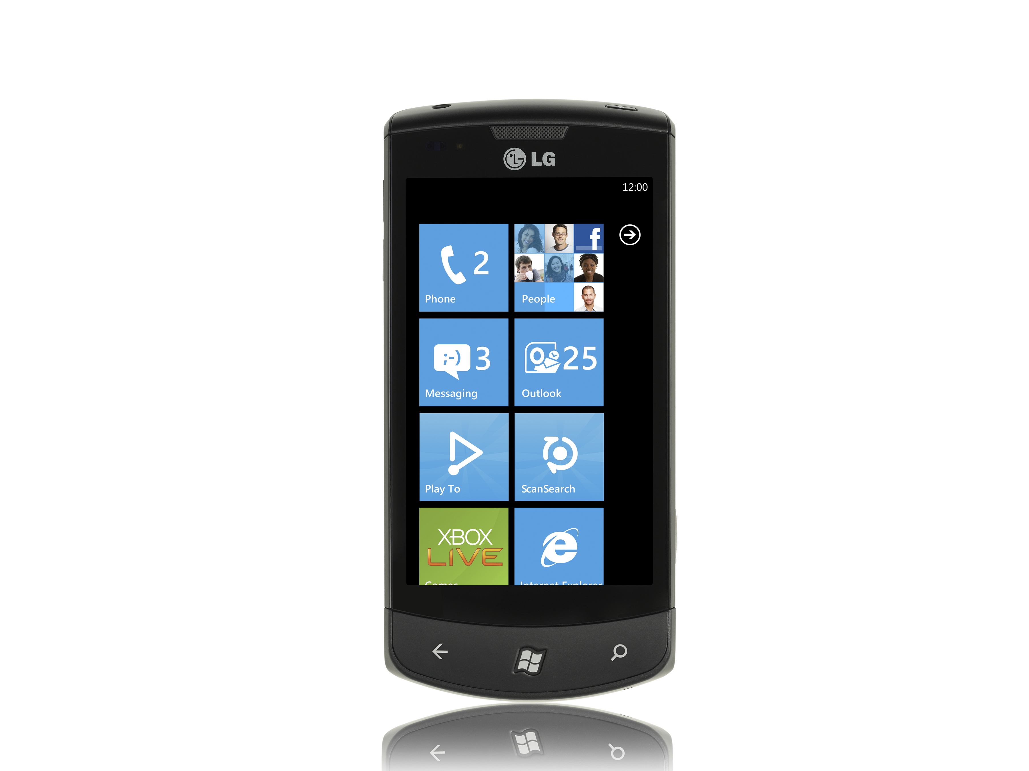
There is but a single Home screen, and it contains shortcuts to apps, data and groups of information via 'tiles'. Most of these are square, some are double width, and there is apparently no limit to the number you can have on the Home screen. You scroll vertically to get to them all. You can move them around so that your most used bits and pieces are at the top.

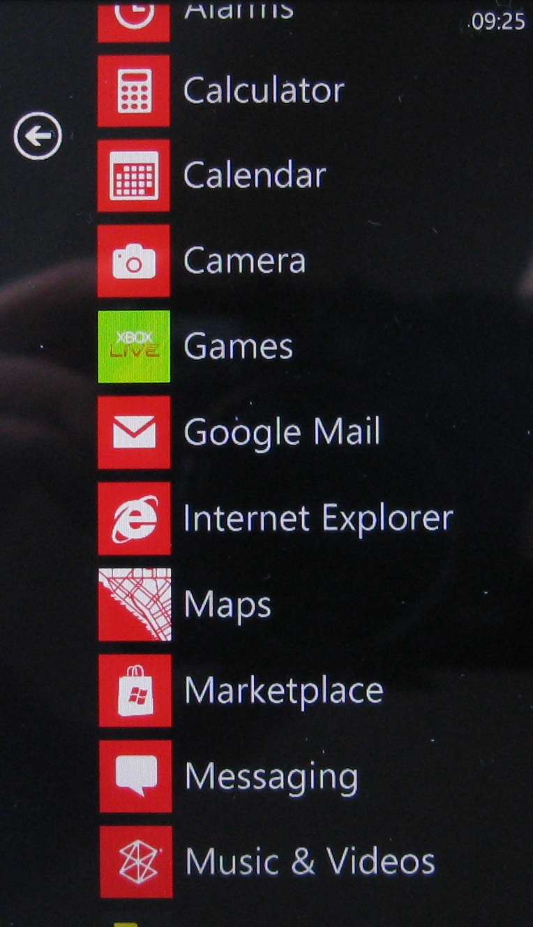
We've so far found this works okay but not brilliantly. We don't like scrolling too far down to get to an app or bit of data we like, and are just as happy to do a quick horizontal scroll to get to the complete apps list.

But if you're the kind of person who doesn't have a huge amount on the go at once, we can see that the system could work well for you. Either way there's no doubting that the large, easy to hit icons are a boon.

Current page: LG Optimus 7: Interface
Prev Page LG Optimus 7: Overview, design and feel Next Page LG Optimus 7: Contacts