Why you can trust TechRadar
As with calling, messaging and email are delivered without surprise, even though these apps have been redesigned from Google's spec by the LG team.
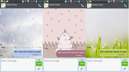
The Messaging app benefits from having a number of user-selected skins that can change the look and feel of the app entirely. Some are fun, others are more business-like, catering to a range of tastes and purposes.

One annoyance with LG's design is that it has removed the 'back' button from within the message window, so that when you finish reading and replying to a message there is no way to return to the inbox. You can press the 'Back' on the handset's virtual navigation keys, but this will exit the app if you enter the app straight into a message, ie: from the notification panel.
The Email app has a similar problem, but we did find a "back to inbox" option hidden away in the menu.
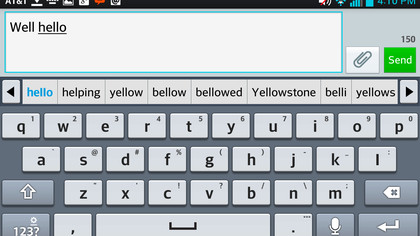
LG includes its own keyboard design into the mix, too, replacing the default Android layout and side-stepping a third-party option like Swype. This keyboard is pretty easy to use, and has its own continous letter tracing input option (like Swype) but it is far less accurate and has a few annoying quirks too.

In particular, we dislike how when you press on an auto-correct error you aren't given the choices that were there when typing the word. Most other Android keyboards do this, but with the LG keyboard you have to manually delete the word and start again.
