Why you can trust TechRadar
The LG Optimus G will be getting an upgrade to Android 4.1: Jelly Bean in December, LG has announced. Out of the box, however, it's running Android 4.0: Ice Cream Sandwich. There's also LG's own Optimus 3.0 custom user interface, which adds a handful of cute visual tweaks and customization options some user.
Ice Cream Sandwich
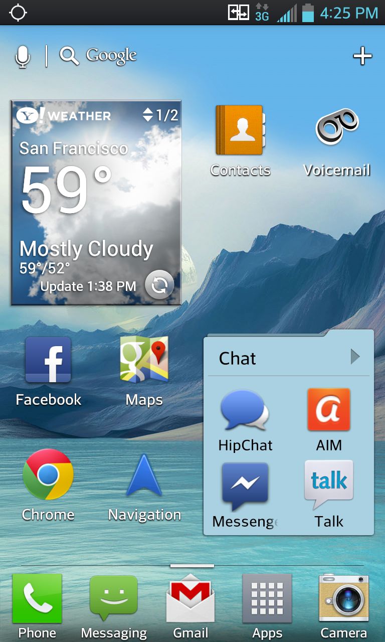
We're excited to see what the Optimus G's hardware can do with Jelly Bean, and it's nice to hear that the update will be here soon. We do wish it had been installed in this new flagship from the get-go, but if devices from Google-owned Motorola, the Droid Razr M and Droid Razr HD, can't even ship with it, we suppose it's to be expected.
Still, the Optimus G's hefty hardware runs Ice Cream Sandwich very well. You can whip across those seven home screens as fast as your thumb will allow with nary a stutter, even if you really load up on widgets. We surely have that quad-core processor and the excessive 2GB of RAM to thank for that.
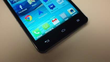
The Optimus G's has three Android buttons: back, home and menu. They are capacitive, aka non-physical, with haptic feedback, and quickly go dim when not in use (this can be adjusted). A long press on the home button brings up a scrolling recent apps menu, and holding menu triggers a Google search.
Three buttons is an interesting choice by LG. While we agree that there's no need for a search button, since there's a Google bar on at the top of every home screen, we would have liked a dedicated recent apps button.
From the lock screen you can jump directly into Phone, Messaging, Email or Camera, by default. Of course, these four icons be altered from the settings menu . We swapped in Chrome, our personal browser of choice. From this menu you can also change the type of clock and calendar that are shown when the phone is locked. Calendar alerts can also be displayed on the lock screen, as are incoming text message and email alerts.
LG's Optimus 3.0 UI
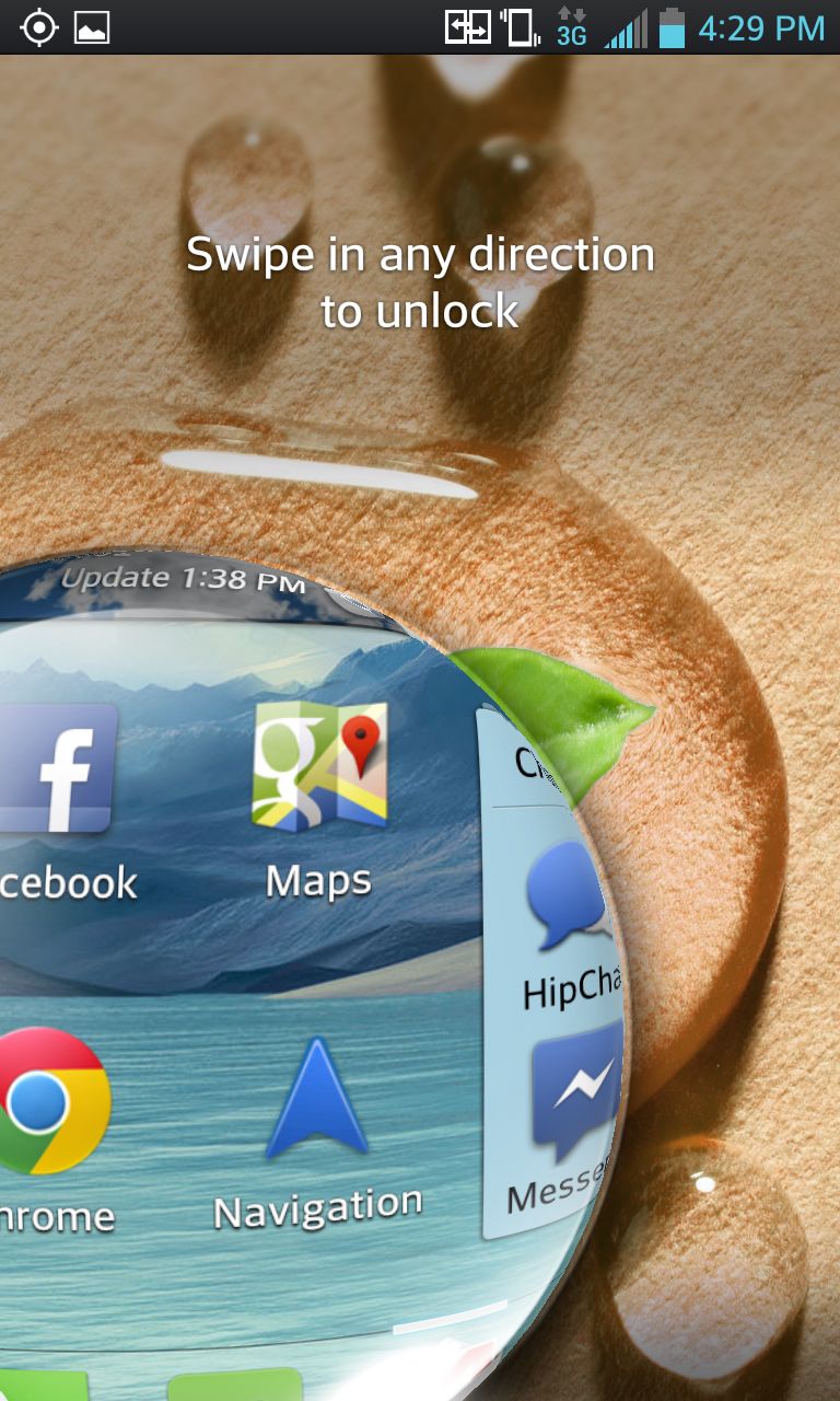
The Optimus G isn't a vanilla Ice Cream Sandwich device. There's also LG's Optimus 3.0 UI, and you'll notice its visual flair from the moment you unlock the phone. Swipe your finger to unlock reveals the screen below like growing drop of water. It's a neat touch we appreciated.
Locking the phone is a reverse of this effect. It's a sort of "iris out," like at the end of a silent movie. The screen goes black from the edges, quickly forming and then closing up a circle in the center of the screen. It happens in the blink of an eye, and it's another nice effect.
Optimus 3.0 adds its own touch to home screen transitions. Skipping from one home screen to the next, widgets and icons get smaller as they move away, and bigger as they move toward the center of the screen. Whipping across home screens creates a "spring" effect as icons bound into place.
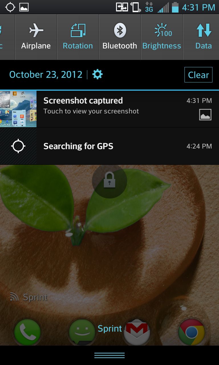
The pull-down notification center displays your unread emails, updates and social media functions. It also has icons called Quick Settings that allow you to toggle Bluetooth, WiFi, Airplane Mode, NFC and more with ease. You can edit which icons appear here, as well as their order. The Sprint version allows you to toggle Mobile Hotspot mode from this menu, while the AT&T version does not.
The icons for LG's pre-loaded apps and utilities can be customized. You can choose from a couple dozen pre-loaded icons, or make a custom icon from a photo you snapped or a picture in the gallery.
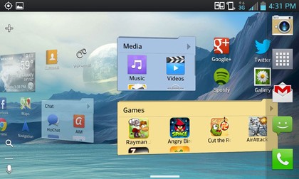
Certain apps can also be transformed into widgets, and vice versa, by adjusting their size. For example, expanding the Chrome app into a widget will show shortcuts to bookmarked websites of your choose. Expanding it further increases the number of shortcuts displayed. It's a great option power users will eat up.
Optimus 3.0 takes ICS's native support for folders and adds to it. Folders labels and colors can be changed, and the size of a folder can be be expanded so you can jump into the apps inside without opening said folder.
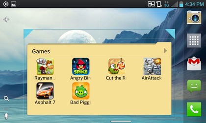
Thanks to the combo of ICS and LG's own UI, the Optimus G has a ton of customization options that we enjoyed. A lot of them, such as expanding folders and changing app icons are not terribly intuitive. The average user may only stumble across them after a few weeks of use. Still, they're great options, but easy to overlook if they're not the kind of thing you want to fool with.
