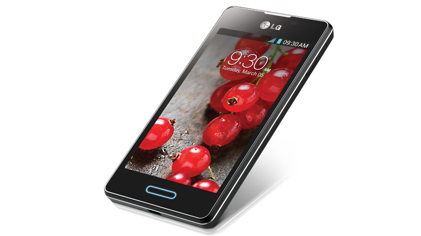
Why you can trust TechRadar
In just about every review of an Android device, we have to mention that nearly every OEM is now putting some level of overlay to the Android software. Unfortunately, we don't have a name for the UI on the Optimus L5 2.
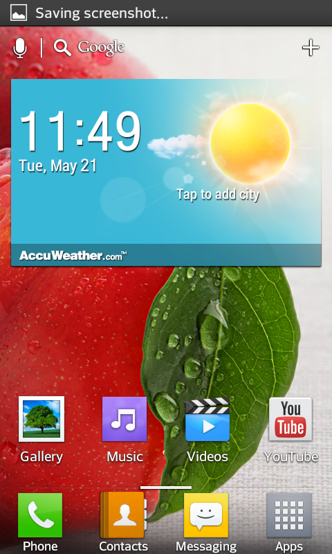
What LG has done to Jelly Bean on the L5 2, on the whole, is relatively basic and not too dissimilar to a lot of other UI's we have seen. It's clean, simple and very pleasant to use.
Starting at the lockscreen there are four apps at the bottom that can be quick launched. We like this approach, especially as it makes loading the camera quicker - or so we thought.
It turned out that the 1GHz single-core processor took a few seconds to load the app, which was a little disheartening. Opening the lock screen is done by placing your finger on the screen, and swiping outwards, slowly making the homescreen appear.
LG has only seen fit to provide five home screens, with widget happy users probably finding that this is a little inhibiting. Chuck in the Google Now, Clock and Gmail widgets, and the home screen space suddenly starts to feel a little restricted.
This isn't helped by the persistent Google search bar at the top of the page which makes everything seem a tad cramped.
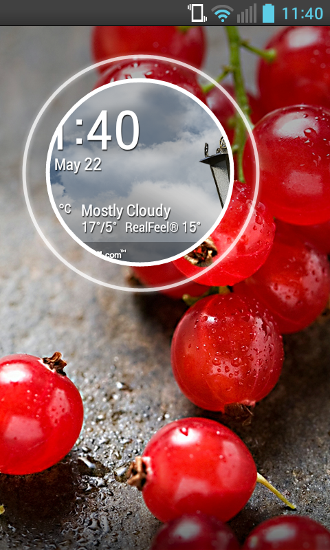
Maybe the lack of home screen space is to the Optimus L5 2's advantage, as we found that the processor didn't cope as well as we had hoped, swiping between home screens was by no means lightning fast and adding data intensive widgets to the mix will certainly not help the situation.
Widgets are accessed via the app drawer, having their own dedicated tab. They can also be accessed via long pressing a space on any homescreen. Some widgets are resizable, so you can make them bigger or smaller, but there is no clear indication as to which ones have this ability.
The main stay of any widget array, is the clock/weather widget. We've seen LG's clock/weather widget elsewhere, on other OEM's devices, but as we have commented before, it is a smart looking and functional clock.
One neat feature, and one of the highlights of what we thought was a generally poor UI from Huawei, is the ability to change themes on the LG Optimus L5 2. As we said in our Ascend G510 review, "changing the icons as well as the wallpaper, almost gave the phone a new feel".
We know it's only a small touch, but it is the small touches as well as the larger innovations that make the UI feel intuitive.
Things like being able to create folders by dragging one icon onto another as in iOS, for instance, or the ability to long press an icon in order to change its look all add to this.
We were a little disappointed to find that there was no infinite scroll, but we did manage to find a toggle for that whilst digging through the settings.
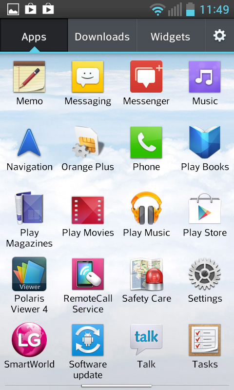
The app drawer was easy to use, nothing really more than just the stock Android offering. The downloads tab did make it easier to filter out the preinstalled rubbish, although we were pleased to say that it was possible to uninstall at least some of the bloatware.
We were impressed that we were able to rearrange the icons according to taste, our preference being alphabetical. That soon faded, however, as after we downloaded more apps, we found that they had just added themselves to the end of the list, rather than being automatically sorted.
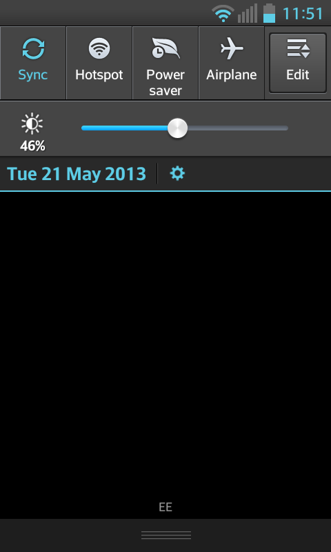
Like many other OEMs, LG has graced the Optimus L5 2 with some quick settings in the notifications bar. This is a feature that has become prevalent in modern UI's, HTC Sense, Samsung's TouchWiz and Huawei's Emotion UI are all equipped with them.
All manner of settings, such as Wi-Fi, Bluetooth, GPS, NFC and Portable hotspot can be switched on and off from the notifications bar.
Interestingly though, there is no brightness button. Instead, LG has decided to equip its UI with a brightness slider, like we saw on the Samsung Galaxy S3 Mini. Given all the power settings, we found this disappointing.
Android's Jelly Bean experience, swipable and expanding notifications, is also present making it easy to dismiss the spam emails, or a Facebook message that you "don't want" when you're at work. The multi-tasking pane, accessed by long pressing the home button, is also present.
It is clear that LG has given its UI a decent level of thought, with the Optimus L5 2 feeling generally intuitive throughout.
There are a few niggles, such as the auto brightness, however we found that the biggest problem was the lack of processing grunt, meaning that loading the camera took a few seconds, and swiping between the screens sometimes seems a bit laboured.
