TechRadar Verdict
Pros
- +
Blazing speed on 4G
- +
Updated design
- +
Larger screen with higher resolution
- +
Quick Settings and QuickMemo are handy tools
Cons
- -
Slower processor
- -
Camera isn't as good as previous version
- -
Tons of bloatware
- -
No date on Jelly Bean update
Why you can trust TechRadar
LG likes to keep smartphone customers on their toes as much as possible by releasing different versions of the same phone in different markets, which can cause some confusion. Some versions of the Optimus L9 have NFC, an 8MP camera, and a 4.7-inch screen, while others are NFC-less, with only a 5MP camera, and a 4.5-inch screen. Although any of those models are a marked improvement over theOptimus L7 with its 4.3-inch screen with a 480 x 800 resolution, which the Optimus L9 is meant to replace.
The good news is that this phone feels more like a mid-range smartphone, which is nice since the L7 felt like the bottom-range phone it was meant to be. The L9 sports a slightly larger screen than the L7, but clocks in with a 540 x 960 resolution. On paper, that's not a huge jump, but your eyes can definitely tell the difference. Both phones sport a 1GHz dual-core processor and run Android 4.0: Ice Cream Sandwich, which LG has promised will be upgraded to Jelly Bean sometime in the first half of 2013.
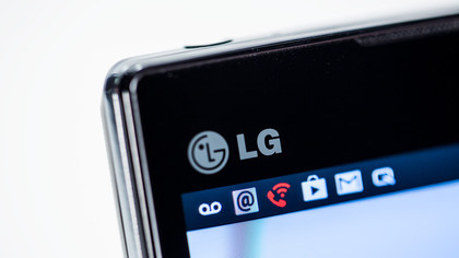
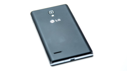
The L7 tried to emulate the style of more expensive phones with a metal-looking plastic edge, although that illusion vanished when you picked up the device and felt the plastic heft. The L9 is a bit more successful in pulling off that trick, and while it retains a thinner, metallic plastic edge, it looks more like a black slab phone that doesn't scream "budget." While it fairly slim at 9.1mm, we're not sure it matches up the "sophisticated" label that LG's marketing department slapped on it.
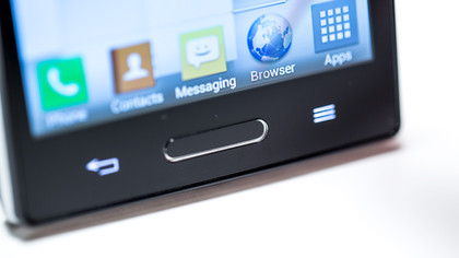
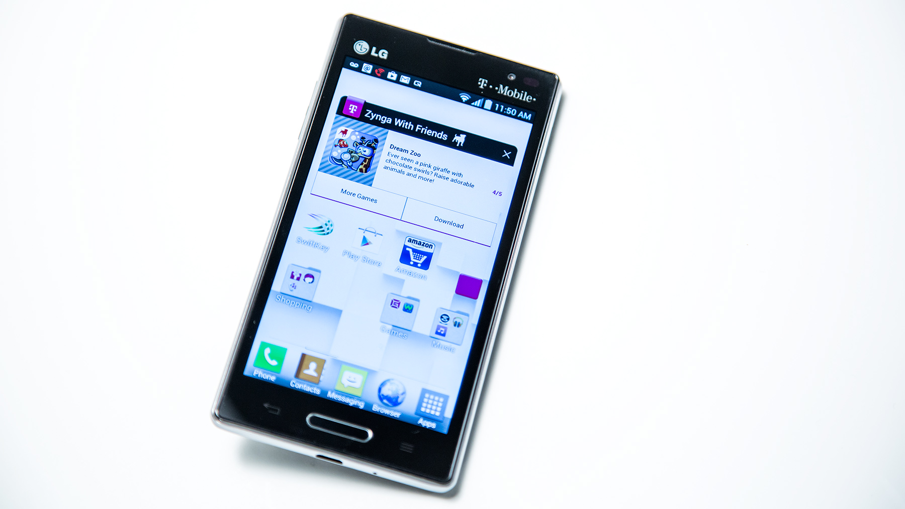
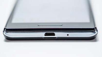
The front of the device is sleek and glossy, although the LG and T-Mobile logos at the top under the glass detract a bit from that. A slightly raised, oblong Home button at the bottom is the only thing that punctuates the Corning Gorilla Glass 2 front, with the Back and Menu keys under the glass on the touchscreen, and dark until you tap them. The sides are beveled, with the left side holding the volume rocker switch, which you can push in the middle to activate QuickMemo, while the right side only features the power button. The top holds the headset port and a sub-microphone, while the bottom is reserved for the charging port and the main microphone.
The back side of the device is a improvement over the L7, featuring a stacked design with the camera, flash, and LG logo lined up on the top third of the back, and the horizontal speakerphone grill at lower left. There is a thumbnail notch on the back, just by the charging port, which you can use to easily lever the back off. Inside, in a surprisingly clean layout, you can access the micro SIM card, microSD card slot (accepts up to 32GB), and the removable 2,150 mAh battery.
Interface, Contacts, and Calling
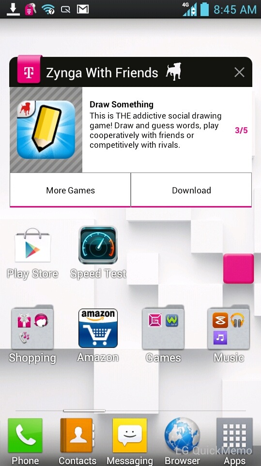
The Optimus L9 runs Ice Cream Sandwich, with a light layer of LG flavoring on top of that. It is minimally intrusive, although when you first boot it up, there are hideously annoying ads that pop up on your home screen, encouraging you to download new apps, games, and T-Mobile services. It probably isn't the last time we will see things like this either, and while you can delete them on your own, the fact that you have to even deal with them at all is a bit of an annoyance. That's the biggest complaint here, with the rest of the experience being fairly simple to deal with, and easily customizable.
You can set up how your home screens cycle, and choose different animations for them, but one Android annoyance remains: there is no true grid for the widgets snap to. You can align icons or folders easily, but when you add widgets to the mix, you will always be left with some wasted space on the home screen. With the improved screen, you want to take advantage of it, but the gaps between widgets and folder are a bit maddening. The on-screen keyboard was fairly easy to use, and while it does offer the swipe to type method of text entry, we didn't mind using it at all for standard tap-entry.
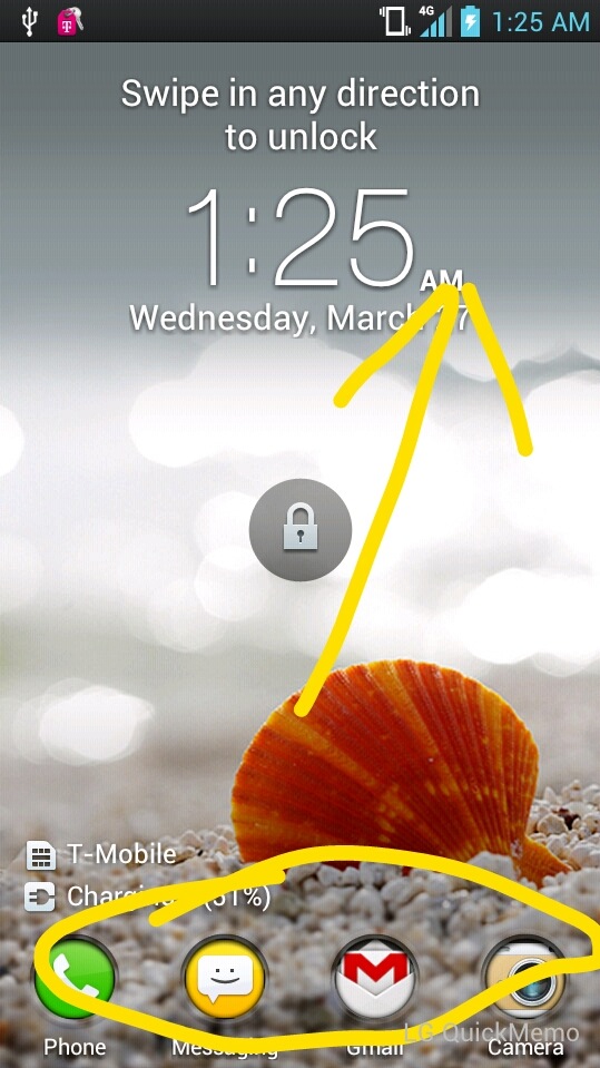
The best two features by far are the ability to configure shortcuts on the Lock Screen that let swipe to activate your favorite programs, which launch as soon as the phone unlocks, and the Quick Settings menu at the top of the screen, allowing you the option to quick change Brightness, WiFi, Bluetooth, Sound and other preferences quickly rather than diving into system settings. Also handy is the QuickMemo feature that lets you snap an image of the screen, write on it, and then share it. This is accessible from the Quick Settings, or by holding down the volume rocker for one second.
Current page: Introduction, Design and Interface
Next Page Contacts, Calling and Messaging