Why you can trust TechRadar
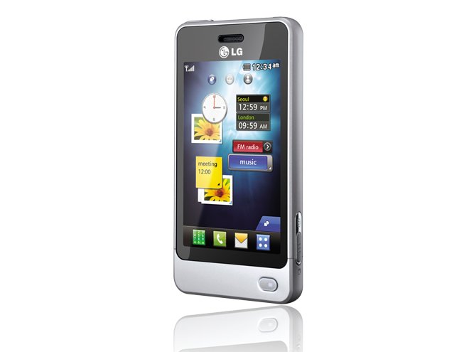
The LG POP GD510 has a resistive touchscreen rather than the sort of capacitive display as used by the iPhone and other higher grade touchscreen phones, so it doesn't have the fluid multi-touch motion that screen allows. However, the WQVGA (240x400 pixels), 262k-colour display has a sufficiently responsive action for straightforward finger-pressing and swiping.
The A-Class user interface features three conjoined standby homescreens you can swipe between with a slide finger movement. Each of these displays the same basic control buttons at the bottom – numberpad for dialling, contacts, messaging and applications main menu – but offers a different type of special control option.
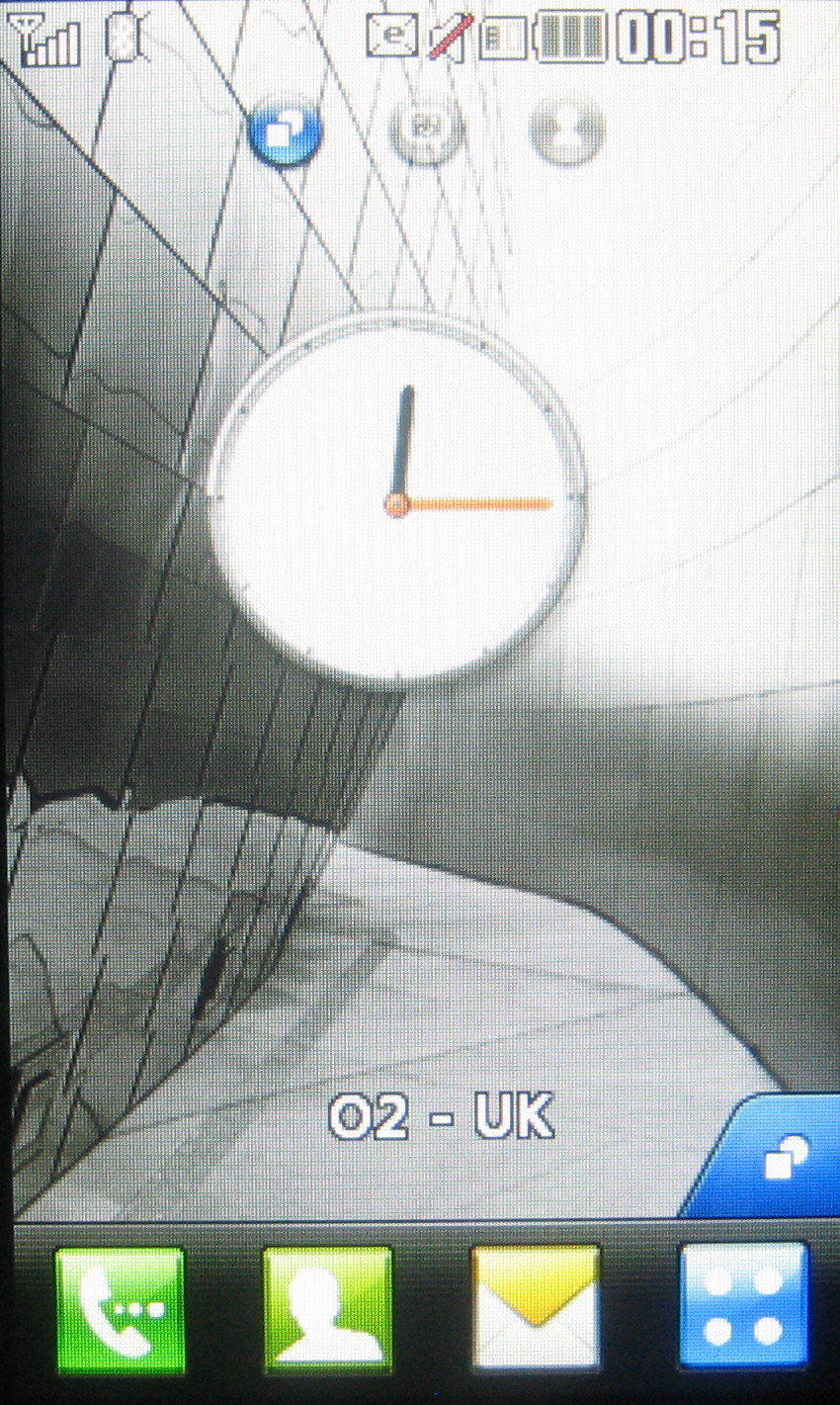
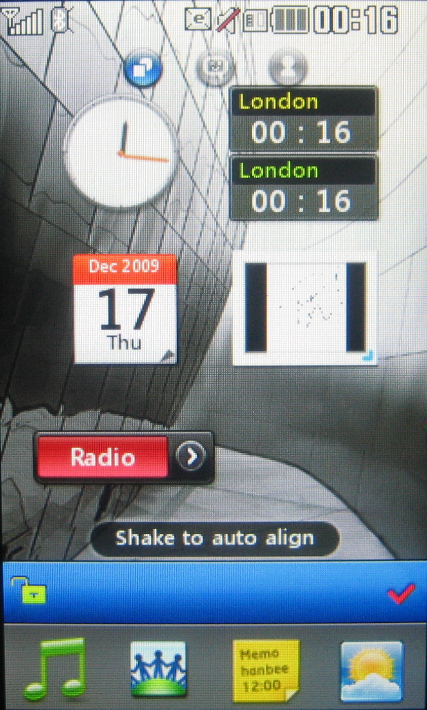
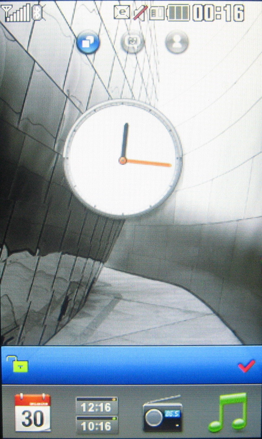
The default homescreen enables you to use widget mini applications. Pressing a small tab at the bottom of the display opens up a widget toolbar, from which widgets can be dragged and dropped onscreen.
These can be dotted around as you like, providing quick-tap access to features such as the music player, clock, image gallery, links to social networking services, an online weather forecast service, and Google search. A quick shake of the phone will neatly order them, and you can drag and drop them on and off screen as much as you want.
Swipe the main screen to one side and you get other homescreen views. One is a speed dial screen, which enables you to place icons for up to eight favourite contacts onscreen, with photos if you've assigned them in the contacts book.
They can be dragged and dropped to the main part of the display from a pop-out toolbar, just like with the widgets. Press the contact icon onscreen and options pop out from each side, to compose a message, dial the number, edit it or remove it as a speed dial option.
The third homescreen view adopts LG's LiveSquare quirky display of recently used numbers and contacts as an animated set of avatars of people or animals against swappable background. This 'recent contacts' style screen changes as different numbers are used. Press an avatar and the options on the tool bar vibrate, indicating that you can call, text or edit the contact. Alternatively, you can drag and drop a contact avatar onto a toolbar icon to initiate the function.
Sign up for breaking news, reviews, opinion, top tech deals, and more.
The homescreen options are useful without offering as many features as a decent smartphone, but they work well enough and add a bit of extra finger-dabbling potential for its target audience.
The main menu is opened by pressing the button in the bottom right corner of the screen, bringing up a grid of icons that takes a graphical cue from Apple's iPhone.
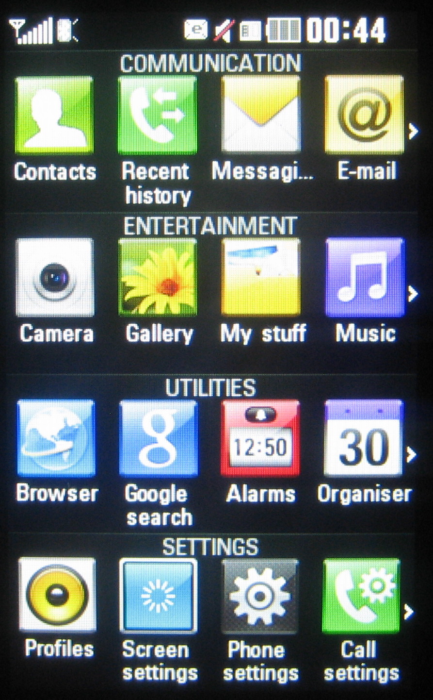
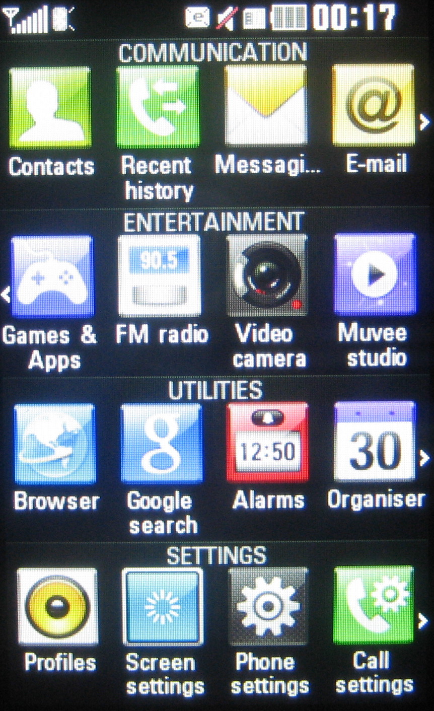
The menu is arranged in a 4x4 grid of icons, separated by categories of function – Communication, Entertainment, Utilities and Settings - you can scroll sideways on each individual row to see more options. Flip the phone sideways, and the accelerometer switches it from a 16-icon grid to a full 32-icon spread in landscape mode. They're easy enough to tap to select, though in landscape they aren't labelled.
Swiping through sub menus, you don't have the speed-sensitive kinetic scrolling action you get with an iPhone; you can only swipe quickly through a few entries at stroke.
Current page: LG GD510 Pop: User interface
Prev Page LG GD510 Pop: Overview and design Next Page LG GD510 Pop: Calls and messaging