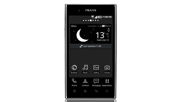
Why you can trust TechRadar
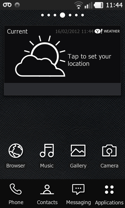
The LG Prada 3.0 has a striking black and white interface that hits you between the eyes as soon as you switch the designer smartphone on.
Navigating through the seven home screens reveals some really good looking widgets that take full advantage of the black and white colour scheme.
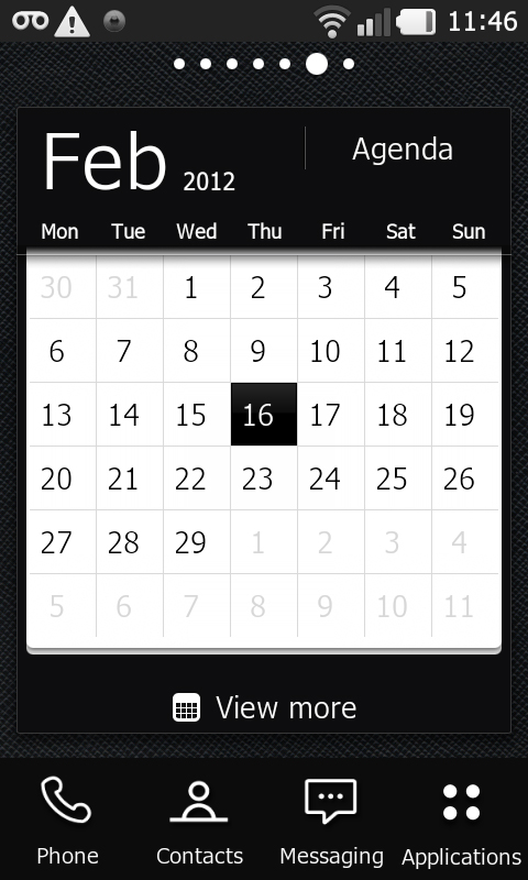
Beneath any home screen, an array of four buttons afford access to the dialler, contacts, messaging and applications.
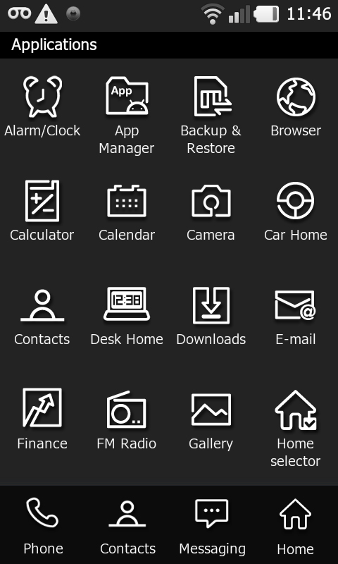
Hit the Applications shortcut and again black and white is the name of the game, with some sleek icon design thrown into the mix. Take a look at the Contacts icon, for example. We think it's super.
However, the LG Prada 3.0's black and white theme can only be taken so far.
Scroll down the applications list and you come to the Google Services. The shortcut icons here are in colour.
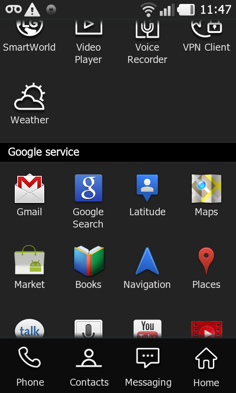
Switch to a screen with Android widgets on board and colour again rears its head.
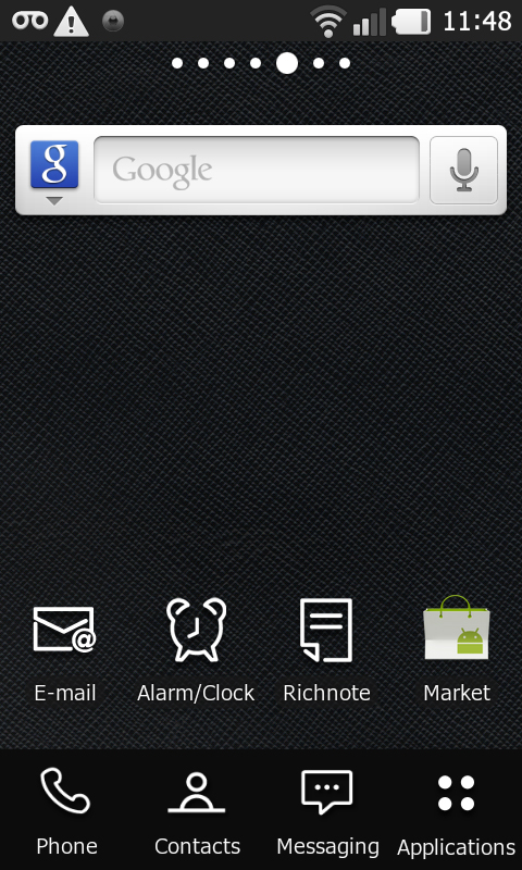
Run apps, and again colour inevitably starts to seep in. What you get depends in part on how much control LG has been able to exercise in the skinning process.
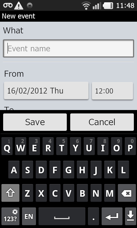
The calendar app is black and white, but there's a green call icon on the dial pad, which we find quite acceptable.
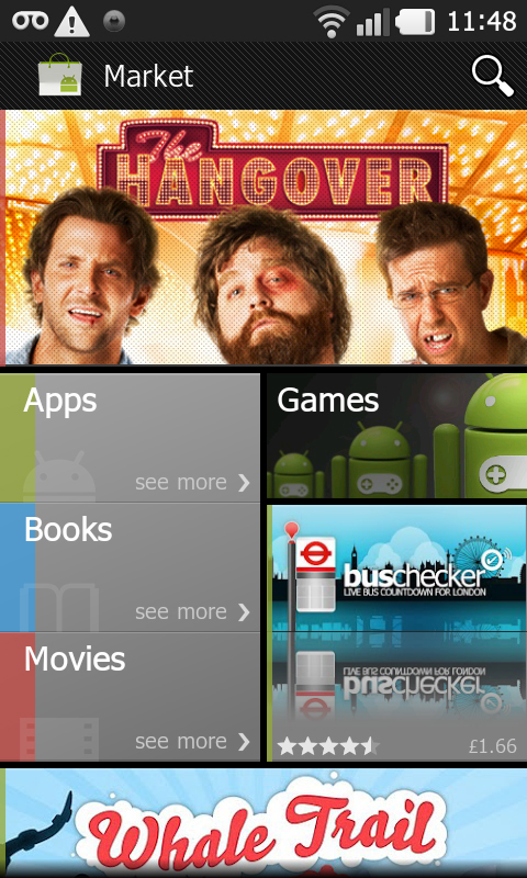
Nip onto the web, or into the Android Market, for example, and of course, full colour prevails.
