Why you can trust TechRadar
Announced just two days after Google's Android 6.0 Marshmallow launch event, the LG V10 released with Android 5.1.1 Lollipop. LG innovates quickly, but not that quickly.
The new operating system update has been promised by the company, telling us its team in South Korea is already working on the new version, with the hope of having it run with all the standard LG UX 4.0 apps soon.
Interface
Android Lollipop 5.1.1, in the meantime, runs perfectly fine on the LG V10, as long as you're okay with LG's rather lackluster interface and pre-loaded apps. This is one case in which the phablet differs from other Google-powered phones, but not in a good way.
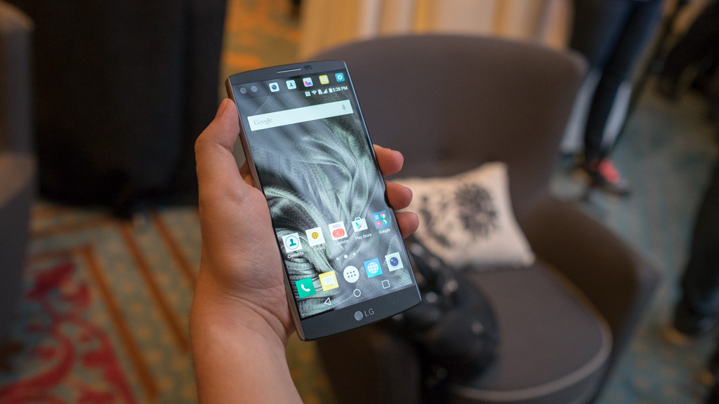
LG UX 4.0 tweaks the Android interface to somehow be both overly complex and have nothing exciting going on. All of the square icons on its pre-installed apps look dated and don't conform to the company's new love of circles elsewhere, namely with its Circle Case, quick settings icons found in the dropdown menu and the notifications icons in the second screen.

Sure, it gets the basic phone interface job done with a very plain design and unattractive color scheme within the dialer, settings and notifications menus, but then it tries to be too helpful in other, more vibrant areas. The attractive menu, dubbed Smart Bulletin, is a great example.
LG's Smart Bulletin, instead of Google Now on Nexus devices or something like Samsung's use of Flipboard, is the default for the coveted leftmost home screen. It's filled with widgets, and for some reason "QuickRemote" leading the charge. No one I know uses this.
It's followed by Calendar, LG Health, Smart Settings, Evernote, Music and Smart Tips. You can untick the ones you don't want, or turn off the menu entirely, and that's a good idea because there are so many better, fully customizable widgets and launchers out there.
I do appreciate the system-wide minimizer Mini View, which shrinks the entire interface on this massive phone down to size. Also likeable is the keyboard, with evenly spaced out keys and an always-visible numbers row. But I'm hard pressed to find a reason to like this operating system over Android Marshmallow, pure Lollipop 5.1.1 and even Samsung's TouchWiz.
Apps
The drab-looking interface is coupled with LG-made apps that are uninteresting or repeats of Google's better apps, and thankfully, they're uninstallable - even "Email" and the non-descript "Browser." Aside from the Camera app, the same can be said about Calculator, Calendar, Clock, Tasks and Voice Command.
I did find a use for File Manager, which isn't part of Google's stock Android software by default. Gallery, Music and Messages also act as more streamlined alternatives to Google's weightier apps like Photos, Google Music and Hangouts.
The two standout pre-loaded apps are LG Health, which does a nice job of being a lightweight fitness tracking app for a non-wearable, and QuickMemo+, which accepts sketches, photos and not just plain text. It's just as capable as Apple Notes on iOS 9 devices, and Quick Note on the Samsung Galaxy Note 5, minus the included stylus, of course. No matter, you do have five fingers on each hand to fill in those blanks.
The LG V10 doesn't wow me with its default apps, yet it makes full use of the Google Play Store and, in the US, comes with Android Pay to tie into that fingerprint sensor. In a matter of minutes, I had my Google app suite of Chrome, Calendar, Docs and Spreadsheets on the home screen and a To Do List widget in place of the Smart Bulletin on the leftmost section of screen.
LG also makes use of its spacious, 5.7-inch touchscreen with five apps in each row. This includes five apps in the bottom dock where there's already an unmoveable app drawer button for a rare six icon spots across. LG V10 is big, and in this way, it wears its size proud.
Movies and Music
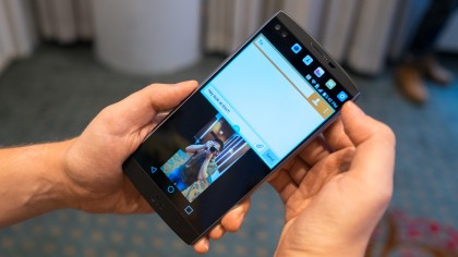
Watching movies is a wonderful visual experience on this quad HD display, and no, the 2.1-inch second screen doesn't get in the way of the viewing experience. It automatically turns off unless you touch it on purpose, so those five colorful app shortcuts at the top don't ruin your ability to watch, say, a Frankenstein movie.
There's a hidden Video app that's not in the app draw, but it handles watching movies by default with very basic controls. The readily available Music app allows for more fine tuning, going as far as including an equalizer, so you can play your downloaded songs however you want. They each get the job done if you're playing local content, whereas the preloaded Google Play Movies & TV and Google Music can handle streaming content.
Listening to movies and music from the built-in speaker, however, could be a more immersive experience if LG simply shifted the tiny speaker from the bottom frame to stereo speakers on the front. There's enough room on the top and bottom plastic bezel to pull this off, and I really dig phones like the HTC One M9, Motorola Style and Nexus 6P with speakers all facing me. At least it's not on the back this time.
Plugging in a pair of headphones proves to be a completely different experience thanks to the 32-bit Hi-Fi digital-to-analog converter. My only complaint is that, outside of the default app and Tidal, it was hard to find audio content and players that supported this format.
Games
The LG V10 graphics processor, the Adreno 418, holds up well against the newest 3D games available in the Google Play Store, like Breakneck. It's a futuristic racing game that didn't stutter, even if this phone is technically beaten by the more future proofed Nexus 6P Adreno 430. It's still fluid.
It has the same CPU and GPU combination as the LG G4, Nexus 5X and Moto X Style, and this means it can get a bit hot under its silicone collar with prolonged use. It gives me enough bezel to avoid touching the screen with my tight grip, which is great as reducing unintentional presses.
I did have to adjust to the turned-off 2.1-inch second screen when gaming because it makes the right and left bezel slightly uneven. It's much less of a hassle than Samsung's Galaxy capacitive buttons that make it too easy to exit a game unintentionally.

