Why you can trust TechRadar
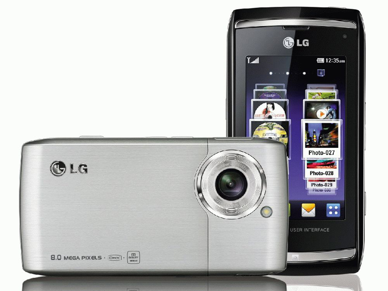
Like the KM900 Arena, the Viewty Smart features LG's cubist S-Class interface. Touch the top bar and a handy drop-down menu gives you simple, one-press access to the phone's key settings, including: Bluetooth and Wi-Fi, voicemail and the Music player application.
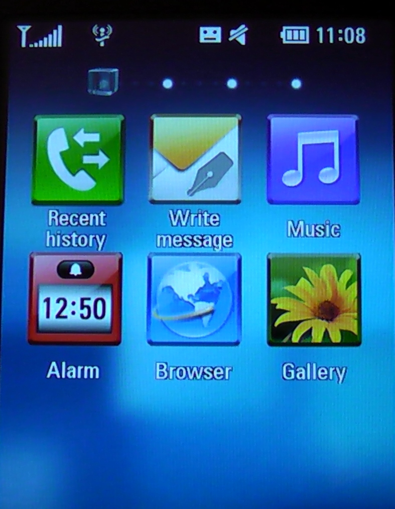
INTERFACE: The LG Viewty Smart features the S-Class UI, which first made an appearance on the LG Arena.
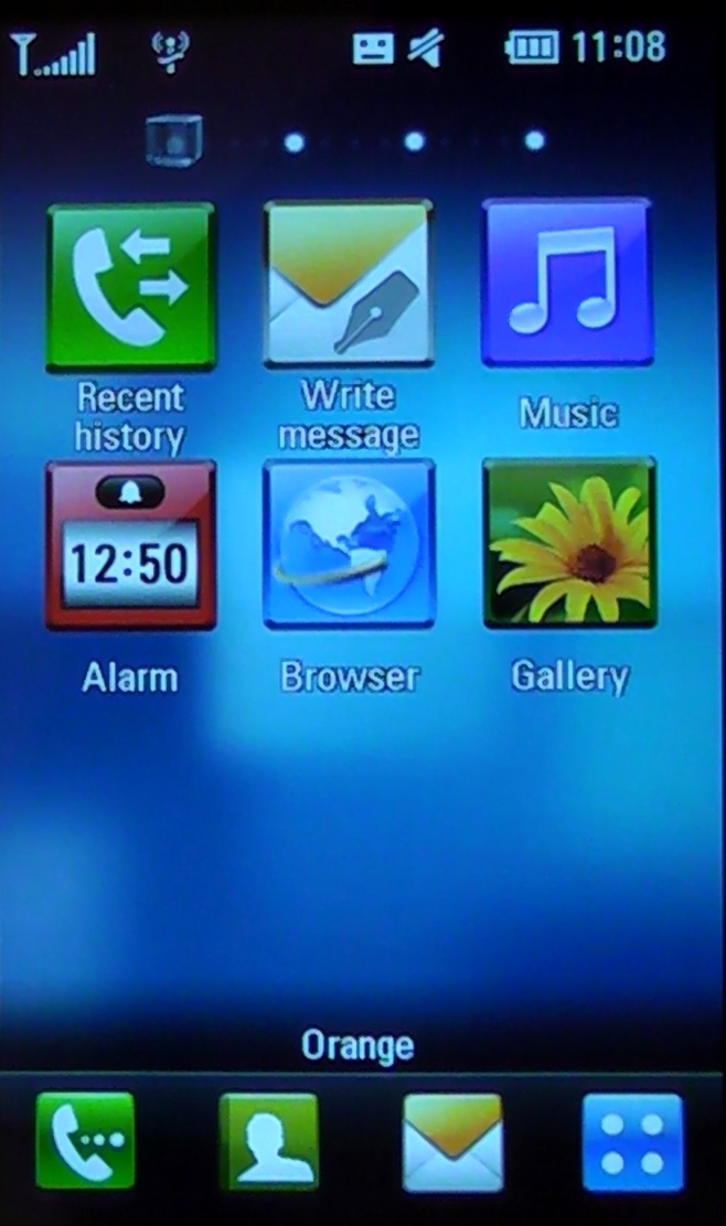
MENU: Four quick-launch icons (at the bottom of the screen) give you access to the core phone functions.
Along the bottom, there are four quick-launch icons for the phone's dialler, Contacts, SMS Inbox and the 'Top menu', which allows you to delve deeper into the phone's various applications. Haptic feedback responds to each button press with a soft vibration. You push the LG Viewty Smart, it pushes you back.
If you're not familiar with the S-Class UI, the main home screen is essentially one face of a cube. Swipe your finger left or right and this cube smoothly rotates with a 3D effect, giving you access to three extra screens – Widgets, Contacts and Multimedia.
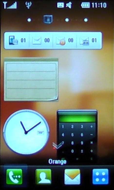
WIDGETS: Flip the S-Class 'cube' once and you'll find the Widgets screen, which can be littered with useful mini-apps like a calculator and memo pad.
There's a growing trend for personalisation on mobile phones and so these extra home screens can be customised. Small applications and application shortcuts (I.e. a Calculator, Memo and Weather app) can be spread across the Widgets screen. While your closest contacts, favourite music and digital photos can be arrayed across the remaining two.
It sounds powerful. But it doesn't have the flexibility of the multiple screens on current Apple and Android phones and the personalisation is actually fairly limited. The animated 3D cube is really just a gimmick.
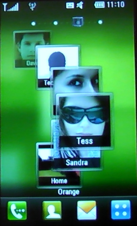
CONTACTS: The Contacts screen can be configured to display your favourite people. With just one touch, you can call or message them.
Nevertheless, the S-Class UI is easy to use. You press and hold to unlock the phone (compared to the iPhone's 'slide to unlock') and the touchscreen is reassuringly responsive as you swipe between the four home screens. On the Contacts and Multimedia screens, content can either be arranged in a no-nonsense grid or a pretty, scrollable wheel.
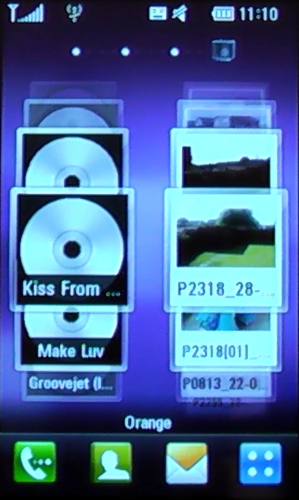
MEDIA: The Multimedia screen can be used as a shortcut to your favourite music tracks and digital photos.
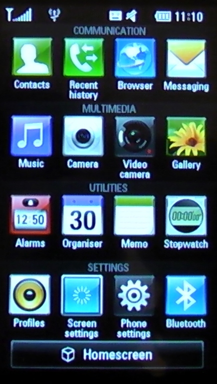
MENU: The 'Top men' displays an iPhone-esque grid of all the options and applications on the LG Viewty Smart.
Delve into the deeper menu and the applications are split into four categories – Communication, Multimedia, Utilities and Settings. This is the real guts of the phone – you can do anything from this iPhone-esque menu, from launching the web browser to adjusting the screen settings.
As you play around, transitioning between the various applications can be sluggish, almost as if the Viewty Smart goes 'umm...' before it launches the app or opens another menu. It's noticeable, but it's hardly a deal breaker.
Current page: LG Viewty Smart - Interface
Prev Page LG Viewty Smart - overview Next Page LG Viewty Smart - messaging & calls