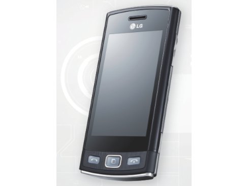
Why you can trust TechRadar
When we reviewed the LG Town, a budget handset with a slide-out keyboard, we said we weren't too excited about the user interface. The LG Viewty Snap GM360 takes the same approach to its UI and we feel similarly about it.
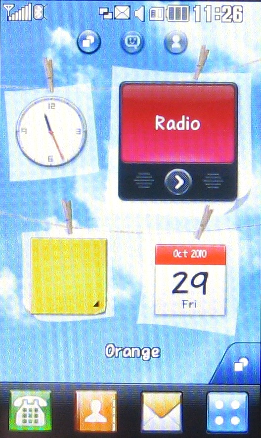
There are three home screens, which you move between by sweeping as you would on any touchscreen handset. Each home screen has different, pre-designated functions, so there's no freeform ability to just stick widgets wherever you like.
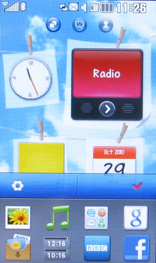
That said, the main home screen does have space for widgets of your choosing. You pull these onto the screen from a menu that sits along its bottom portion. You're limited to four and they sit in a configuration that's dictated by the wallpaper you've picked.
The next screen is for housing your favourite people. Again, you can pull them onto the screen from a menu that sits along the bottom.
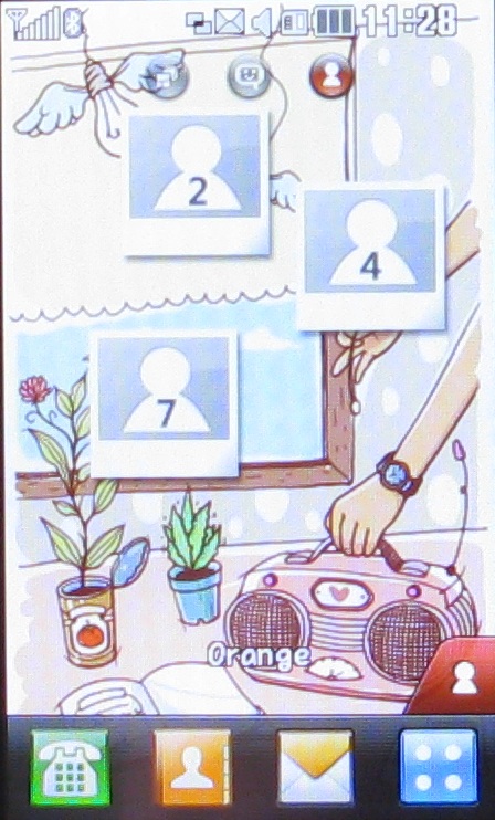
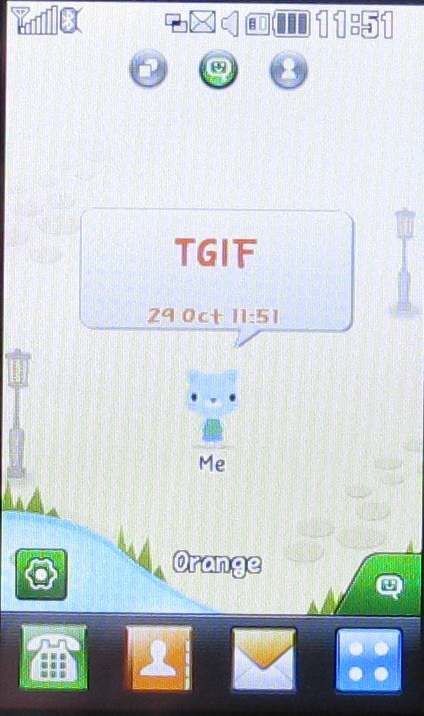
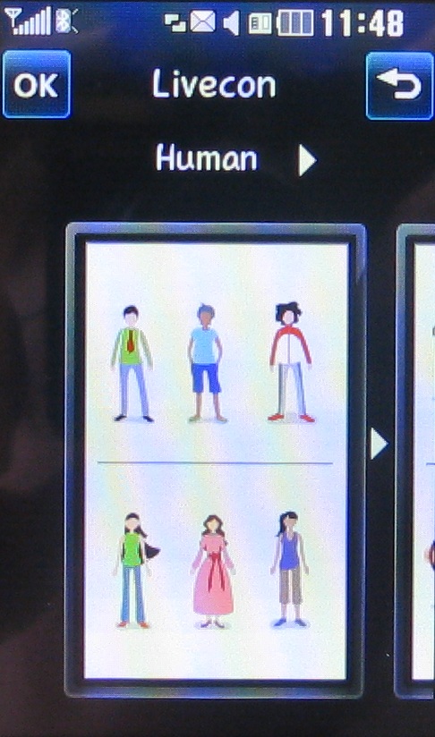
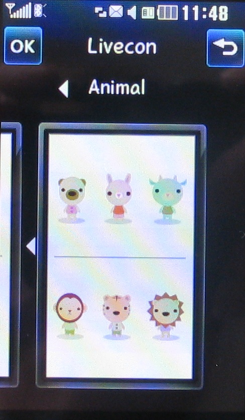
The third home screen is the one that you may find you don't get on with at all. It's all about LG's LiveSquare system. You can add friends to this screen, giving them little avatars.
These avatars animate and show you information about incoming calls and messages. Tap an avatar and you can see your contact history with them. It's a little bizarre to be honest.
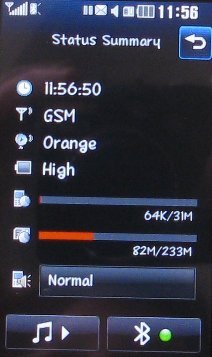
The status bar along the top of each of the home screens can be tapped for a little more information about the status of the LG Viewty Snap GM360, and you also get a quick Bluetooth toggle and music pause/play button here too.
Each of the three main screens has a shortcuts bar beneath it. These enable you to quickly get to the phone dialler, contacts, messaging and the main apps menu.
LG organises its apps into four groups: Communication, Entertainment, Utilities and Settings. A horizontal finger sweep takes you from the 16 shortcuts on screen to a second screen of 16.
Current page: LG Viewty Snap GM360: Interface
Prev Page LG Viewty Snap GM360: Overview Next Page LG Viewty Snap GM360: Contacts and calling