Why you can trust TechRadar
If you're a regular Android user, you probably haven't thought of a physical home button since Google started including onscreen buttons with recent versions of its mobile operating system.
However, it's clear that Meizu has been thinking long and hard about it, as the inclusion of a home button on the M2 Note doesn't feel like a retrograde step, and instead offers some rather interesting and innovative features.
Although the flagship Meizu MX4 comes with a fingerprint scanner under the home screen, there's none here. While this is disappointing – yet expected due to the M2 Note's budget leanings – there's enough interesting tech to make you forget about the lack of biometrics.

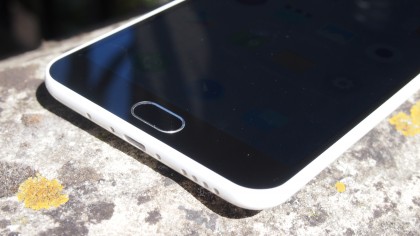
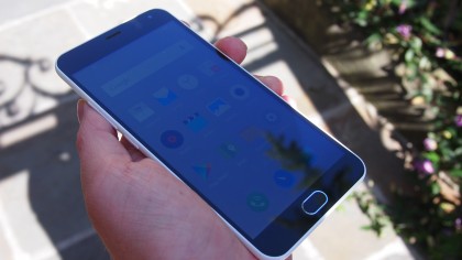
Dubbed the Mback, the oblong home button's main aim is to make the Meizu M2 Note easier to use with one hand, despite its large screen size. This means the back, home and app drawer icons of stock Android are gone from the M2 Note's custom version of Android 5.1 Lollipop. Instead you can use the home button to replicate the tasks those onscreen buttons used to cover.
Tapping the button takes you to the home screen, while swiping from left to right works as the 'back' button. The Mback has its own haptic feedback, which lets you know what you're doing via discrete vibrations.
The addition of separate vibrations for the home button does a good job of encompassing Meizu's approach to the Mback button. At first it might seem like a small (maybe even pointless) addition, but the feedback the vibrations give helps make the M2 Note feel responsive to your commands.
It took me a while to get used to the button at first, but once I did, I found it worked really well, and it definitely fulfilled its brief for making the large phone feel comfortable to use with one hand.
It's not quite as revolutionary as Meizu states, but it's great to see a company thinking about new ways to make its device easy and comfortable to use. I know that when I move on from the M2 Note I will certainly miss the Mback home button.
Big screen
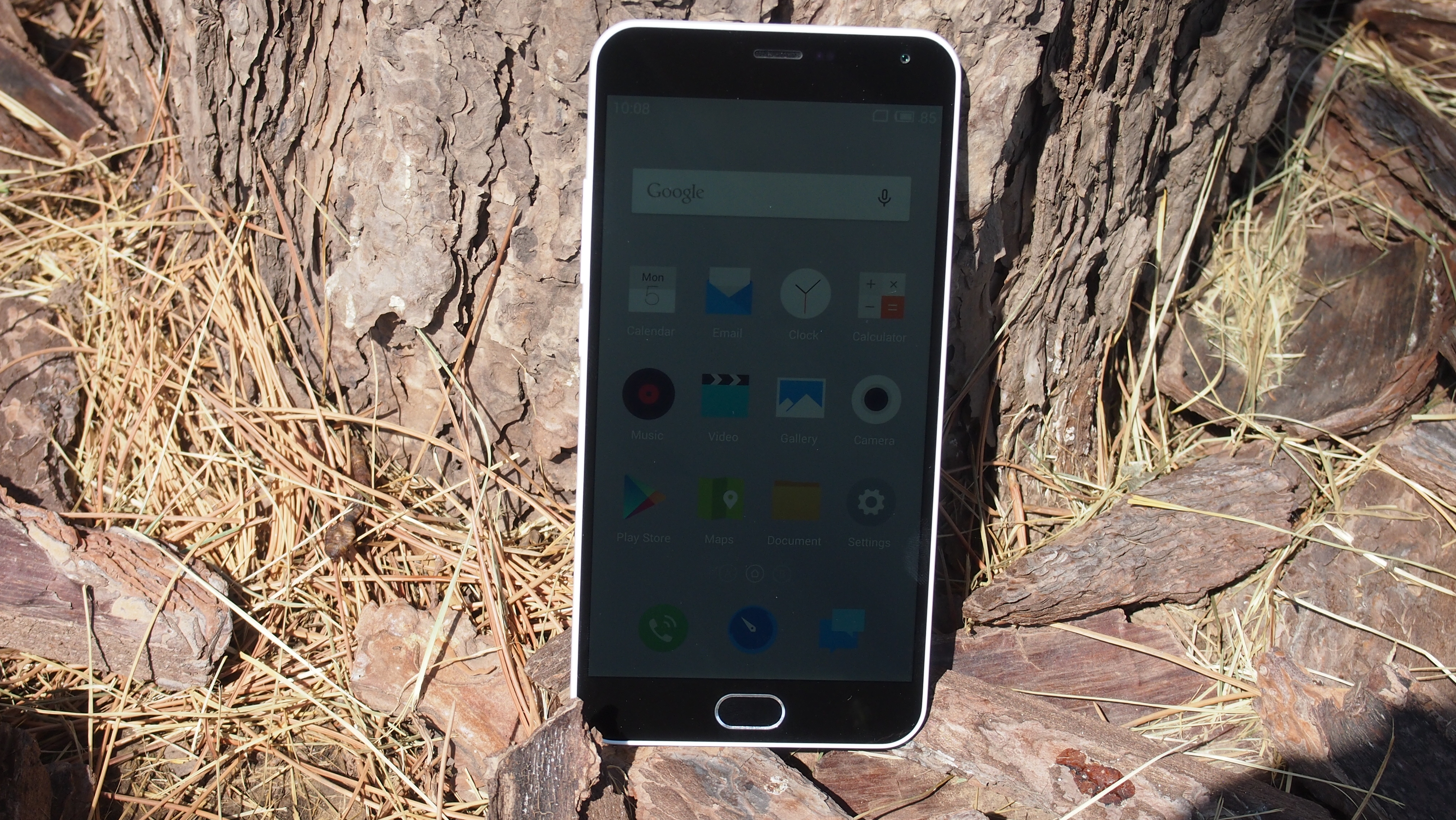
One of the most notable features of the Meizu M2 Note is its large 5.5-inch display. Budget smartphones with phablet-sized screens are nothing new, with the Nokia Lumia 1320 and the Huawei Ascend Mate 2 4G demonstrating that you can combine big screens with small price tags.
What's rare, however, is the M2 Note's 1080p high definition screen – in contrast to other budget phablets that stick to a 720p resolution to keep prices down.

A 720p screen isn't too shabby – especially on a budget device – but the larger the screen, the more unforgiving it is for lower resolutions. Having a higher resolution means it can pack more pixels in per inch – and a high pixel density is essential to having a clear and sharp image.
With a 5.5-inch screen and 1080 x 1920 resolution, the M2 Note has a pixel density of 403ppi – pretty much the same as the iPhone 6 Plus' 401ppi (they share the same resolution and size, but Apple has a funny way with aspect ratios). Although the M2 Note doesn't quite match the screen quality of the iPhone 6 Plus, it doesn't do a bad job either.
This is particularly impressive considering that the Meizu M2 Note sells for almost a fifth of the price of an iPhone 6 Plus.
So, if you're looking for a large screen device for under £200 ($300, AU$400), the Meizu M2 Note is without doubt a worthy choice, with the bright, vibrant and full HD screen putting other budget phablets to shame – and even giving more expensive devices a run for their money.
Cheap and cheerful
The Meizu M2 Note's biggest selling point is its impressively low price. When the Chinese price of 799RMB ($129, £85, AU$168) for the 16GB version was given at the launch event, we were sceptical that Meizu would translate this price to the rest of the world.
Although it doesn't quite reach that low price, you can pick up the Meizu M2 Note for as little as £144 (about $227, AU$294) and sometimes even cheaper if you shop around.
This puts it in the same price bracket as the Microsoft Lumia 640, Sony Xperia M2 Aqua and the current budget smartphone to beat, the Motorola Moto G (2014).
All three of these budget smartphones are formidable opponents, proving that companies don't have to make too many compromises when creating a desirable budget device. The fact that the relatively unknown Meizu can go up against such well-established names like Microsoft, Sony and Motorola, and in many ways come out on top, is a testament to the quality of the M2 Note.
Let's quickly compare some of the specs of the Meizu M2 Note to the Moto G (2014), which currently sits at the top of our best budget smartphones list.
The M2 Note's 5.5-inch screen, with 1080 x 1920 resolution, dwarfs the Moto G's 5-inch 720 x 1280 display in both size and quality. A Mediatek octa-core 1.3GHz CPU and 2GB of RAM also help the M2 Note feel more sprightly than the Moto G, with its quad-core 1.2GHz CPU and 1GB of RAM.
The Moto G comes with just 8GB of storage, which is pretty common in handsets at this price range, but can get filled up quickly. Meanwhile, the M2 Note comes has 16GB and 32GB capacities.
It's already clear the Meizu doesn't mess around when it comes to putting some decent hardware in a budget device.

Matt is TechRadar's Managing Editor for Core Tech, looking after computing and mobile technology. Having written for a number of publications such as PC Plus, PC Format, T3 and Linux Format, there's no aspect of technology that Matt isn't passionate about, especially computing and PC gaming. He’s personally reviewed and used most of the laptops in our best laptops guide - and since joining TechRadar in 2014, he's reviewed over 250 laptops and computing accessories personally.
