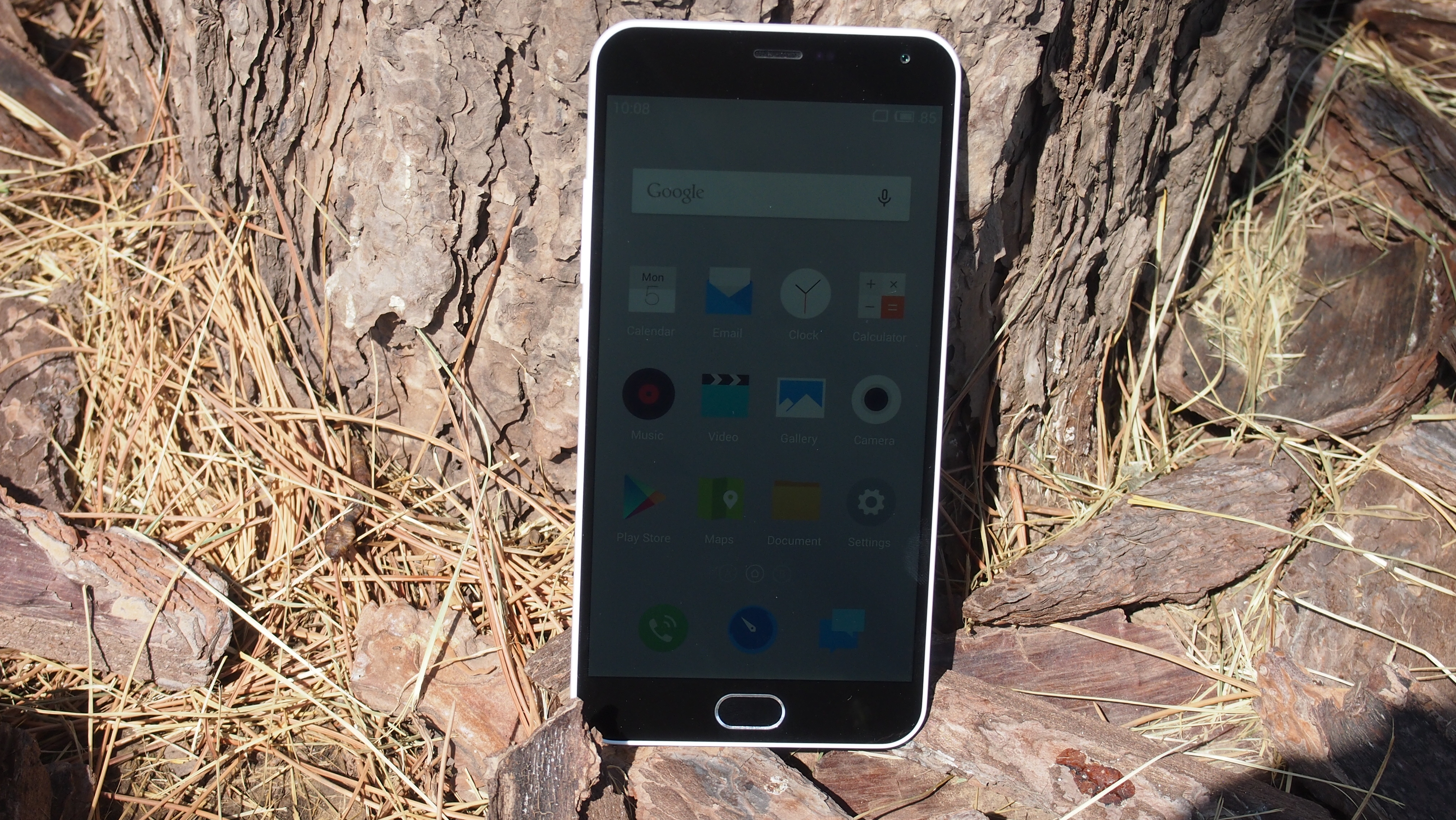
Why you can trust TechRadar
Considering the price of the Meizu M2 Note, the specifications are pretty impressive – and generally much more powerful than other handsets in the same price bracket. While most budget phones make do with 512MB or 1GB of RAM, the M2 Note comes with 2GB, which helps multitasking with numerous apps open feel smooth and fluid.
The Mediatek octa-core 1.3GHz CPU also helps keep everything running smoothly, and running the GeekBench 3 benchmark, which puts the CPU through its paces, yielded a multi-core score of 2693.
For comparison's sake, the Moto G (2014), perhaps the Meizu M2 Note's closest competitor, scored just 1142 points. The Sony Xperia M2 Aqua meanwhile scored 1133, so it's clear that the M2 Note is punching well above its weight in the performance stakes.
It's not quite up to the level of flagship smartphones like the HTC M9, which scores 3803, but it's important to remember that the M9 is a lot more expensive.
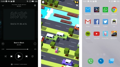
Benchmark numbers are fine when getting a general idea of how well a smartphone performs, but how does it fare in real world use? The good news is that the Meizu M2 Note once again exceeds expectations, with smooth response times when navigating the user interface.
When you first load up apps there's a slight delay, but once up and running every app I tried, such as Spotify and Facebook, the phone ran quickly and without any crashes or complaints.
I also put the M2 Note through its paces by playing a few games, including Crossy Road and the graphically intensive Racing Rivals. Although there were a few minor pauses – certainly nothing game breaking – the M2 Note did a pretty good job of keeping up with the games, and each one I tried looked great on the large 1080p screen.
Interface
The Meizu M2 Note ships with Android 5.1 Lollipop straight out of the box, so you're getting Google's latest and greatest mobile operating system without having to wait.
It also comes with Meizu's excellent custom overlay, known as FlymeOS, with elements of Android Lollipop's material design working well with the overall minimalist aesthetic of the interface.
A number of attractive wallpapers can be used with FlymeOS, though the theme is currently restricted to Chinese content.
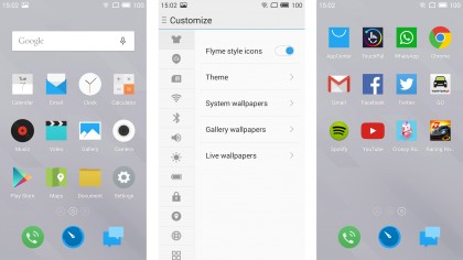
It has some nice touches as well; you can swipe down from anywhere on the screen to bring down the notifications and options screen (not just from the top like standard Android), and if you flick up from the bottom of the screen, a quick launch menu lets you quickly open your recently used apps.
Again these little touches help make the M2 Note more comfortable to use with one hand, and prove that Meizu has put more thought into its custom Android interface than other manufacturers, who often use it to tie their customers into various services (I'm looking at you, Sony) or fill the handset with bloatware.
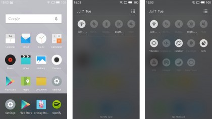
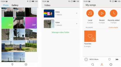
Bloatware is mercifully absent from the M2 Note in fact, with the preinstalled apps offering decent functionality. The Gallery app does a fair job of displaying your photos, Memos unsurprisingly lets you take down notes, and music and movie apps handle media-playing duties in a straightforward way.
That means there's little in the way of frills, but the basic interface has a minimalistic charm that is present throughout the Flyme interface, and gives you a no-nonsense way of playing music and films.
Although the Chinese versions of the M2 Note don't come with Google's Play Store, the international version does, so you can install all your favourite apps on the M2 Note as well.
One design choice that might irk people is that all apps you install are shown on the Home screen of the device, as the Flyme OS interface doesn't have the Apps Drawer of stock Android.
The Apps Drawer is represented on other Android devices with a round icon and six dots, and this holds all the apps you've installed. You can then move the apps you use the most to your home screen, while keeping the others out of sight. This can be a handy way of keeping your phone's home screen organised and not looking too cluttered.
With the Meizu M2 Note, all apps are displayed on the home screen, which can ruin the simplistic nature of the interface. It also means that you could end up having to scroll through numerous screens to get to the app you want.
The only way to remove app shortcuts from the home screen is to uninstall the app – which isn't ideal. It's a rare misstep for an otherwise well thought-out interface.

Matt is TechRadar's Managing Editor for Core Tech, looking after computing and mobile technology. Having written for a number of publications such as PC Plus, PC Format, T3 and Linux Format, there's no aspect of technology that Matt isn't passionate about, especially computing and PC gaming. He’s personally reviewed and used most of the laptops in our best laptops guide - and since joining TechRadar in 2014, he's reviewed over 250 laptops and computing accessories personally.
