Why you can trust TechRadar
Packing a 5-inch display into this low cost device is an impressive feat, even if the panel on the Lumia 535 is far from perfect.
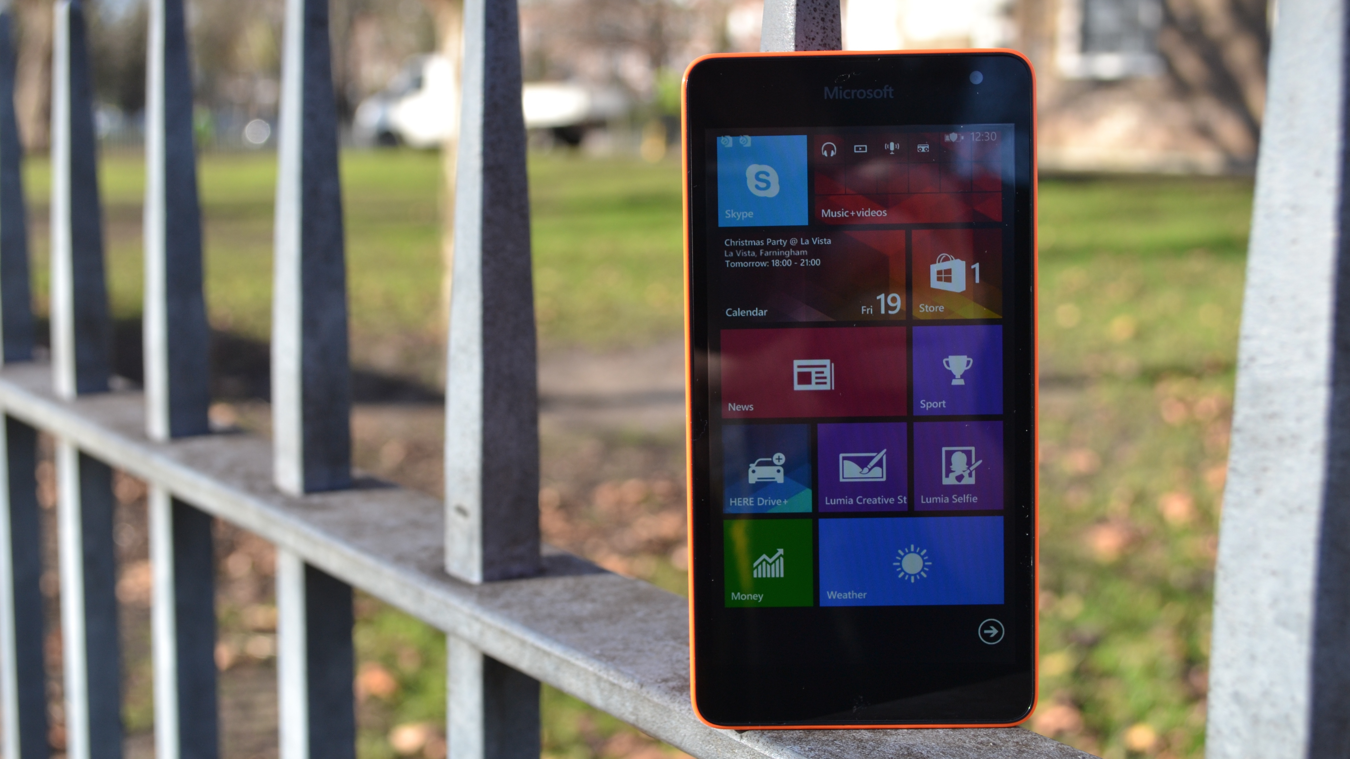
The 540 x 960 Gorilla Glass 3 coated display has nice colour reproduction, deep blacks and a decent hit of brightness, but it lacks detail. The blocky Windows Phone icons look fine, but text is jagged. Reading a web page is a strain and photos lack vibrancy. It's a shame, but at this price I wasn't expecting much better.
Viewing angles are also poor. Tilt the phone even slightly to the side and all you'll get is a faceload of reflection. I had to jack the brightness setting all the way to high, and I left it there for the entire time I had the device, just to make sure I could read the display.
Auto brightness always underestimated things, turning it down too far when the lighting was less than optimal.
If you've used Windows Phone 8.1 or WP 8 before, then you'll feel at home here, as everything is exactly the same as on previous Microsoft-powered smartphones.
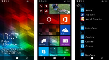
After swiping up from the lock-screen you reach the main display, which is made up of tiles, all varying in size and functionality.
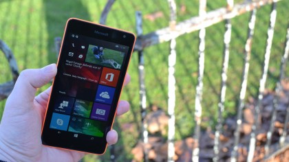
Live Tiles can display info and act like widgets on Android, flipping over constantly to display handy tidbits. The Cortana (which I'll cover further down) tile for example shows a news overview, while the Facebook one flips over to display any notifications you might have waiting.
These tiles can be customised into three different sizes and you can add as many of them as you want. Pull down the top and Action Centre pops down, bringing with it some quick settings and an overview of your most recent notifications.
Action Centre is the Windows Phone 8.1 equivalent of Notification Centre on iOS and the notification pull down on Android and while it doesn't quite match the feature rich version in Google's OS or the seriously updated iOS 8 one, it's a good first attempt.
Cortana
First introduced in Windows Phone 8.1, Cortana is, just like Action Centre, an attempt from Microsoft to play catch-up with Apple and Google's already established digital assistants.
Named after the classic AI character from the Halo game series, Cortana is a really well-made feature that I've found myself using far more than I've done with Siri on the iPhone.
You can launch it either from the homescreen icon or from the search key and once it pops into life there are a few things it can do.
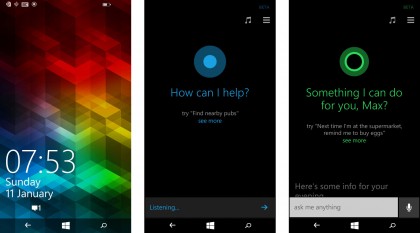
Tap the music note and it'll listen out and tell you, just like Shazam, which song is playing. It was accurate too. I tested on 10 different songs, some obscure and some obvious, and it proved very accurate, delivering results in about 20 seconds.
An overview of the latest news stories is accessible with a swipe up, while clicking the microphone icon lets you chat directly to Cortana. It works just like Siri; ask Cortana to set your alarm or call your Mum and she'll oblige.
Niftily though you can also type your request, which is great if you're in an environment where you shouldn't be having a chin wag with your phone.
It's great to see that Microsoft didn't exclude Cortana from this phone just because it's low-end. It performs just the same as it does on a high-end Lumia like the 1520, responding to my commands quickly and accurately, barely getting even a tricky to pronounce name wrong.
The location based reminders are great too…in fact, almost too good; a reminder for me to pick up beers when I got inside Tesco worked every time.
A full suite
Along with including Cortana, just about every other staple feature of Windows Phone 8.1 is here too, including OneDrive, the full Office suite and Nokia's Here Drive + maps.
Office is great for quickly pulling down documents from Office 365 or OneDrive and having a brief scan through, but I never felt an urge to do any editing on the phone.
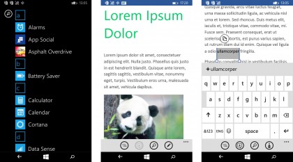
This is in some part down to the keyboard, which simply takes up far too much space on the screen. Granted, it does feature some nice Swype-like flow typing tech, but the autocorrect is a pain and its accuracy is poor.
One app I really appreciate is Data Sense, which tracks all your data usage whether it's mobile or Wi-Fi. It even breaks it down app by app and you can set a limit if you only have a certain amount of data per month, either mobile or at home.
A battery saver app is equally useful, showing which apps run down your juice the quickest.
App-less performance
One constant criticism with Windows Phone has been how far it lags behind Apple, Android and to some extent Amazon when it comes to apps.
While the response of 'we now have Instagram, WhatsApp, Facebook, Twitter and so on' will no doubt be called, for me it's still not up to scratch.
Take Instagram for example: while its true you can download it and scroll through snaps of Starbucks cups and droolworthy food just like any other phone, it's not the same.
The app feels so far behind its iOS and Android counterparts, there's not even video support.
I get the feeling that once a developer releases a Windows Phone app they feel the job is done and just leave it to pick up some downloads and for Microsoft to prove how many of the top apps they have. Yes, the apps are there, but it's not on the same playing field as Apple and Google.
