Why you can trust TechRadar
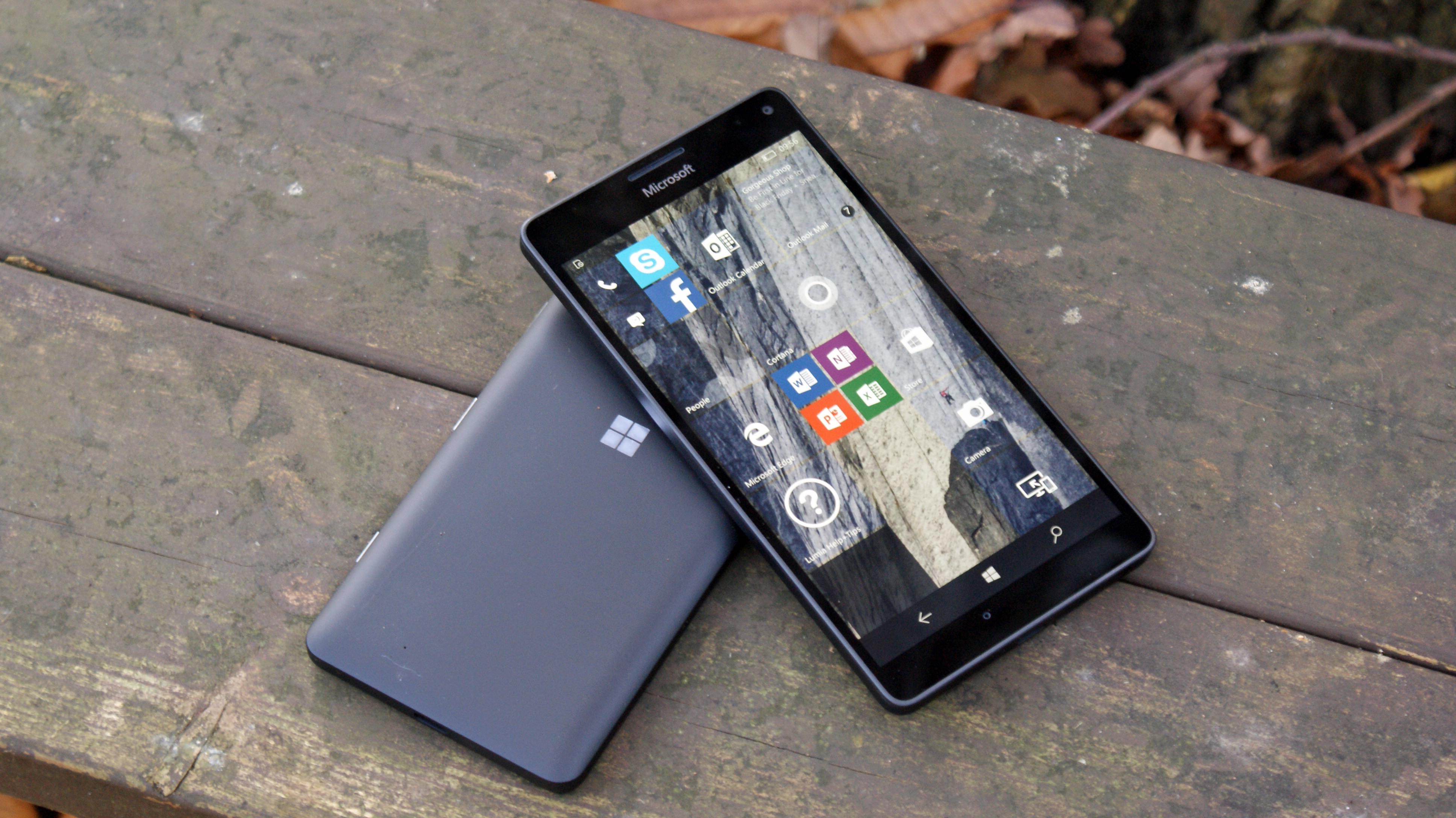
A lot has been said about Microsoft's mobile journey. The firm arrived on the scene in 2000 with Windows Mobile, and rebooted with Windows Phone 7 in 2010 and later again with Windows Phone 8; each attempt failed to capture the attention of mainstream users. Windows 10 Mobile is something different altogether though.
The real story behind Windows 10 is the change in focus, a recalibration of Redmond's mobile strategy. In the past we saw the typical Microsoft bravado, bolstered by years at the top of the heap, culminating in rather brash efforts that failed to make a lasting impression.
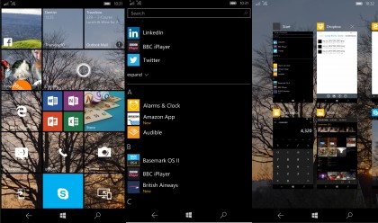
Windows 10 Mobile is an acceptance of the current reality of the wider smartphone landscape, and of Microsoft's place in it. Microsoft has reinvented its software once more to meet the needs of a different user base, one that values customisation over almost all else and that doesn't care a great deal about looks.
As such, there is plenty of wholesome geekery on offer. Perhaps the best example of this is Windows 'Hello', the iris-recognition technology built into the device.
Theoretically this enables the user to unlock the phone with their eye, but in practice I found that it failed more often than not, no doubt because I wear glasses.
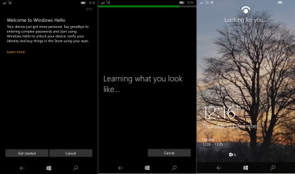
Microsoft has been careful to label the feature as a beta, with shortcomings to be addressed via software updates, and I found that when someone who doesn't wear glasses used the feature the accuracy was much improved.
While iris scanning isn't perhaps as immediately convenient as a fingerprint scanner, it's nonetheless an imaginative inclusion.
As for the wider feel of Windows 10 Mobile, imaginative isn't the first word that springs to mind. When I first used Windows Phone it was on version 7.5, and compared to Android and iOS I generally felt that it had a bold style and cohesion, even in the third-party applications the other systems often lacked.
Windows 8 cemented this, and to this point I don't believe any operating system looks better on an AMOLED screen. With Windows 10 Mobile, however, Microsoft has abandoned this sense of style in favour of feature creep.
This makes for some odd choices. The circles in the revamped People hub are a little grating, while the renamed 'Microsoft Edge' (replacing the inbuilt Internet Explorer) takes a little getting used to. Removing the native Music app for 'Groove Music' is also a little confusing, especially for those unacquainted with Microsoft's new streaming service.
For every downside there is an upside however. Double-tapping the softkey bar causes the display to sleep, while the phone app has a built-in option for voice recording, a godsend for those doing interviews.
There's even a slider for adjusting the transparency of the Live Tiles, which is a nice touch. In short, even more than Cyanogen OS, Windows 10 Mobile has the potential to be something of a tinkerer's paradise.
The story as a whole is of a shift from design over usability to function over form. The experience is still somewhat suspect, though. I suffered regular stutters when using the Start button, frozen screens at random intervals, apps randomly crashing and occasional issues with voice calls, among other things.
Given that Windows Phone as it currently stands is completely rock-solid, the fact that Windows 10 Mobile is such a mish-mash is a little surprising.
Microsoft will in no doubt improve the experience over the next few months, and those with prior experience of using a device with beta software will understand the risks involved; for the average punter, however, it could well be a no-no, at least for the moment.
USB-C
In the last few years microUSB as a standard has become pretty much ubiquitous on smartphones, with almost every device (so long as it doesn't bear the Apple logo) using such a port for charging and data transfer. The times, however, are a-changing.
USB-C offers a couple of advantages over microUSB, enabling faster charging and, by incorporating a reversible connector design, eliminating the problem of trying to plug the cable in the wrong way up.
This is all well and good, but there's just one problem: good luck trying to find someone who has a spare USB-C cable handy.
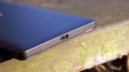
With only a few flagship phones currently using the standard, we're not throwing away our microUSB cables just yet. I've been through around four phones in the last five years or so, and I've accumulated roughly enough microUSB cables to circle the Earth twice.
This means that charging most devices isn't an issue, and neither are lost or damaged cables. Working with USB-C is another matter altogether.
Moreover, with the Lumia line, the 'wrong way up' problem was solved with the addition of a textured pattern on the charging cables supplied by Nokia – that one small indent made a big difference.
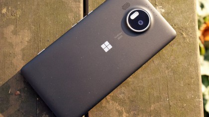
On the Lumia 950 XL I found the USB-C port more of an irritant than anything else, and if the point of the change from microUSB is convenience, then I'm missing something. I had to remember to take a USB-C cable with me for data transfer and charging in different rooms, something which was a definite nuisance.
This could prove to be a real pain when travelling as well – you can pick up a generic microUSB charger simply and cheaply just about anywhere, and that's far from the case with USB-C at the moment.
Although devices such as the OnePlus 2, Nexus 5X, Nexus 6P and LG G5 have adopted the standard, it's not being taken up beyond by everyone with the Samsung Galaxy S7 and S7 Edge sticking with microUSB.
One Great Continuum
Despite the ever increasing power of smartphones giving developers more and more options for expansion and improvement, not much has actually changed in the last few years. Case in point with the iPhone, which despite various iterations since its original release is still functionally the same device.
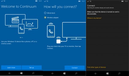
With the Windows 10 unified code base and variable design language, Microsoft is hoping to position Continuum as a halfway point between the mobile phone and the desktop, as a device that can revolutionise computing as a whole.
At the moment however, Continuum is limited to dedicated Windows apps, of which there are only a few, meaning the feature is effectively a mirror of Windows RT, enabling a little extra functionality when plugged into a bigger screen.
If the story of Windows 10 is one of potential however, then Continuum is easily the feature that has the greatest chance to become something great; however only time will tell what will become of Microsoft's admirable effort.
Current page: Key features
Prev Page Introduction, design and display Next Page Specs and performanceSean is a Scottish technology journalist who's written for the likes of T3, Trusted Reviews, TechAdvisor and Expert Reviews.
