Why you can trust TechRadar
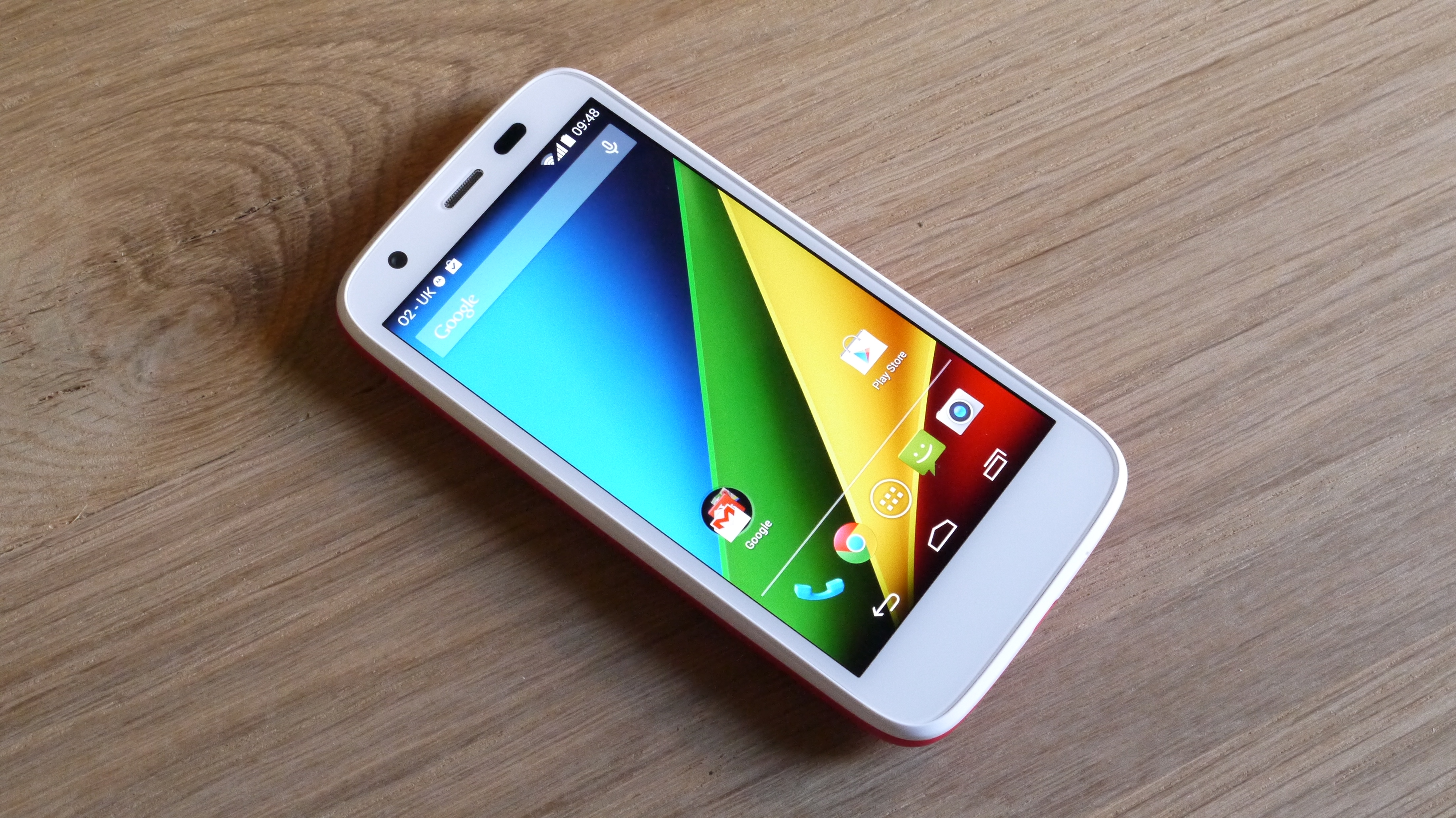
The Motorola Moto G was one of the first handsets to be updated to Android 4.4.2 KitKat and since then the 3G version of the phone has had a fairly speedy upgrade to Android 5.0 Lollipop - thanks to the manufacturer's close ties with the search giant. The 4G model is still to be updated, but Motorola has revealed that for this model it will be skipping Android 5.0 and jumping straight to Android 5.1.
With a 1.2GHz quad-core processor and 1GB of RAM at its heart, the Moto G is more than well equipped enough to run Lollipop which is the smoothest version of Android to date, but if you're on the 4G version running Android KitKat you can expect smooth performance too.
Android purists will be pleased to learn that the Moto G and Moto G 4G are running the stock version of Android, with Motorola opting against applying an overlay - claiming instead that it's focused on things which add real benefit to users.
These "benefits" include a faster boot up time and improved audio, data management, web speeds and general navigation.
I found that the Moto G did boot up impressively quickly, but Motorola's claims that it performs various tasks quicker than the Samsung Galaxy S4 still seem a little far fetched to me.
Sure the interface is smooth - impressively so in fact when you consider the price - but I can't say that it noticeably out performs, or even matches the various flagships I've had the pleasure of using.
General operation under KitKat is fluid and while it may not be as lightening quick as the top end handsets, the quad-core chip is doing a good job under the hood and I had no issues with lag.
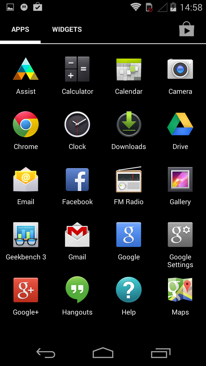
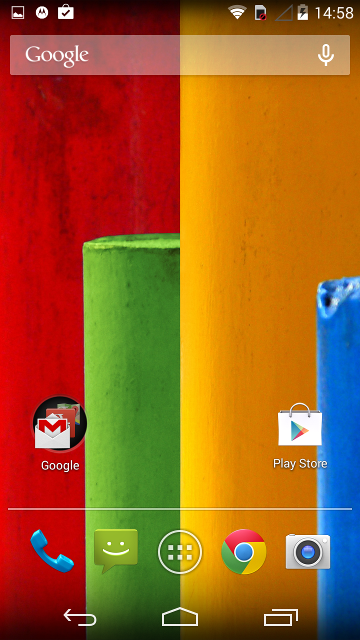
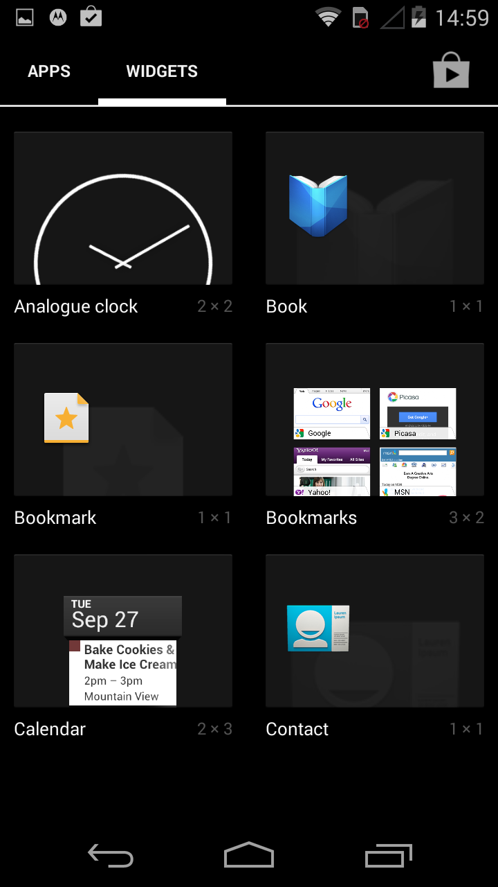
You get five homescreens - no more, no less (there's no way to add or remove) - and the familiar Android set up with a selection of widgets available in the tabbed app drawer for you to choose from.
Drag and drop an app onto another on any homescreen and the Motorola Moto G will automatically create a folder with both applications inside, allowing you to easily organize and manage your favorite apps.
The pull down notification bar at the top of the Moto G's display offers up a feast of information from recent calls, new emails and text messages to Google Now prompts, app updates and third party notifications.
Glide a finger over certain notifications, such as a new email alert, and it will expand allowing you to see a longer overview of the message.
Slide you finger up from the home key at the base of the screen and you'll launch Google Now, Android's own digital personal assistant and Siri rival.
Google Now offers up relevant information in a series of cards, and by tracking your movement, messages and emails it can tailor these cards to suit your needs.
You can get information such as the weather, meeting reminders and details on the journey home here. It's still relatively hit and miss and there are far fewer features enabled for those outside of the US, but Google is constantly working on Now and it's slowly becoming more relevant.
Tap the multi-tasking key in the bottom navigation bar and you'll be greeted with the familiar stack of thumbnails showing the apps which are currently running.
This is testament to the quad-core processor inside the Moto G and Moto G 4G, as the handset can comfortably handle multiple apps at the same time and you're able to switch between them very quickly.
Basic applications opened promptly, but I did notice some lag with some of the more demanding games, such as Stick Cricket and Stick Tennis.
When these were tapped the Motorola Moto G took a couple of seconds to load up the application. It's not a huge issue and game play is still smooth once you're past the initial load, but it just hints at a potentially small flaw in the low 1.2GHz clock speed of the quad-core chip.
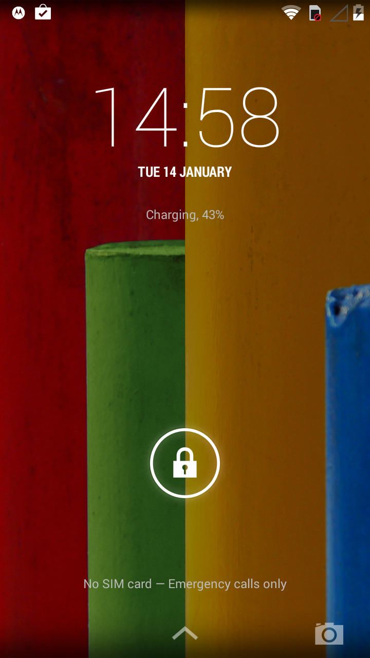
The interface is slightly different on the Lollipop-toting 3G handset, with Material Design giving it a new look and fluid animations, as well as improvements to the notifications system, which now prioritises them and places them on the lock screen.
The multi-tasking screen has a new look too and there are various other small but handy tweaks and features, like a flashlight option in quick settings.
Everything looks bright, crisp and clear on the 4.5-inch display and while the Moto G doesn't match up to the full HD offerings you get on the flagship phones, for a handset with such a low price you'll be more than happy and it puts the competition to shame.
There's a thin bezel down each side of the screen, but it's not the slimmest I've seen and I reckon Motorola is pushing its luck a little calling it an "edge-to-edge display."
Sure it doesn't feel like there's any unnecessary plastic padding around the screen, but it's not as close cut as on other handsets - the LG G4 springs to mind immediately as a handset with a slimmer bezel.
The screen is also very responsive to the touch which makes moving around the Moto G and Moto G 4G a stress-free experience.

TechRadar's former Global Managing Editor, John has been a technology journalist for more than a decade, and over the years has built up a vast knowledge of the tech industry. He’s interviewed CEOs from some of the world’s biggest tech firms, visited their HQs, and appeared on live TV and radio, including Sky News, BBC News, BBC World News, Al Jazeera, LBC, and BBC Radio 4.
