Why you can trust TechRadar
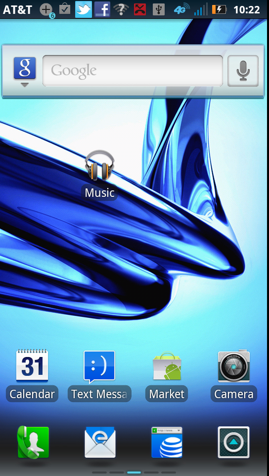
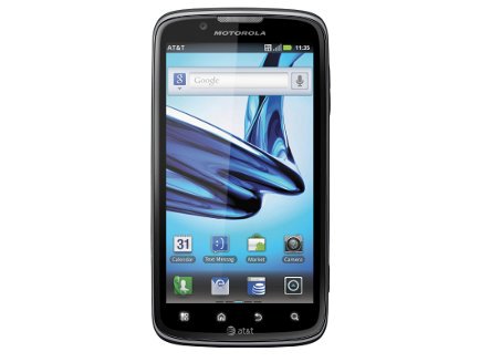
Like every other recent Android smartphone, the Motorola Atrix 2 uses a fairly standard implementation of Android 2.3 with some minor enhancements. HTC does a better job at adding useful widgets on phones such as the Sensation XE.
When there are similar widgets, such as the one for aggregating social networking feeds, the HTC interface is better designed with a more colourful appearance.
That said, the Motorola Atrix 2 is fast and nimble - swipes and other gesture registered accurately and we had no problems with apps loading slowly or the phone chugging along trying to figure out what to do. When you slide from one screen to the next in the app view, the icons move like a book on a page in a smooth animation.
There are five home screens for widgets, and three panels for storing apps, which is plenty of screen space for most purposes.

Motorola places key icons on the home screens, including the calendar, text messaging, Android Market and camera apps.
There is a dedicated camera button on the wide of the phone that you have to press for a moment to engage.
Other home screens hold less important icons, including a photo gallery app, music player and a calculator. You can move these icons around, ditch widgets at will and generally customise the wallpaper and look of the main screens.
One benefit of using less colourful widgets (and fewer of them) than HTC and Samsung phones is that the Motorola Atrix 2 is generally easy to use - there's little confusion about where to find apps.
You quickly learn that, by pressing the menu button below the main screen, you can access Settings. A dedicated phone icon helps you to access the dialler quickly.
Overall, the Motorola Atrix 2 is intuitive to use and doesn't hide options or make them hard to find. Some might prefer the more colourful approach of a Samsung or HTC phone. In many ways, the trim interface is more reminiscent of an Apple iPhone 4S in that icons are apps.
John Brandon has covered gadgets and cars for the past 12 years having published over 12,000 articles and tested nearly 8,000 products. He's nothing if not prolific. Before starting his writing career, he led an Information Design practice at a large consumer electronics retailer in the US. His hobbies include deep sea exploration, complaining about the weather, and engineering a vast multiverse conspiracy.

