Why you can trust TechRadar
Motorola Defy review: Interface
With Android 2.1 on-board, the Defy is a little bit behind the times. Really, we can't see why a handset that's being pushed like this one is can't carry Android 2.2, and its absence is a big point against the Defy.
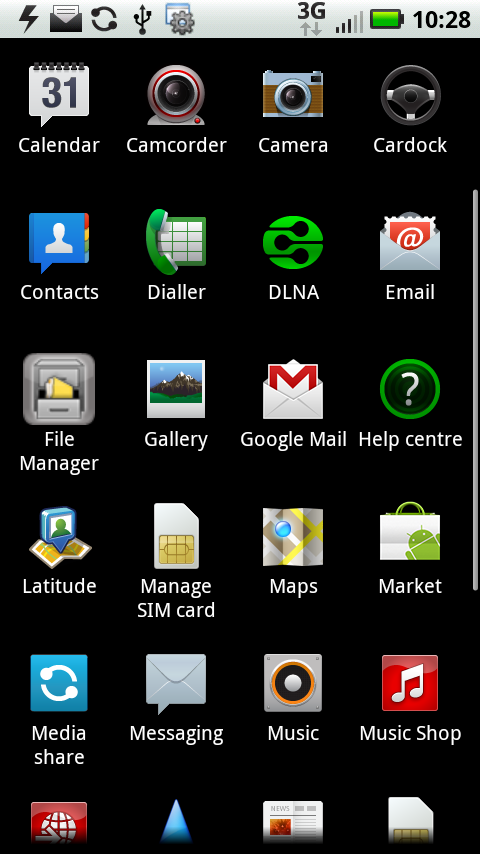
Motorola has skinned the basic Android experience and, while the skinning isn't overpowering, it certainly makes its presence felt. So, when you're looking at the main apps list, there's a certain familiarity to things but also some customisation.
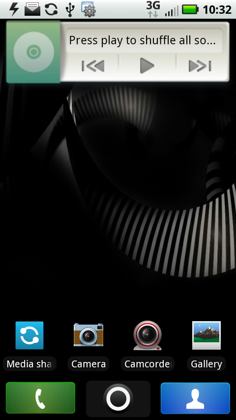
The seven Android main screens have an oddity about them, too. At the bottom of each of them are three shortcuts: to the dialler, contacts and the apps menu.
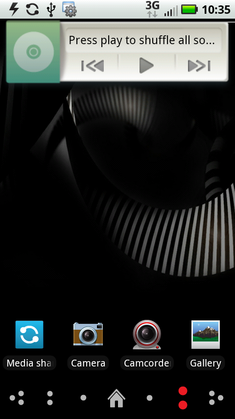
But immediately after you flick to a new screen, this is replaced by an icon that stays in place for just milliseconds and shows which screen you're on. We think it's over the top.
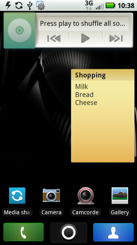
Motorola has added a lot of its own widgets. These give a real fillip to Android's own offerings, and enables you to do all kinds of things. For example: Sticky Notes let you, well, add a sticky note to a Home screen.
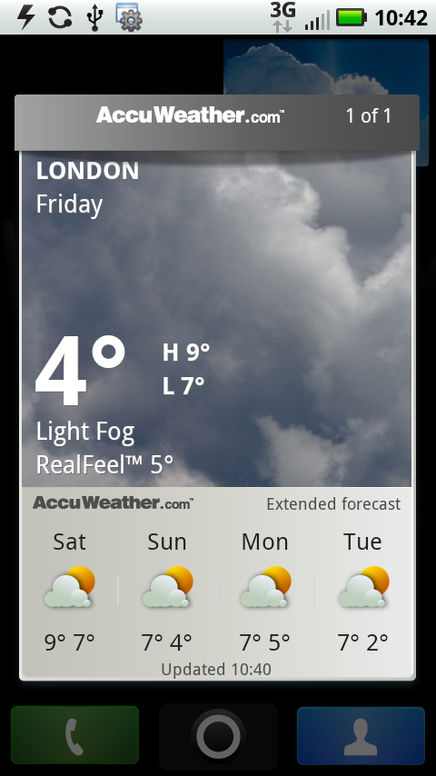
Weather gives you HTC Sense-a-like current weather info and forecasting data from AccuWeather.
And the photo widget gives you quick access to your gallery.
None of these blew our socks off, but it is nice to see the Android basics augmented.
The screen itself measures a reasonable 3.7 inches. Anything around the 3.7 and 3.8 mark is a good compromise between needing overly large hardware and not being big enough to deliver the detail needed for media-rich activities such as web browsing.
A pixel resolution of 480 x 854 puts it just slightly above the 480 x 800 of many of the leading edge smartphones of the day such as the HTC Desire, HTC Desire HD, HTC Desire Z and the new Windows Phone 7 devices such as the HTC 7 Trophy and LG Optimus 7 — though it's still bested by the iPhone 4.
Crammed into a small space, the pixels make for a sharp and bright display. The viewing angles are good too, and the capacitive screen was highly responsive to finger sweeps and presses.
If we have any complaints about the screen, it's that the Gorilla Glass is a bit of a fingerprint magnet.
Under the screen, there are four touch-sensitive buttons for the very familiar Android functions of Home, Menu, Back and Search. These are a bit close to the bottom edge of the chassis for absolute comfort, but they are responsive.
Current page: Motorola Defy review: Interface
Prev Page Motorola Defy review: Overview Next Page Motorola Defy review: Contacts and calling