TechRadar Verdict
A good effort at a comeback for Motorola, but more likely to be a pre-cursor for the next big phone rather than the one that will solve Moto's woes.
Pros
- +
Great embedded social networking
- +
Top notch touchscreen
- +
Easy to use QWERTY keyboard
- +
Good media offering
Cons
- -
Very chunky design
- -
Difficult to unlock
- -
Poor build quality between keyboard and screen
Why you can trust TechRadar
Motorola has been silent for a long time, but it has finally brought out the Dext – the first phone in years that can be spoken of in the same breath as the Palm Pre and HTC Hero.
We all marvelled at the Razr, which was so thin that we didn't care there was a rubbish phone underneath. But then Motorola felt its laurels were pretty comfortable, so decided to have a little rest there.
But now it's back with Google Power, and the Dext Motorola's first Android phone. It's taken a leaf out of HTC's book and seen what can be done when you fuse Android with a little extra – in the case of the Dext it's MotoBlur.
Motorola is hoping this new social networking-friendly overlay will work wonders and see customers flocking back to the brand – but is a bit of Facebook and Twitter enough?
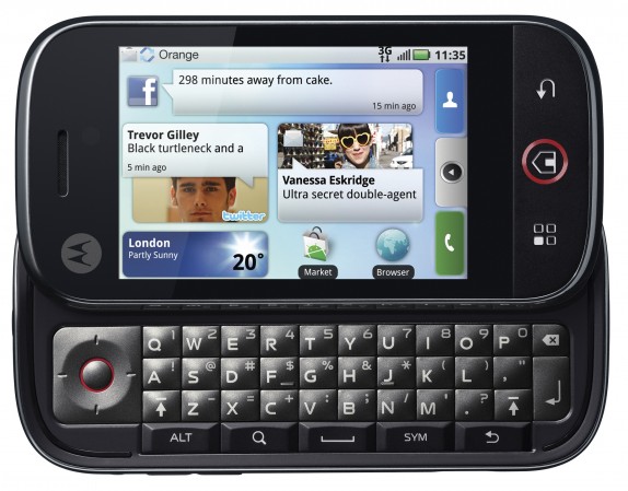
The Dext is a pretty big device, thanks to packing a full QWERTY keyboard and a 3.1-inch capacitive touchscreen. It feels like two phones merged together – with a super thin iPhone-a-like on top with a chunky physical keyboard beneath.
It's similar in form factor to the HTC Touch Pro 2 rather than the T-Mobile G1, and the top portion is – in an uncharacteristic move from Motorola – poorly connected to the bottom, with a large amount of wiggle making the whole thing feel cheaper than it should.
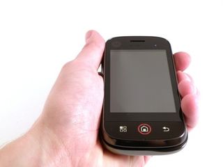
It's a shame, as apart from being a little large, the Motorola Dext is a nice phone. It feels a little strange in the hand with its generous dimensions, and won't be pocket-friendly if you're into skinny jeans, but there's a reason Motorola has made it in such a way.
Apart from its large and responsive touchscreen, the inclusion of a full keyboard on the Dext gives users the choice of text input. The keys are well formed and rubberised, with a decent amount of travel and space around them.
However we've given a few people the Dext to play with and the reviews of the keyboard have been mixed. Some liked it, but some said the keys were too squashed together vertically. Our own opinion is that this is a good keyboard, as we quickly got to grips with it and our accuracy was almost perfect within a day.
We compared this to the likes of the N97 and the G1 – no matter how much time we took to play with them there was always a degree of misspelling – and you can see why we're such fans.
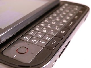
The layout of the phone is not so great though. The keyboard is decent enough, with an Alt and Shift key (two of the latter) giving easy access to a number of characters, but the other keys aren't so ergonomically intuitive.
The power / hold key is hidden between the two partitions on the upper right-hand side of the phone, and no matter how hard we tried, it wasn't easy to hit. The camera button is in a similar place, and not only does it require a really hard press to start up, but it's also in a slightly tricky-to-hit place.
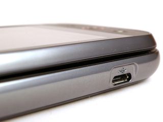
On the left-hand side is the silencer switch and the volume control, with the microUSB port at the bottom. The latter isn't covered, so you'd best watch out you don't pour dust in there or else charging the phone will be a nightmare.
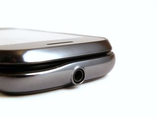
The 3.5mm headphone jack is almost ornately carved into the head of the Motorola Dext, with sweeping curves leading to the protruding port. It's a little much, but at least you'll always be able to find the socket in your pocket.
The front of the phone hosts the three main buttons (no wealth of HTC-like keys here). It's basically a menu key, home button and back key, with the search button put on the QWERTY keyboard (which we must say is a more sensible place for it on such a phone.
There's also an unobtrusive tiny white LED in the top left-hand corner, which blinks for notifications, and is just the right brightness to be visible without being annoying when you're trying to ignore it on the desk.
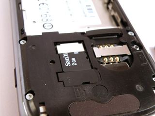
The rear of the phone has only two things – the dappled cover and the 5MP camera (without flash). It's easy to remove the cover to get to the battery (which has a pleasing old-school pull tab to remove the battery) and memory card.
Both the SIM card and the microSD are locked in by weird rubberised gates – we don't know what's wrong with a good old-fashioned push and click, but there you have it.
It's not the most aesthetically pleasing device, and the large amount of give between the top and the bottom of the Dext is very annoying, but it's generally a well laid out phone and manages to stick a fair amount of keys and switches into a palm-sized device.
Current page: Motorola Dext: Overview, design and feel
Next Page Motorola Dext: Interface
Gareth has been part of the consumer technology world in a career spanning three decades. He started life as a staff writer on the fledgling TechRadar, and has grew with the site (primarily as phones, tablets and wearables editor) until becoming Global Editor in Chief in 2018. Gareth has written over 4,000 articles for TechRadar, has contributed expert insight to a number of other publications, chaired panels on zeitgeist technologies, presented at the Gadget Show Live as well as representing the brand on TV and radio for multiple channels including Sky, BBC, ITV and Al-Jazeera. Passionate about fitness, he can bore anyone rigid about stress management, sleep tracking, heart rate variance as well as bemoaning something about the latest iPhone, Galaxy or OLED TV.
