Why you can trust TechRadar
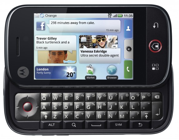
The MotoBlur interface is basically the same as HTC's Sense UI but taken in a different direction. Motorola took great pains to point out how very different it is to HTC's effort at the launch, but in all honesty there's only so many ways you can squeeze social networking onto an Android phone.
The main crux of the device is 'Happenings', which is another dubious word for updates on Twitter and Facebook. Starting up the phone is a slightly convoluted process as it requires to you to not only set up a MotoBlur account, but also to login to Google, Twitter, Facebook and MySpace in order to access those accounts and integrate them with the phone.
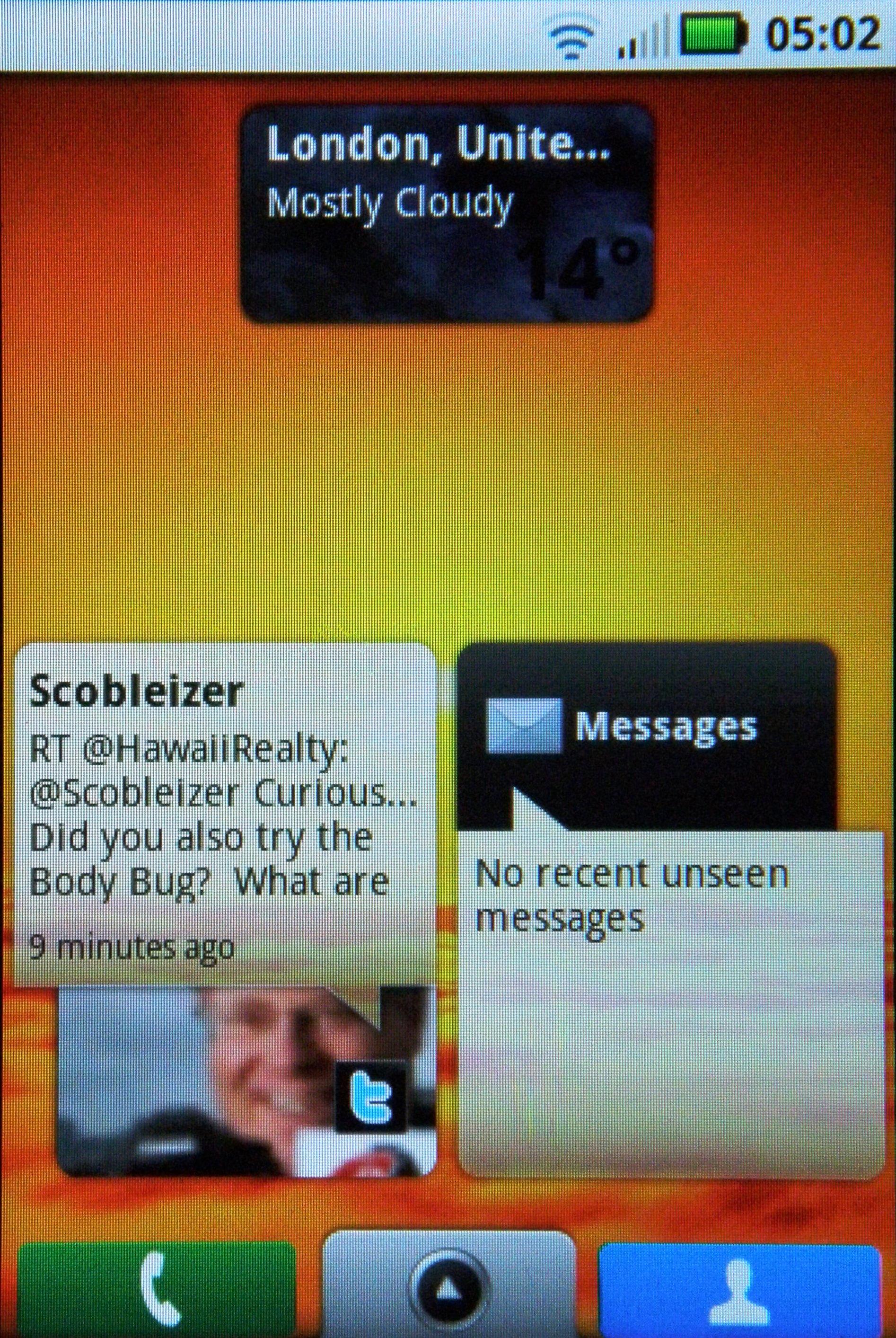
The Dext then takes you to the Android home screen, with the traditional background seen on the HTC Magic and G1 and the Samsung i7500 Galaxy.
But there's a difference – not only do you get five home screens, but there are up and running widgets spewing information about your friend's statuses from Twitter, MySpace and Facebook.
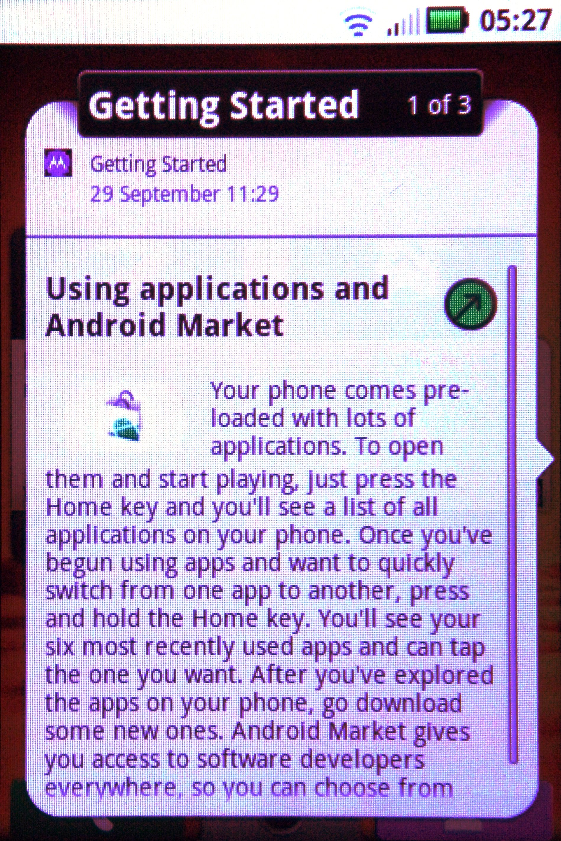
Scroll around and there are news widgets, RSS feeds and tips and tricks to help you set up the phone. Tapping any of these will lead to a larger dialog box opening up, with a small green arrow taking you to the web version of any article or status.
The touchscreen on the Motorola Dext is top notch, registering the faintest of flicks with ease – Motorola has definitely vaulted into the upper echelons of touch responsiveness along with the Apple iPhone 3GS, Palm Pre and HTC Hero.
This is a very important feature on the Dext, as so much of it is scrolling through items like statuses. The first problem we envisaged with MotoBlur is that having all your Twitter and Facebook accounts synchronised into one stream (the Happenings... which sounds like a rubbish pop-horror film) is that the amount of information from 200 friends and the hundreds of people you're following on Twitter will result in an overload.
Well, that was the case at the start, and we worry that some users might simply switch off the happenings widget, especially as the pictures taken from Twitter accounts to furnish the Tweet are of a horribly low resolution and are cropped badly – it doesn't look good.
But take a couple of days to get used to it, and Happenings is a pretty good tool. It would be nice to have a dedicated Twitter client on the phone too (although you can download the likes of Twidroid from the Android Market), as in the HTC Hero, for more advanced Twitter functionality, but the Dext does let you update your status direct from the phone.
In fact, you can update the status of one or multiple accounts at once, so if something vitally important has happened (like you've had a new brand of cereal that morning and simply MUST tell the world about it) you can Tweet it and use it as a status on MySpace and Facebook too.
Some people might find that Twitter is just too constantly updated and will only want to see their friend's status from Facebook – you can select to see some, all or none of your social networking accounts through Happenings if you so wish.
However, it would be nicer if you could have one widget for Twitter, one for Facebook and so on It's just a bit much having them all in one place, even though it's easy to get used to as we said.
Also, we'd like to see an 'all read' label on Happenings – it's constantly telling us we have hundreds of unread statuses, but the reason we haven't read them is because they were from hours or days ago.
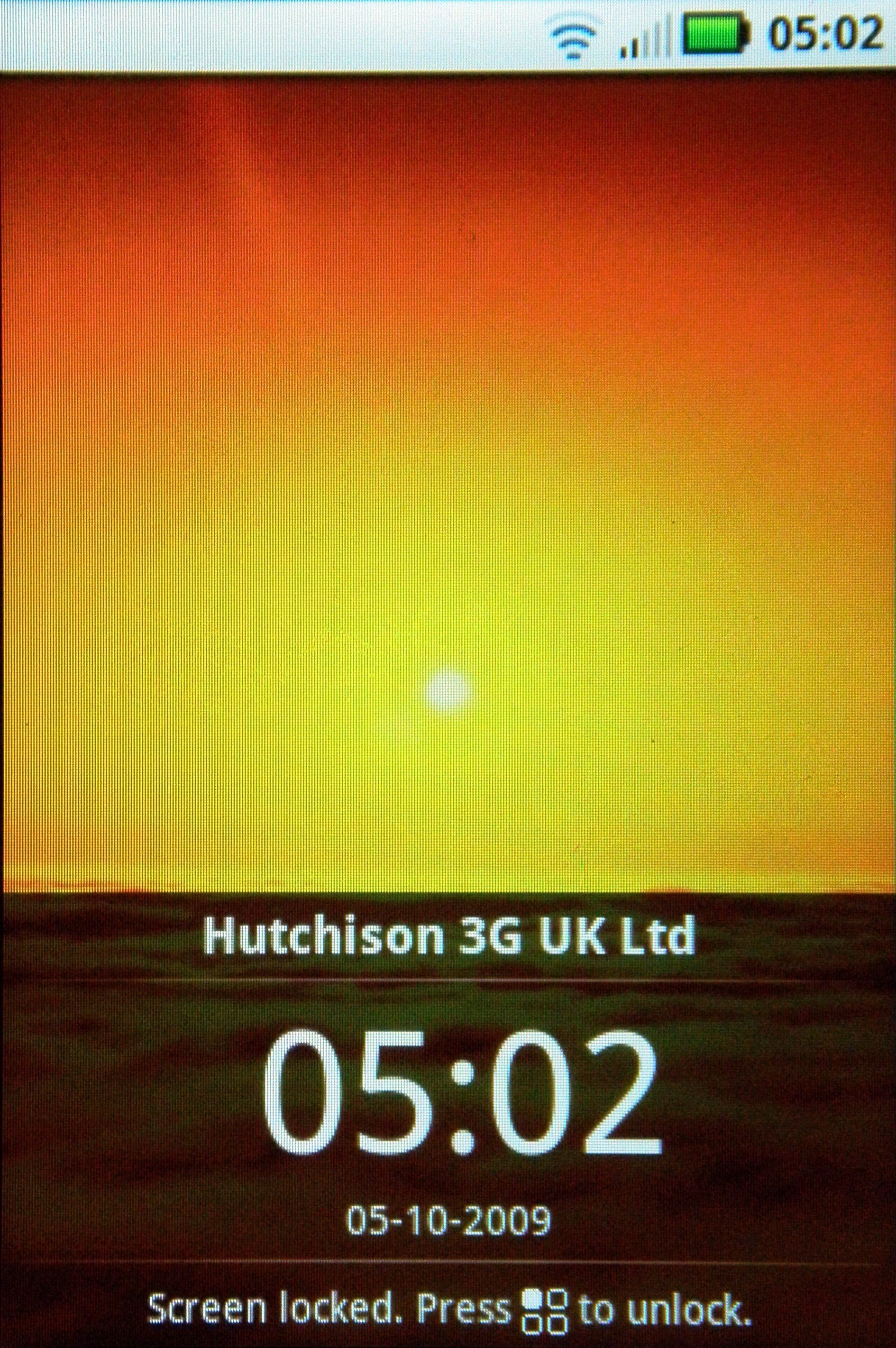
Locking the phone is once again a convoluted process – we miss the simple 'Menu, *' options of old. While it's nowhere near as bad as the Samsung i7500 Galaxy, the new phone needs you to hit the annoyingly placed power key and then tap the menu button – for some reason we couldn't get used to this and kept hitting the wrong options.
Other than the widgets on offer, it's standard Android fare, and it's here that we feel Motorola has missed a trick. So much of consumer opinion is about perception, and MotoBlur needs to be seen as an evolution in Android. So why put the standard background on at the start?
HTC managed to make some people think there was a new OS under the hood of the Hero, simply by inserting a new background to make the new widgets look even snazzier. Had Motorola done that, it would have made people realise MotoBlur is more than just a collection of widgets spitting information about their friends.
But we can't be angry at another phone using Android, especially as it adds something to the burgeoning OS. We're happy to see the standard tools present once more – pulling down from the top of the screen to access notifications about messages or USB connections or movement into roaming zones is still a great trick.
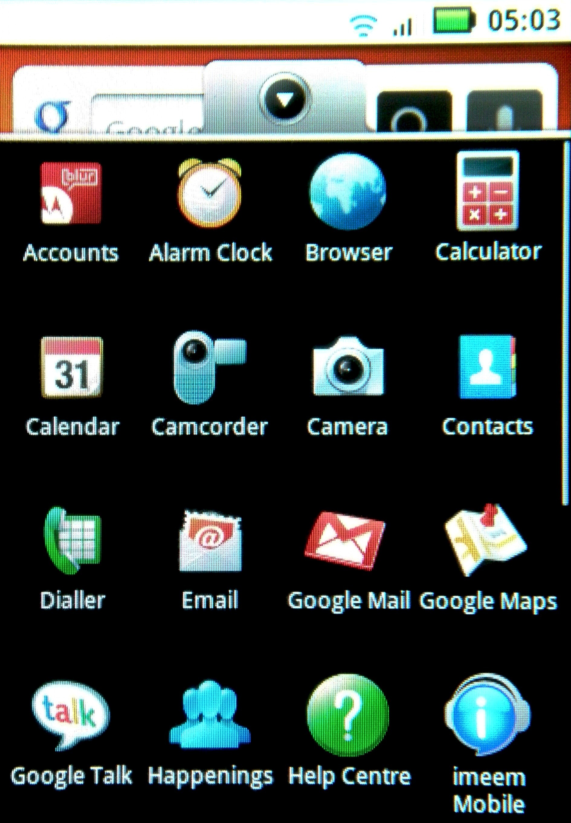
As is grabbing the menu tab to open up the icon list, and holding said icons down to place them on the home screen. We also still love the fact that holding an icon opens up the deletion bin – it just makes organising the home screens (and as we have five, they need even more upkeep) even easier.
The accelerometer works well too – we love those that can spin through 360 degrees for whichever way you want to hold up the phone, and the Dext does just that.
However, open up a couple of applications (such as the music player) and the whole thing slows down a lot – pressing buttons requires a couple of seconds waiting, in which time you've probably accidentally hit another icon.
It's a shame for a phone that promises a lot – perhaps Motorola should have done better than the Qualcomm 528 MHz processor it stuck under the hood.
The Motorola Dext might be a little bit too heavy when it comes to showing you information, but MotoBlur is something new and exciting for Android, and shows the power of the OS when the big names get developing for it.
Current page: Motorola Dext: Interface
Prev Page Motorola Dext: Overview, design and feel Next Page Motorola Dext: Calling and contacts
Gareth has been part of the consumer technology world in a career spanning three decades. He started life as a staff writer on the fledgling TechRadar, and has grew with the site (primarily as phones, tablets and wearables editor) until becoming Global Editor in Chief in 2018. Gareth has written over 4,000 articles for TechRadar, has contributed expert insight to a number of other publications, chaired panels on zeitgeist technologies, presented at the Gadget Show Live as well as representing the brand on TV and radio for multiple channels including Sky, BBC, ITV and Al-Jazeera. Passionate about fitness, he can bore anyone rigid about stress management, sleep tracking, heart rate variance as well as bemoaning something about the latest iPhone, Galaxy or OLED TV.
