Why you can trust TechRadar
Interface
If you've read our Moto X review, you'll find a few similarities here with the interface. To start, the Droid Ultra is running Android 4.2.2 Jelly Bean with a custom skin or user interface.
Let's start with the phone sitting on your desk - it's turned on, but it's asleep and doing virtually nothing. When the device senses movement, the time comes on along with any notifications you might have.
The phone invites you to press and hold on the notification, and then it tells you what you can do with that. You can either drag your finger downward and unlock your device, or you can drag it upward and get a preview of your notifications.
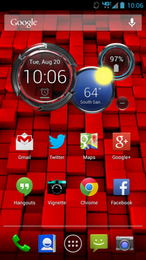
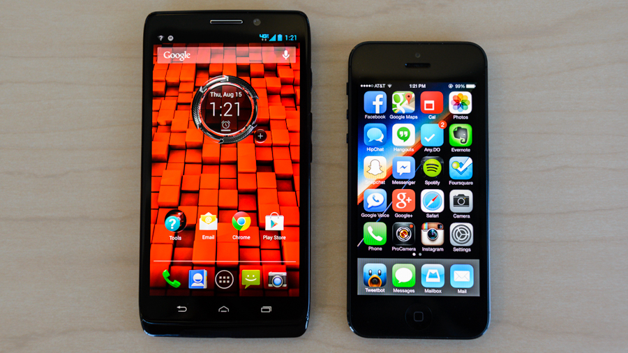
Once your phone is on, you'll be illuminated in a bright Verizon red color, along with a widget that tells you the date, time, local weather and battery percentage. Having all this information is useful, so we've left that widget alone despite its machine-like looks.
If you flip the circles that comprise the widget, you'll see additional settings for that widget. And if you press the small minus button next to it, you can collapse it down to just the date and time circle.
You have five home screens that you can customize with app icons and widgets, all to your liking. Although it might be nice to have up to seven home screens, we usually find it unnecessary and end up using fewer than the five that are available.
Customizing the home screens is easy, and is just a matter of pressing and holding and dragging icons and widgets, or pressing on an empty space in the screen to bring up additional options.
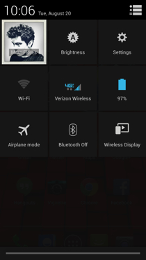
The notification bar at the top, which is expanded by dragging it downward, gives you access to all your notifications and settings. When you click on the Settings icon, you'll immediately see a few shortcuts to your most used settings: Brightness, Settings, Wi-Fi, Cellular connection, Battery, Airplane mode, Bluetooth and Wireless Display.
Back to your home screen, there is a dock at the bottom that can hold up to four app icons, with your app list shortcut set right in the middle.
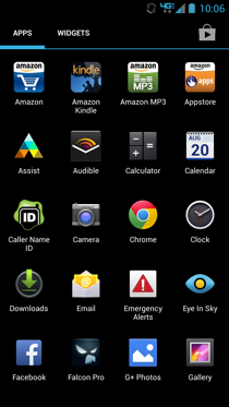
When you jump into your full list of apps, you flip through them going left or right, much like you would on a Nexus device (rather than up and down like on HTC Sense, for example).
The interface is pretty intuitive overall, and with a little tinkering you can find the fastest way around your smartphone in a way that works for you. Luckily, we didn't experience any lag or crashes during our testing period, so we can confidently say that you probably won't, either--at least until you start filling it to the brim with apps, music and media content.
Performance
In our time with the Droid Ultra, we didn't run into any system performance issues. Swiping between screens and going in and out of apps and settings was fast (i.e. it took a second or less for each action without lag or crashes).
There is one area, however, that gave us some performance trouble, but we believe it's because it's a new feature that still needs work: touchless control.
Touchless control works exactly like it does on the Moto X. The device's microphone is always on, and the feature can be activated by saying, "OK Google Now." But first, you have to go into Settings to set up the feature.
The instructions will guide you through the setup process, which involves saying "OK Google Now" three times so that the system can recall and recognize your voice. Once you're done, you can go through the types of commands that touchless control offers, like searching for items on the web or making phone calls.
One of the biggest benefits of touchless control is the ability to interface with your device when you're driving. You can have text messages sent or read aloud to you, and when you start driving it goes into drive mode, which offers navigation features if you need them.
When touchless control works, it gives you a little sense of victory. You smile a little and think to yourself, "Yeah. That's right." But when it doesn't work, you'll often become frustrated and wonder why smartphones even exist and why you shouldn't just throw it out the window. OK, maybe we're exaggerating a little, but that's how frustrating it can be when your voice doesn't register, or it doesn't understand what you're saying.
Although it's going to take some work, touchless control has good potential. Just don't expect to use this as a way to interface with your phone all day long. It really only comes in handy when your hands are tied or when you're driving.
Specs
As far as specs go, the Droid Ultra isn't too far off from the Moto X. We're really curious where people flock to when the two share shelf space at Verizon retail stores. It has a 1.7GHz Snapdragon S4 processor with what Motorola calls its X8 Computing system, 2GB RAM and 16GB on-board storage (no SD card support).
Its 2,130mAh battery promises up to 28 hours of usage, which is surprising considering the Moto X's 2,200mAh battery only promises 24 hours of usage.
The 5-inch display has a resolution of 1280 x 720, so it's not the sharpest screen on the market 294ppi, but it's not bad at normal viewing distances, as we've mentioned before.
Battery life
We were generally pleased with battery performance during our testing period with the Droid Ultra. Motorola claims a 28-hour usage life span before the device needs a charge. It's optimistic, as far as our experience goes, but it certainly lasts an entire day.
We took the smartphone off the charger around 9 a.m. every day, and at around 10 or 11 p.m., shortly before we were hitting the hay, we were left with about 15-20%. That's not bad at all by today's standards, though if battery life is the biggest deal for you, the Droid Maxx might be your best bet.
While sitting idle, battery drain wasn't bad at all, either. If left fully charged before going to bed, it'll drop to about 95-96% with all notifications turned on.
Current page: Interface, performance and battery
Prev Page Introduction and design Next Page Call quality and connectivity