Why you can trust TechRadar
Motorola Flipout review: Comparison and verdict

Possibly the most obvious handset to compare the Motorola Flipout to is Motorola's own Defy. The Motoblur social networking facilities and connected music player are on both, and if you want these, in usability terms the Defy is a much better, if considerably more expensive, option.
If you can live without those two features but want Android, then we have to go where we so often turn at the budget Android end of things at the moment, to the Orange San Francisco. For £99, you get Android 2.1 and a larger screen on pay as you go - and it's even on the same network as the Flipout.
Oh, and one final point – there is a reason people shy away from making handsets that have peculiar shapes. For the most part, they aren't ergonomic - and people love ergonomics.
We liked
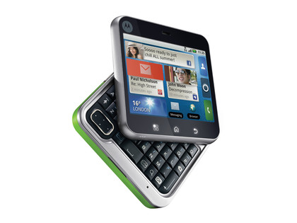
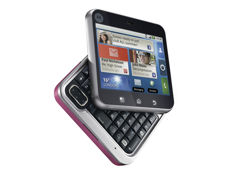
There's a certain satisfaction about flipping the keyboard in and out, which we got to rather like. The Flipout also fits neatly into a pocket.
The connected media player is a super little piece of tune- and video-playing cleverness.
Motoblur is impressive, though the small screen of the Motorola Flipout doesn't do justice to its ability to unite Twitter and Facebook feeds.
Motorola really knows how to bring Facebook and Twitter data into contacts well, and within minutes you can have a fully populated, interconnected contact book - although this is across most of its range, so you'd be better served looking at a more powerful device, like the Motorola Atrix.
We disliked
The small screen leaves us wanting more at almost every turn simply because of its inability to display enough information.
The web browser in particular struggles with the amount of screen available to it, and pinch to zoom was a stuttering experience, too.
Motorola needs to get to grips with Android 2.2 (unless it plans to skip it entirely go straight to Android 2.3) - although sadly that now looks like it won't be the case.
The physical keyboard is good – but not great. If you're going to buck the trend and do something out of the ordinary with a handset design, it has to be great to pass muster – not merely adequate.
Verdict
Motorola has followed up an improving range of Android devices with the lacklustre Motorola Flipout. While the Flipout carries many of the same software facets as the Defy – Motoblur, DLNA, connected media player, they're cramped into a small screen that makes it difficult to get the most from them.
We aren't convinced that the quirky physical design has a lot of traction, and the so-so quality of the physical keyboard doesn't help in that respect – nor does the build quality, which feels too plasticky to us.
With battery life coming in at about a day, we can't even give additional points for longevity.
It's not a terrible phone, and the ever-more budget price tag is certainly going to appeal to some, as is the fact it has a physical keyboard - something a lot of people really miss.
We just feel like the overall Motorola Flipout package could be a lot better - perhaps the Motorola Flipout 2 (if it ever appears) will manage to iron out some of the kinks.
Current page: Motorola Flipout review: Comparison and verdict
Prev Page Motorola Flipout review: Official gallery