Why you can trust TechRadar
Motorola Flipout review: Interface
Motorola seems quite keen on Android 2.1 having opted for that with the Defy as well as the Flipout. Really, we think Moto should bite the bullet and get with version 2.2 - but sadly it now looks like that won't happen.
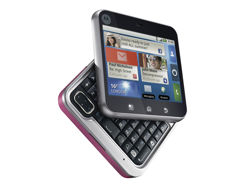
In fact the Defy and the Flipout share a lot in terms of user interface look and feel, it's just that the Flipout screen measures a squished 2.8 inches and offers 320 x 240 pixels while the Defy is a more conventional 3.7 inches and 480 x 854 pixels.
What a difference the size variation makes.
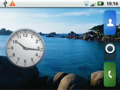
Motorola's Android's skin has been tweaked a little to fit the screen size. For example each of the seven Home screens has its Menu, Call and Contacts buttons on the right edge instead of along the bottom.
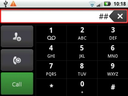
And when it comes to the dialler the call, recent calls and add contact buttons are on the left of the number pad.
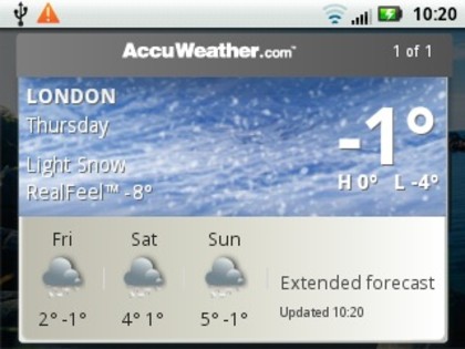
But you can still populate the seven Home screens with widgets. The smaller screen space means you can't get as many as you might like on a single screen, and those that take up a full screen can feel squished. Take the AccuWeather weather widget for example.
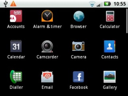
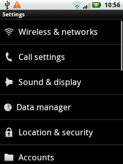
Where you notice the screen squeeze the most, though, is in lists and suchlike. The menu screen shows a smaller array than usual of apps, and menus show fewer choices than usual. All this means you need to do more scrolling.
Current page: Motorola Flipout review: Interface
Prev Page Motorola Flipout review: Overview Next Page Motorola Flipout review: Contacts and calling