Why you can trust TechRadar
Motorola Milestone 2 review: Messaging
Text messaging is the standard Android default, but given a grey and yellow makeover. Messages are threaded and a long-press brings up the option to delete an individual text from the thread, forward it, copy the text to the clipboard or lock it to give it a little extra protection from deletion. It's basic but does the job.
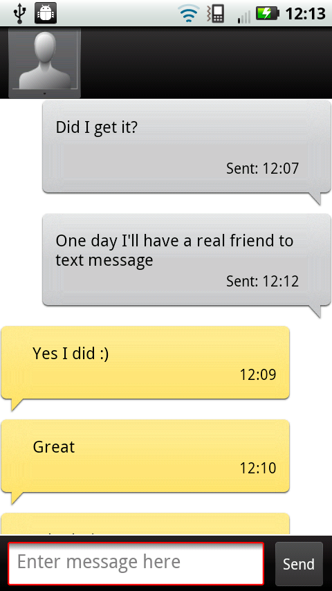
Twitter and Facebook integration is handled entirely by Motoblur, with no other third-party social apps pre-loaded on the phone.
Motoblur's Messages widget doubles as your universal inbox. It'll pull in text messages, emails from any accounts you've registered with Motoblur and direct communications from Twitter and Facebook, letting you reply to all of them from within the expanded widget.
For reading general status update and timelines, Facebook, Twitter and the other social networks have been busted out into a standalone Social Networks widget. From here you're able to favourite and retweet Twitter messages, with the Facebook panel also supporting the reading and leaving of comments.
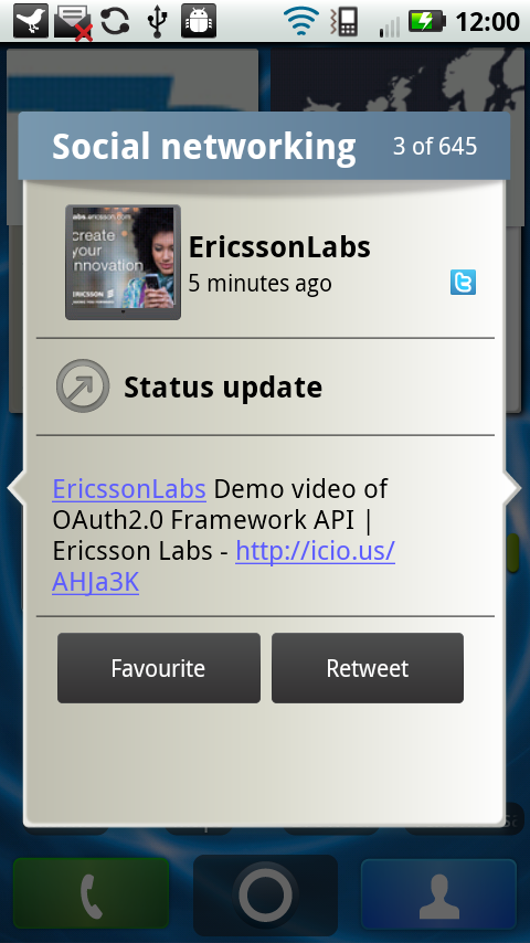
Both widget options let you scroll through messages and reply, but there's no refresh or reload option - so you're left staring at them wondering when/how they last checked to see if you've had any life-altering Facebook pokes.
A separate Social Status widget lets you post new messages direct to your social networks, via a simple text screen. It's all a bit fractured, basically, with much over-duplication and confusion.
You'd be far, far better off binning it all for something more functional from a third-party, like the lovely Android TweetDeck app.
Android 2.2 supports Exchange email and calendar sync, with standard POP3 email accounts added via Motorola's simple account management screen.
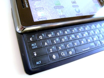
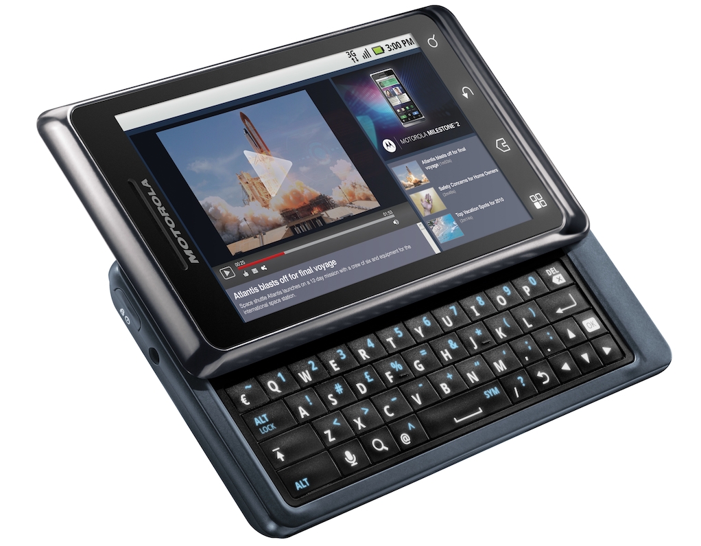
As for writing on the QWERTY keyboard? The keyboard itself is formed by placing a flexible plastic sheet over little switches, so it's possible to feel the little bump of each key switch beneath your fingers or thumbs.
These little nodules help you find each key, plus the switches are very stiff, so you never accidentally press two at the same time.
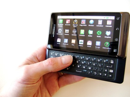
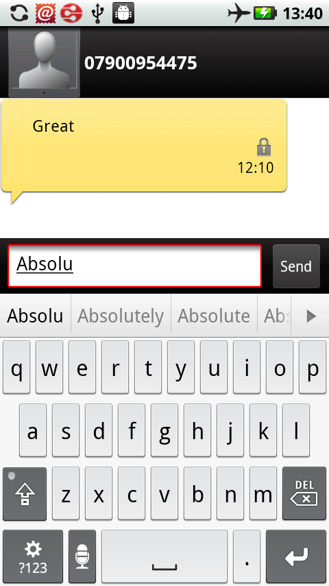
Pressing the top row of keys can be awkward, because there's not a lot of clearance between the keys and the bottom on the screen. Usability is enhanced by the word prediction tool (that can be turned off), which is conveniently placed along the bottom edge of the screen – so while space is tight, at least the system makes good use of the screen's closeness to the keys.
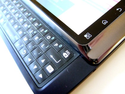
Also welcome is a four-way cursor key area that replaces the original Milestone's directional button, so you're able to quickly whizz the cursor around text boxes to make edits – plus there's an Android Back button here too, making it easy to operate the whole phone via keyboard alone. And it's backlit, which is also handy.
It'd be nice if there was a second shift key on the right-hand side of the keyboard, because pressing the left shift key and a letter on the left of the layout is a little cumbersome – but given the slim, compact form factor of the phone, it's not too much of a compromise.
It's still not the perfect solution to a mobile QWERTY, but if you're prepared to practice and work on a separate typing style, it's among the best we've seen so far.
Current page: Motorola Milestone 2 review: Messaging
Prev Page Motorola Milestone 2 review: Contacts and calling Next Page Motorola Milestone 2 review: Internet