Why you can trust TechRadar
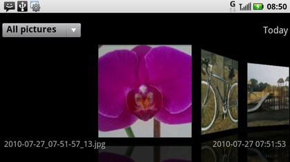
With Android 2.1 at its heart the Motorola Milestone XT720 is well equipped with modern smartphone goodness. Motorola adds its own touch user interface elements on top to give you some nice tweaks, such as a scrolling menu for viewing pictures which is accessible direct from the camera.
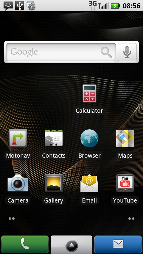
Motorola has also done its own thing with the main screens selection. The Home screen has room for nine application shortcuts and, along the bottom of the screen there are shortcuts to the dialler, messaging and, in between these two, an icon you sweep upwards to get to the main apps menu.
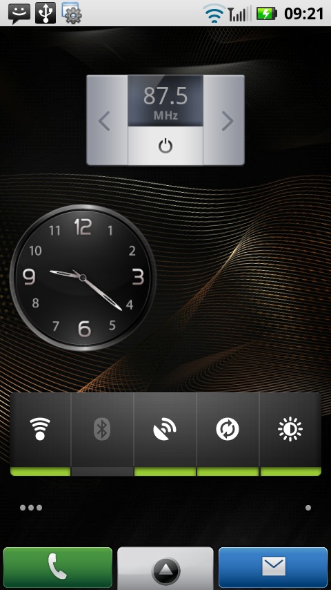
There are five Home screens in all, and, as usual, you get to these with horizontal finger sweeps and can fill them with widgets.
The front chassis is not without its buttons, too. There are four, beneath the display. They offer the usual Home, Menu, Back and Search functions.
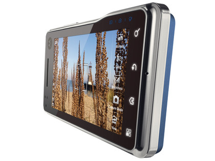
On that little hump on the right of the chassis there are three tiny teeny icons that look as though they might be touch buttons too. In fact they just light up to remind you what camera mode you're in – video, camera or gallery. Yeah, thanks Moto.
The screen is an absolute wonder. We've already said that it measures 3.7 inches, which puts it on a par with the HTC Desire, and makes it .2 inches larger than that of the iPhone.
But there's more to it than size alone. The screen delivers 480 x 854 pixels. Now, the HTC Desire manages 480 x 800 and the iPhone 4 has its well-documented 960 x 640.
The screen is a standard TFT and it isn't as bright or resoundingly clear as super AMOLED screens such as that on the Samsung Wave. In fact, we had trouble viewing it in bright outdoor sunshine.
The screen is capacitive, which means it responds to pinch to zoom requests, though we found this a little hit and miss at times. And, in general, we found the screen less responsive to taps than we'd like.
Mostly it wasn't a problem, but it's not up there with the best. Another negative on the screen is that it is a real fingerprint magnet.
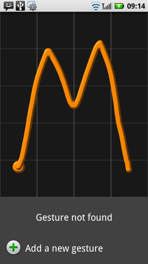
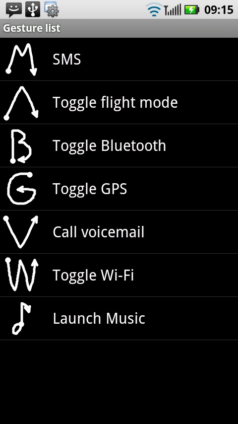
Motorola has implemented a clever little feature called My Sign. You can use this to get quickly to an app or service by designating an on-screen gesture as a link to it. You need to actually run the My Sign app for gestures to be recognised, though, so this is best put on the main screen if you want to use it.
In general we like the UI tweaks that Motorola has thought of, but it has to be said that things aren't as slick as they are on HTC's Sense user interface.
Current page: Motorola Milestone XT720: Interface
Prev Page Motorola Milestone XT720: Overview Next Page Motorola Milestone XT720 Calls and messaging