Why you can trust TechRadar
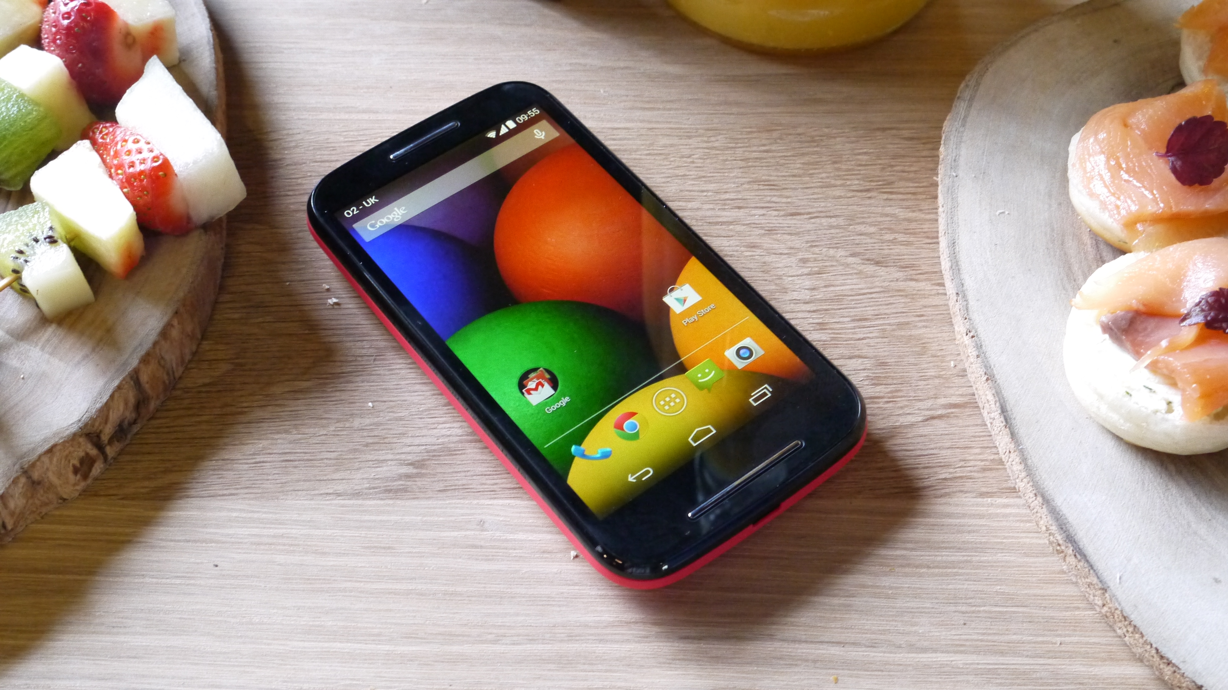
The Motorola Moto E's interface doesn't stray far from stock Android, which given that it's running the latest version (4.4.2 KitKat) isn't necessarily a bad thing.

It's fairly plain and basic with little in the way of fancy features, but everything is where you'd expect and works as you'd expect.
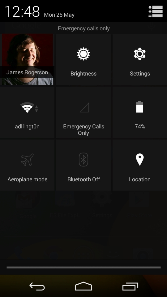
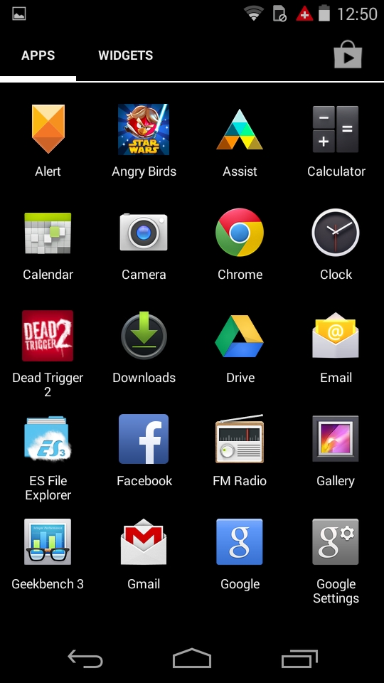
There is an app drawer at the bottom of the screen, quick toggles (such as Wi-Fi, Bluetooth and brightness) available from the notifications screen. The three software buttons- home, back and recent apps, handle just about everything that a tap or a swipe won't.
The Moto E has five homescreens, all of which are enabled from the start and you can't add or remove any, so initially you'll have a lot of empty space, but that can quickly get filled up with apps and widgets.
If things start to get messy you can create folders by dragging one app on top of another. You can slide down the notifications bar at the top to view any updates, missed calls, calendar events or, well, anything else you might have expected to be notified of.
A tap of the recent apps button at the bottom will let you quickly flip between the apps you're using. The main settings screen can be launched from the home screen or quick toggles screen and has all the standard Android options you'd expect, such as the ability to change the font size, set up Wi-Fi connections and manage applications.
It's also worth noting that Motorola has committed to upgrading the Moto E to the next major version of Android when it arrives, so it may be a cheap phone but it's not going to immediately become outdated.

Performance could be better. The Moto E has a 1.2GHz dual-core Snapdragon 200 processor, 1GB of RAM and an Adreno 302 GPU, so it's to be expected that it wouldn't be great.
I found that swiping between home screens was smooth enough and the touchscreen was responsive, but launching apps was often slow. Most would only take a few seconds to load, but when all you want to do is read a message the wait can be annoying.
Once you actually get into an app though it normally runs fine, the only real exception being if you're downloading something.
As soon as you start doing that the whole phone screams to a halt to the point where I even experienced lag when typing on the keyboard.
I should emphasise though that the whole thing is perfectly useable and when not downloading anything it runs fine, which is an admirable achievement for such a low cost handset.
It might not top the benchmarks, in fact with a GeekBench 3 score of 609 it most certainly does not, coming out only a little higher than the Vodafone Smart 4 Mini and well below the EE Kestrel. But it works and it doesn't feel like a chore to use, which is a key thing at this price point.
Current page: Interface and performance
Prev Page Key features Next Page Battery life and the essentialsJames is a freelance phones, tablets and wearables writer and sub-editor at TechRadar. He has a love for everything ‘smart’, from watches to lights, and can often be found arguing with AI assistants or drowning in the latest apps. James also contributes to 3G.co.uk, 4G.co.uk and 5G.co.uk and has written for T3, Digital Camera World, Clarity Media and others, with work on the web, in print and on TV.
