Why you can trust TechRadar
Key features
What are the key feature of the Motorola Moto E (2015) you ask? Of course the main one is the price! Motorola is offering some pretty good specs here for a phone knocking around the £100 price tag, making the Moto G look like an expensive piece of kit.
A bunch of retailers are offering the Moto E for £109 SIM-free. In this kind of category you can also get the EE Kestrel at £99, the Nokia Lumia 530 for around £89 and the Sony Xperia E3 for around £80.

The Moto E sits at least £10 higher than that but it offers quite a lot more functionality than the other competing handsets with the EE Kestrel the only one in that list also offering up 4G internet.
The Moto G is also a close competitor with an average price of around £139.99 and some interesting features. If anything the Moto G is probably the closest great competitor in price to the Moto E so be sure to read our review before making your choice of Moto.
4G LTE connectivity is a new feature for the Moto E (2014) and is a key selling point for the handset. Ultra-fast internet connectivity was missing from the original Moto E and some even accused Motorola of holding the feature back from the handset.
The software on the Moto E is the latest Android Lollipop in a stock capacity. It offers the material design the company has been teasing for so long and a selection of new features.

Considering the price of the handset the stock UI is a big benefit and offers all the functionality you'd expect to see making it a real key feature.
Interface
I've got one word for you: Lollipop. The Moto E comes running the latest and greatest Android Lollipop software in a stock capacity meaning there's no horrible overlay sat on top to hide away some of the Lollipop features.
Back in 2010 it made sense to hide away some of the Android platform with your own design overlay. But Android has developed a lot since then and the new flat UI design with Lollipop gives it a much better look than most other third-parties are offering to sit on top of it.

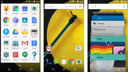
Along the bottom you'll find the back, home and list buttons with the stock logos representing each. The list function is in the new Lollipop style with each tab in view with a rolodex style list to scroll through and find the open app as easily as possible.
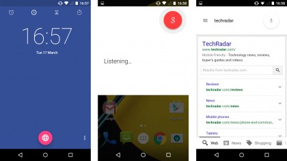
The list mode also includes the Google search bar along the top, much like it does on the homepages, where you can quickly type in to search around the phone or directly onto the internet, as well as use the Google Now voice functionality.

The keyboard is simplistic while offering a good amount of functionality. It comes with swiping technology built in as well as an intuitive dictionary bringing up better words to your attention and making typing an absolute breeze.
Along the bottom of the home page is an icon for the phone app, messages, an app drawer, Google Chrome and the calendar. The app drawer is simple and comes with all the redesigned and good looking Lollipop icons.
The lock screen now includes notifications meaning you'll be able to see the latest updates without even having to unlock the phone and swipe them away if you don't need to act on it.

The date sits across the centre with the clock taking up a good amount of the screen just above while the unlock padlock logo is in the centre of the bottom with a phone to the left and camera to the right.
If you tap on either of those logos it'll boot up the camera or phone dialler as it unlocks, which can be really helpful if you're in a bit of a hurry.
Head into your settings and you'll be able to make the phone more secure with a variety of different locks including patterns, pin numbers or passwords. There's no fingerprint sensor and the camera isn't strong enough for face recognition so you'll have to settle for an older fashioned password set up.
Current page: Key features and interface
Prev Page Introduction, design and display Next Page Performance and battery lifeJames is the Editor-in-Chief at Android Police. Previously, he was Senior Phones Editor for TechRadar, and he has covered smartphones and the mobile space for the best part of a decade bringing you news on all the big announcements from top manufacturers making mobile phones and other portable gadgets. James is often testing out and reviewing the latest and greatest mobile phones, smartwatches, tablets, virtual reality headsets, fitness trackers and more. He once fell over.

