Why you can trust TechRadar
Contacts
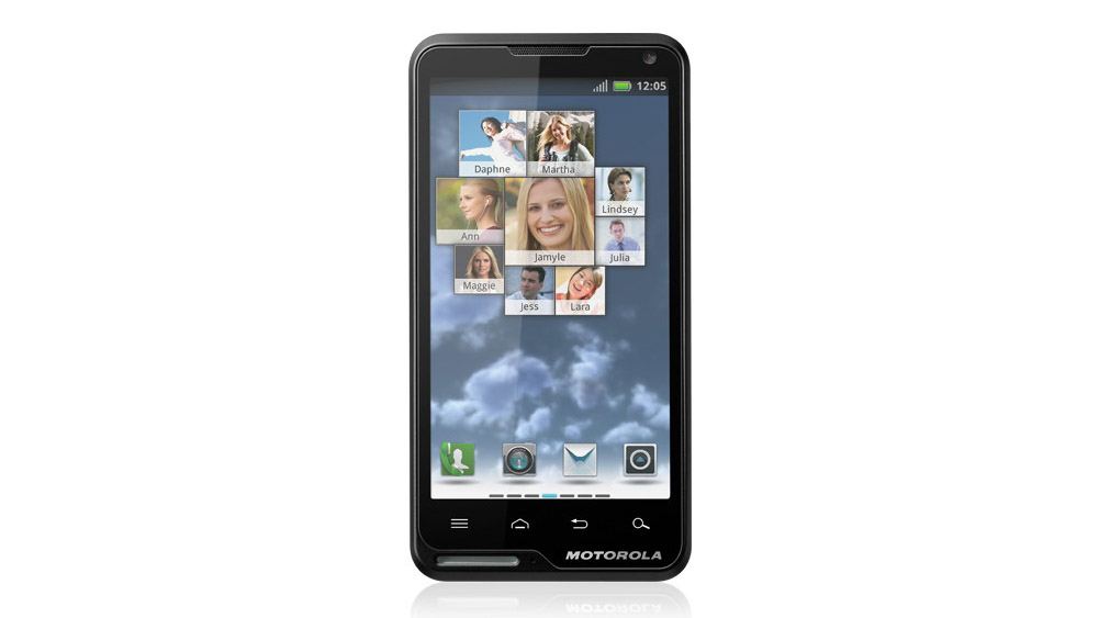
Contacts are accessed from the four docked shortcuts at the bottom of the Motorola Motoluxe's home screens.
There are four tabs across the top of the contacts app: Phone, which takes you to the dial pad, Call log, Contacts list and Favourites. If you prefer to have an even quicker way of accessing your most-dialled numbers, there's also another tiled Motorola widget for the home screens that will automatically populate with the contacts you talk to most often.

Android is particularly good at integrating social networking with contacts, but unlike the HTC Sense user interface, the integration is a bit hit and miss on the Motorola Motoluxe.
Syncing your Twitter and Facebook accounts will auto-populate your contacts list with numbers and images stored in accounts, but doesn't always manage to pull through the latest status updates.
It should also, in theory, be possible to sync Twitter, but the Twitter app crashed often for us while doing this, and started a chain of near-constant error messages, so we had to switch off auto sync.
Other than this, the contacts app is quite bland, and there are also no options to manually sync contacts that have doubled up through adding several social accounts.
Adding a new contact is easy, although a bit hidden, given that you have to dip into the touchscreen settings button rather than having an on-screen option in the dial pad. You're then automatically walked through the options.
And if you're saving a missed call from a new number, rather than inputting a number from scratch, you tap and hold down the number to reach the same process.
Calling
When calling with the Motorola Motoluxe, the connection was good and the in-call volume level and sound quality was also decent, meaning we could hear our chatting partner just fine on many occasions.
But there was one thing that made us want to get off the phone: the design of the speaker means the chassis is cut out just where it presses against the top of your ear. Sharp edges and ear bones don't make a great combination - in fact, it's particularly uncomfortable.
That said, the quality of the call goes downhill whenever the other person is in a particularly noisy setting, emitting a ton of feedback in our ears.
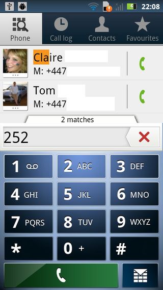
The dialler supports smart dialling, picking out both phone numbers that match and alphanumerical letters that match the numbers you dial.
We feel we should point out that this handset also has the world's worst default ringtone. Hel-lo Moto indeed.

Midjourney V7 gives the AI image-maker power, speed, and correctly shaped hands

This Ryzen-powered NAS is barely bigger than a shoe box and can hold 11 SSDs and HDDs, delivering more than 500TB of storage

This is the world's first 1TB microSD Express card to go on sale, just in time for the launch of the new Nintendo Switch 2
