Why you can trust TechRadar
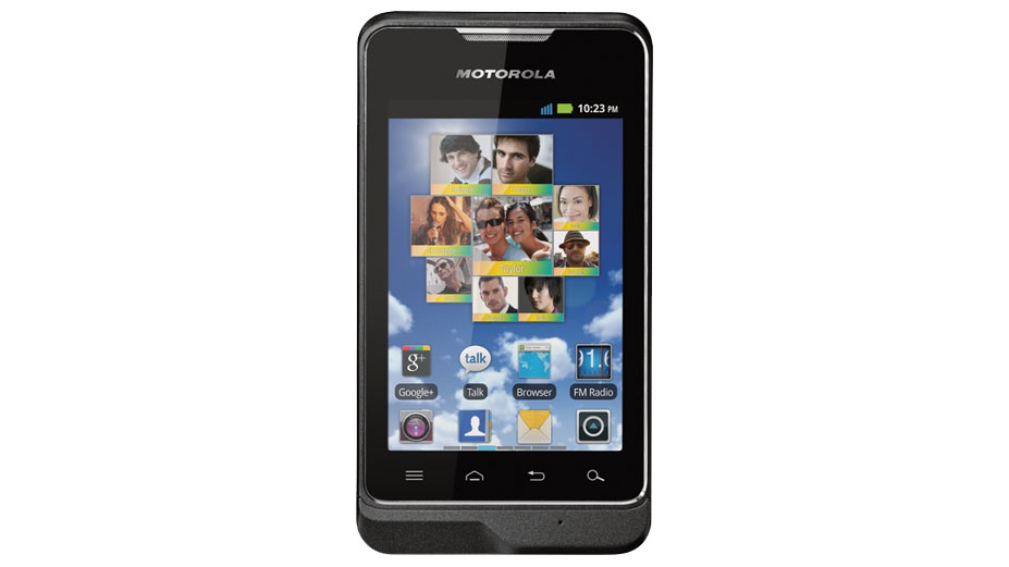
Motorola's one of the biggest culprits when it comes to taking Google's clean Android base and making some bonkers software and interface changes.
And its love of making changes for the sake of it continues inside the Motorola MotoSmart's tweaked version of Android 2.3.6.
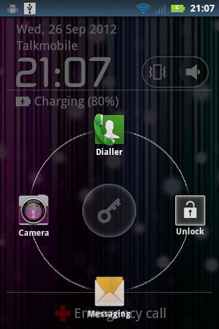
The lock screen is a pretty poor introduction to the phone.
It's useful in that you can quickly access the camera, messaging system, dialler or unlock the phone, but it's slow to respond and pretty glitchy to use.
There are no music player controls here either, although you can mute the phone's ringing and notifications sounds through a toggle - but that won't mute the music.
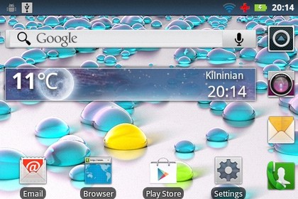
Once unlocked, one nice touch you don't see on many Android smartphones these days is the option to flip the phone and use the home screens in landscape orientation, with Motorola adding a sideways option for people who want to be a bit awkward.
It's something we often ask for, since it's nice to have the choice of orientation.
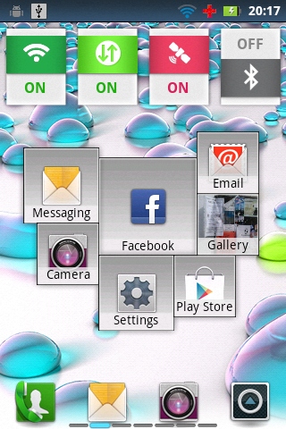
Its other key additions to Android are a pair of widgets Motorola calls its Activity Graph and Social Graph.
These chunky little collections of icons are automatically populated based on your most used apps and most contacted people, and are very useful to have.
Motorola has also included the option for you to boost the number of home screens, with up to nine separate screens available for your apps, widgets and shortcuts.
Installing widgets and shortcuts to your home screens is also handled a little differently than usual in Motorola world.
A long-press on the home screen brings up the option to install widgets, shortcuts and folders.
However, apps can also be long-pressed within the app drawer and placed on your home screens through an "add to home" option.
Pressing the Home button while on the home screen pulls up an overview mode of all home screens, where you're able to long-press on a screen to delete it entirely, or pick one to focus on.
Only you probably won't, since this zooming about gets the Motorola MotoSmart a little bogged down, to the point where it starts buffering your presses and getting in a terrible state.

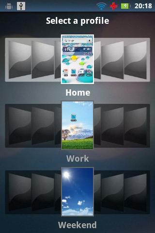
There's also a profiles section, accessed by touching the Menu key while browsing your home screens, which enables you to choose between three separate collections of apps, so you can in effect have three entirely different Android home screen setups on the go at once on the Motorola MotoSmart.
That's a nice thing to have.
Motorola's also tweaked the standard Android Notifications pull-down pane, adding in one of Google's software additions that was introduced in Android 4.0 Ice Cream Sandwich - the ability to dismiss individual notifications, which, in Motorola's case, is done by pressing the little red icon to the right of the notification.
You also get a music player control section in here, along with a list of your recently used apps along the top, should you need another way to quickly access your favourite phone tools.
