Why you can trust TechRadar
Contacts
Contacts on the Motorola Razr HD are for the most part accessed from the People app.
This is a Google app so it's present on many Android phones, and unlike some manufacturers Motorola hasn't confused things by adding its own contacts app too.
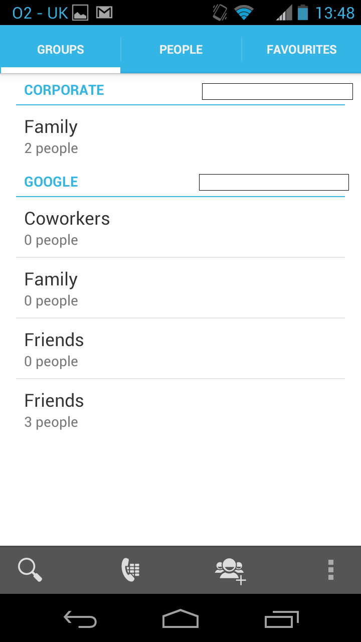
The People app has three tabs along the top - Groups, People and Favourites. You can probably guess what each entails but we'll run through them anyway.
The Groups tab enables you to create groups and add contacts to them...obviously.
So for example you might want one group for family, one for friends and one for business. It enables you to split your contacts up and more easily find people who could otherwise be buried in your phone book.
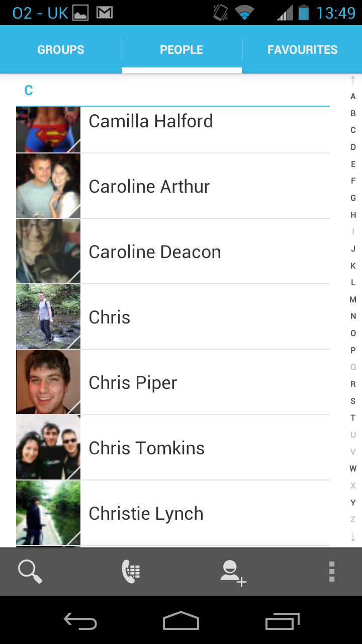
The People tab is likely the one that you'll spend the most time on. It lists all of your contacts in alphabetical order and displays both their name and picture (if you assigned them one).
Tapping their picture or long-pressing their name brings up shortcuts to call, text or email them, view their Facebook profile or view their main contact card, while tapping their name just takes you straight to the contact.
The contact card itself contains any information you've stored on them, so we're talking numbers, email addresses, social network profiles, websites, their postal address and more.
You can add as much or as little information as you want here, and anywhere you see a phone number, email address or the like you can tap on it to contact them.
There's also a drop-down menu at the top of each contact card with options to add new information, share their details, delete them, set a custom ringtone for them, place the card on your home screen or send all of their calls to voicemail.
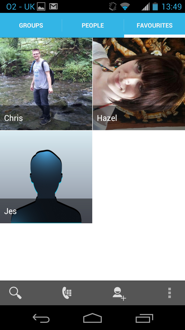
The final tab in the Motorola Razr HD's People app is Favourites, which simply shows large images of anyone you've added to favourites, giving you quick access to them. Tapping on an image will take you to their contact card.
At the bottom of all these screens there are options to search for a specific contact, go to the dial pad, add a new contact or customise which contacts you want to display.
The layout is about as intuitive as it gets, though we do wish that it was quicker to actually call someone. It should be doable with a single tap or swipe, but it's not.
We'd also love to see deeper social network integration - sure, you can add Facebook profiles and the like to contact cards, but it would be great if status updates and IM chat messages were visible from contact cards too.
Calling
Generally the easiest way to call someone on the Motorola Razr HD is just to go into the People app (assuming it's someone that you have in your contacts), but it's not the only way.
There's also a Phone app, which is mostly just a dial pad - but it's a good one because it supports smart dialling, meaning that once you start dialling a number it will bring up matches from your phone book, which you can then tap on to call rather than typing the whole number out. You can also use the letters on the dial pad to type someone's name and it will bring them up that way too.
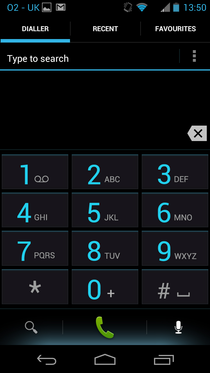
At the bottom of the screen there's a magnifying glass that will take you to your phonebook, along with a microphone that enables you to use voice commands to call or text someone.
It works pretty well in general, though it takes a couple of seconds to actually carry out your command so we'd still say just typing out what you want tends to be preferable.
You can also access call settings from the Motorola Razr HD's dial pad, which enables you to do things such as set up call forwarding.
Aside from the dial pad itself, there are tabs across the top of the screen for Recent and Favourites, with Favourites just listing your favourites and enabling you to call them or access their contact card with a tap, while the Recent tab lists recent calls, telling you how long ago they were made or received and enabling you to call the person back by tapping on them.
When a call comes through the name or number of the caller appears at the top of the screen, with a picture below that (if they're in your phone book with one assigned). There's also a circle in the middle that you can swipe right to answer the phone or left to ignore the call.
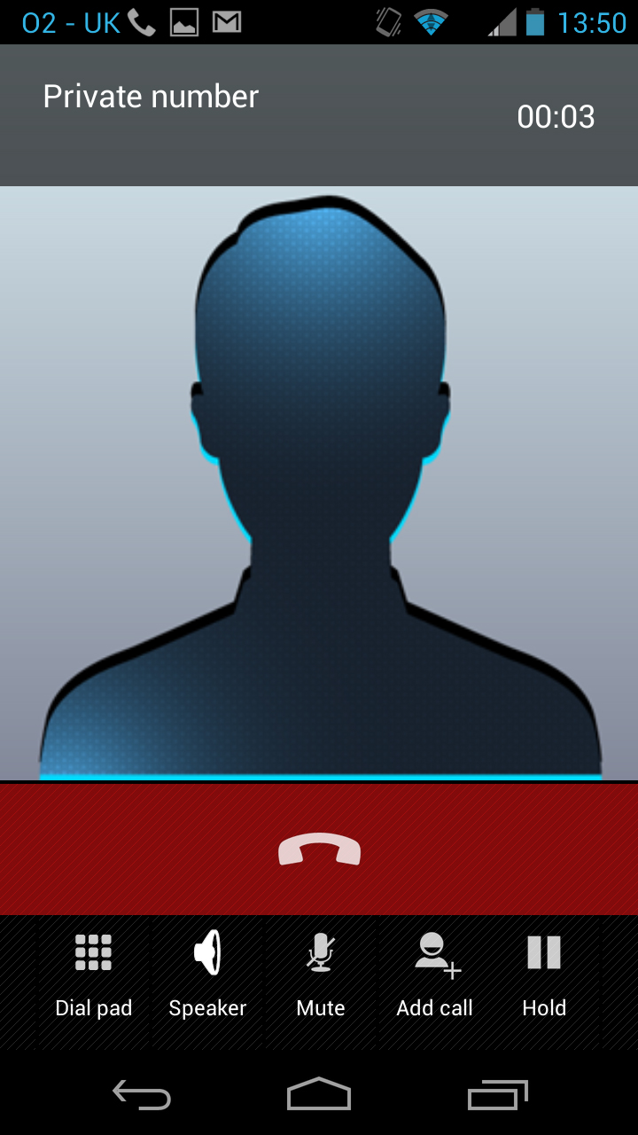
When on a call a picture of the person you're talking to dominates the screen - or if you don't have one then a non-descript silhouette takes its place. At the top you can see the caller's name or number and the call duration, while near the bottom there's a big red hang-up button.
Below that there are a few options - one that takes you to the dial pad, one to turn speaker phone on or off, one to mute the call, one to add someone to the call and one to put the caller on hold.
You can also just tap the home button to return to your home screens and do anything else on your phone while still on the call, (you can get back to the call screen or hang up from the notifications screen).
Call quality is impressively good, with the phone even providing great clarity in areas where we normally find signal to be pretty poor.
We didn't experience even a single dropped call, either. The speaker phone could be better though - it works but the sound is quite tinny and at times a little distorted.
James is a freelance phones, tablets and wearables writer and sub-editor at TechRadar. He has a love for everything ‘smart’, from watches to lights, and can often be found arguing with AI assistants or drowning in the latest apps. James also contributes to 3G.co.uk, 4G.co.uk and 5G.co.uk and has written for T3, Digital Camera World, Clarity Media and others, with work on the web, in print and on TV.
