Why you can trust TechRadar

Occasionally, smartphones are used to make phone calls - who knew? The Razr V is no exception, although it's not quite the best implementation of a dialler we've ever experienced.
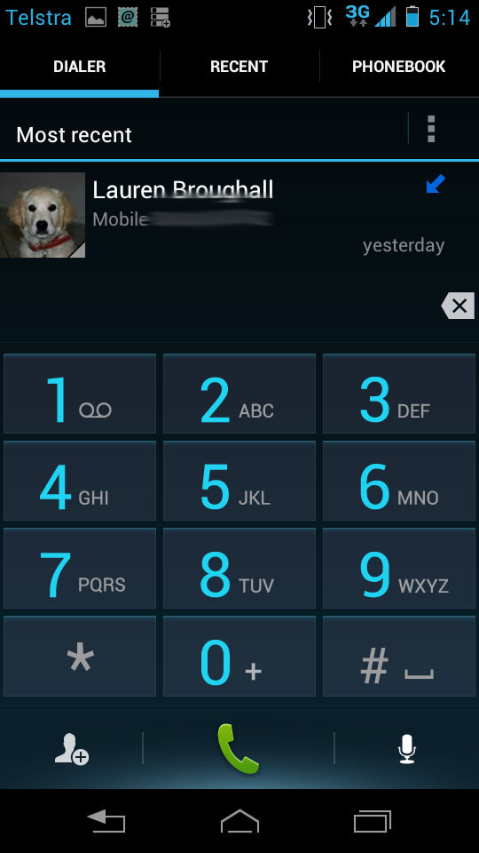
Launching the phone app immediately pushes you to the dialler. The numbers are big enough to punch in quickly, with a big box above the keys to see what you're dialling.
Below the number buttons are three shortcut keys. The centre is dedicated to actually making the call, the right one is a microphone icon to initiate voice controls - which worked about half the time we tried it - and the left button is a "new contact" button.
This contrasts to the majority of Android handsets we've tested that place the Contacts list button in the bottom left of the screen. It's a bit of a confusing decision, really. Who's going to go to the dialler to add a new contact? Surely having quick access to the contacts already in your phone is a much more useful shortcut.
That function is found on the same screen, just along the top instead of down the bottom. Three tabs offer the ability to switch between the dialler, recently called numbers and your contacts list.
Call quality through the handset's speaker is clear, without any difficulty in hearing through the phone's earpiece. Equally, the speakerphone is fine, projecting sound well enough to use the device as a conference speaker.
Contacts

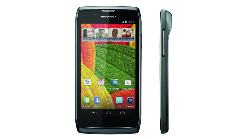
Unlike the iPhone 5 and Xperia Z, Motorola has preloaded a dedicated People app in the Razr V and placed it in the permanent shortcut row at the bottom of every home page.
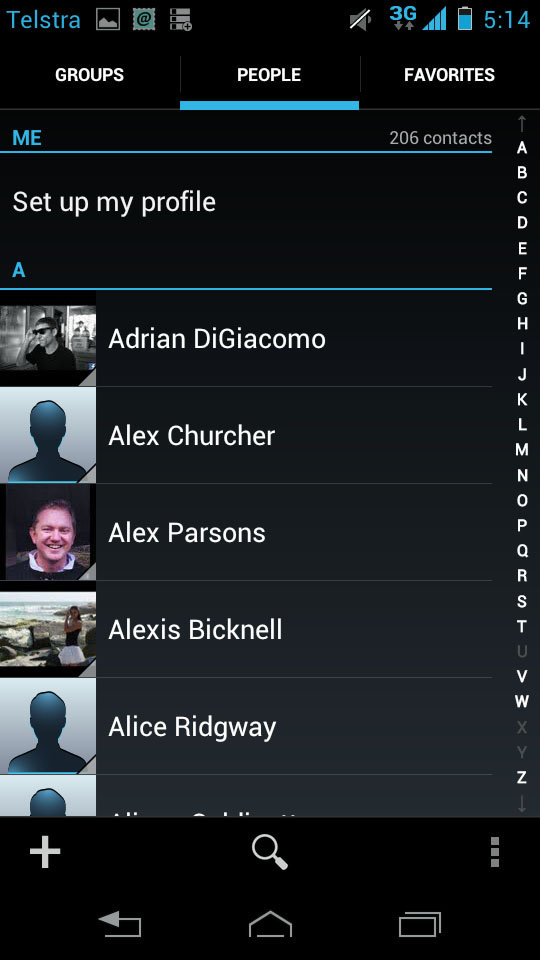
That said, you can also access your contacts list by selecting the top right tab from the dialler app, so you're never far away from your address book. It gives a slightly different UI though, with favourites located above the contact list, so if you use Groups a lot, you'll need to access the people app.
The People app breaks your contacts up into three different categories: Groups, People and Favorites. People is the default with a thumbnail image accompanying an alphabetical list (sorted by first name) and the alphabet running down the right hand side of the screen for fast access to later letters.
Groups is for manually curated groups organised through your Gmail account, while Favorites is for your most popular contacts.
Both Groups and Favorites display contacts as large square image tiles, that open up into the contact's full details when selected.
You can also pin individual contacts to the home screen, bypassing the need to access the People app.
