Why you can trust TechRadar
At the heart of the Nextbit Robin are a Snapdragon 808 processor and 3GB of RAM. Those are the same specs as the LG G4, which is pretty impressive given that the Robin is positioned more as a mid-ranger than a flagship.
It's pretty impressive in practice too: the Robin can take a little thinking time when jumping between apps, but otherwise this is a nippy phone, and smoother in use than the similarly priced Moto X Play.
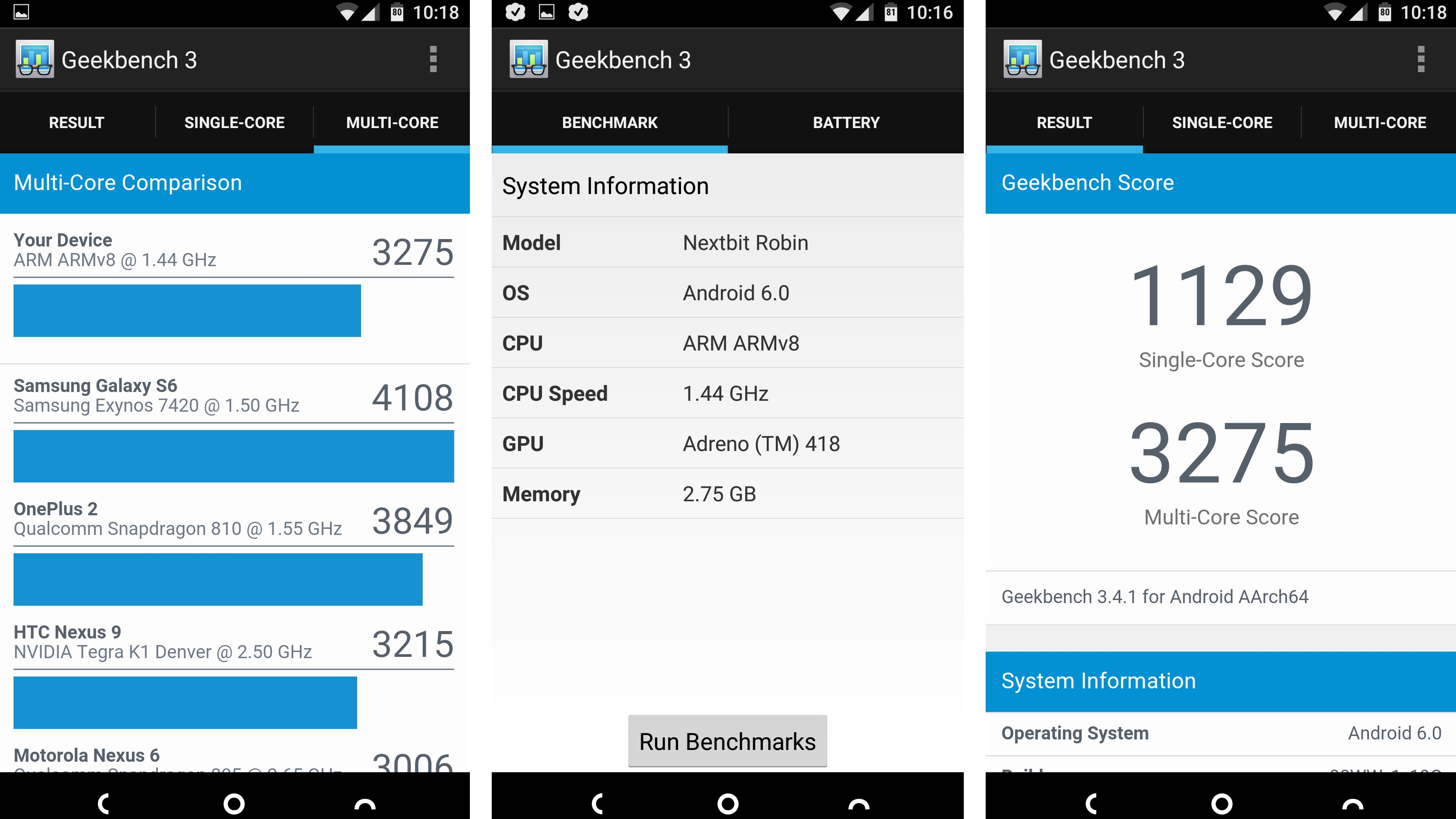
That's not really a surprise, though, given the Nextbit Robin's higher specs. In fact, the Robin averaged a Geekbench 3 single-core score of 1154 and multi-core score of 3334, both of which dwarf the X Play's 715/2716 results.
However, while the Robin is a smooth operator you can still get more performance for your money. The OnePlus 2, which again is priced similarly, has a powerful Snapdragon 810 chip and a mammoth 4GB of RAM, which together deliver an average multi-core score of 4795.
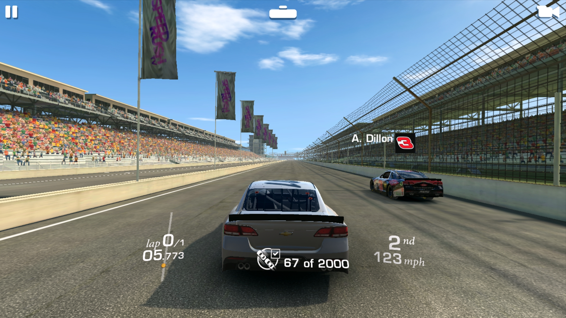
The Nextbit Robin is neither the best nor the worst performer at this sort of price, then, but it's generally speedy and even handles games well. It had no problem with Real Racing 3 for example, other than lengthy load times between events.
The display and speakers make it a strong option for games and other media too. The display is a bit reflective, and loses a lot of brightness if you view it at odd angles, but head-on it looks great, while the dual front-facing speakers deliver loud audio, although music can sound a bit flat through them.
Interface
Not content to let Android Marshmallow do its thing, Nextbit has tweaked the interface in some quite drastic ways.
The main difference between this and just about every Android handset not made by Huawei is that there's no app drawer. Instead, all of your apps sit on your home screens, which means things can get very messy very quickly.
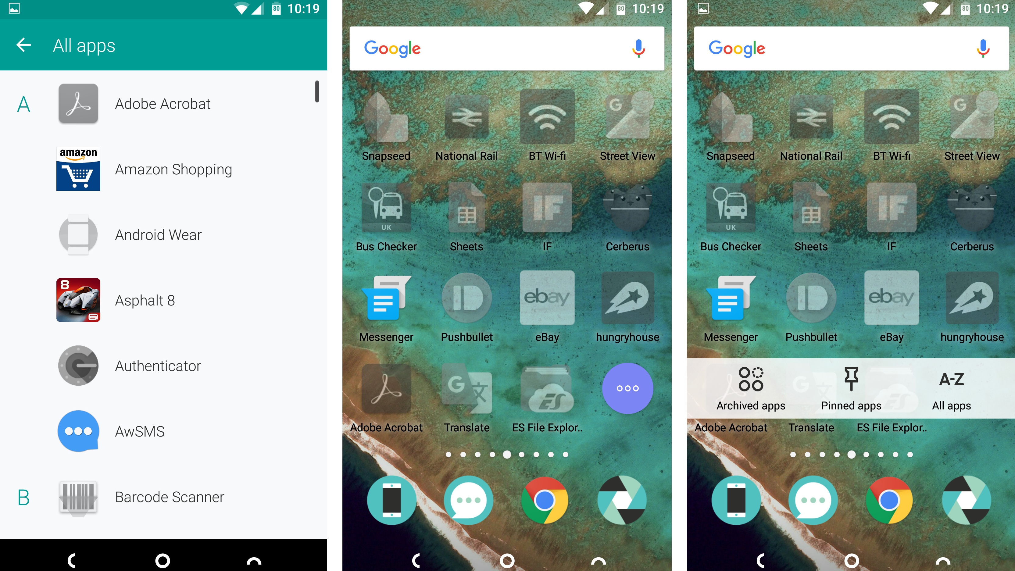
Nextbit has at least made it easy to find things by adding a floating bubble to the bottom-right corner of each screen, which when tapped can give you an A-Z listing of all your apps.
You can also get a quick overview of any pinned or archived apps from here, so your favourites or those which have been sent to the cloud are never far from sight.
But, personally, the lack of an app drawer really frustrates me. I don't want all my apps on my home screens, but with the Robin – unless I fiddle about with a third-party launcher – I don't have any choice.
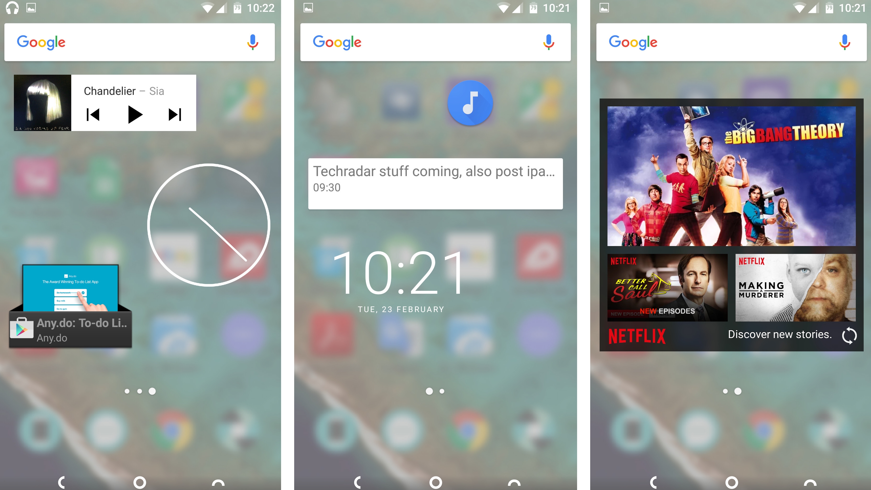
The Robin also handles widgets in an interesting way. Rather than have them sit on your home screens you essentially have a second set of screens just for widgets which you can get to by pinching a home screen.
This makes widgets easier to find, as they're all in one place, and it means you don't have to choose between a widget or another few app icons on your main screen; but it also means they're not as glance-friendly.
James is a freelance phones, tablets and wearables writer and sub-editor at TechRadar. He has a love for everything ‘smart’, from watches to lights, and can often be found arguing with AI assistants or drowning in the latest apps. James also contributes to 3G.co.uk, 4G.co.uk and 5G.co.uk and has written for T3, Digital Camera World, Clarity Media and others, with work on the web, in print and on TV.
