Why you can trust TechRadar
The key selling point of the Nexus line has always been that it launches with a brand new Android version.
Last year, we got Ice Cream Sandwich, the year before saw the Nexus S launching with Gingerbread.
But Google gave Jelly Bean to the Nexus 7 tablet earlier this year and with Android 5.0 Key Lime still Pie in the sky (get it?), there was nothing for Google to do other than stick a few new features onto Jelly Bean 4.1, package it up as Android 4.2 and make the best of it when it came to the Nexus 4.
Differences between the two Beans are subtle, but effective. Google's introduced a new keyboard which supports swipe functionality, pretty much aping and repackaging the killer quality of Swype.
It's also taken cues from the likes of Samsung and HTC by adding toggles to the notification bar which allow you to control things like Bluetooth, Wi-Fi and brightness without having to faff about going through a million and one menus, although they're still not as quick and accessible as the others.
Another new addition is something called Daydream. It's an odd idea – your phone goes into a light sleep mode, playing a screensaver instead before it goes to sleep.
Obviously, most of us will just turn the screen off straight away when the Nexus 4 isn't being used to save power.
But for when the phone is docked or charging, you can choose between picture albums or colours. It's one of those things that looks pretty, but in reality, probably only 0.5% of users will ever use it. Those that don't will forget it's there.
You can no longer remove - or even move – the Android search bar. It's firmly fixed at the top of each of your five home screens (you can't add more home screens unless you go for a third party launcher, unfortunately.)
That's slightly annoying because even though this is a Google-branded handset, the beauty of Android is its immense customisation options.
Being forced to permanently have a Google search bar present – which could easily be brought up by swiping up from the bottom to engage Google Now anyway - seems a little over the top.
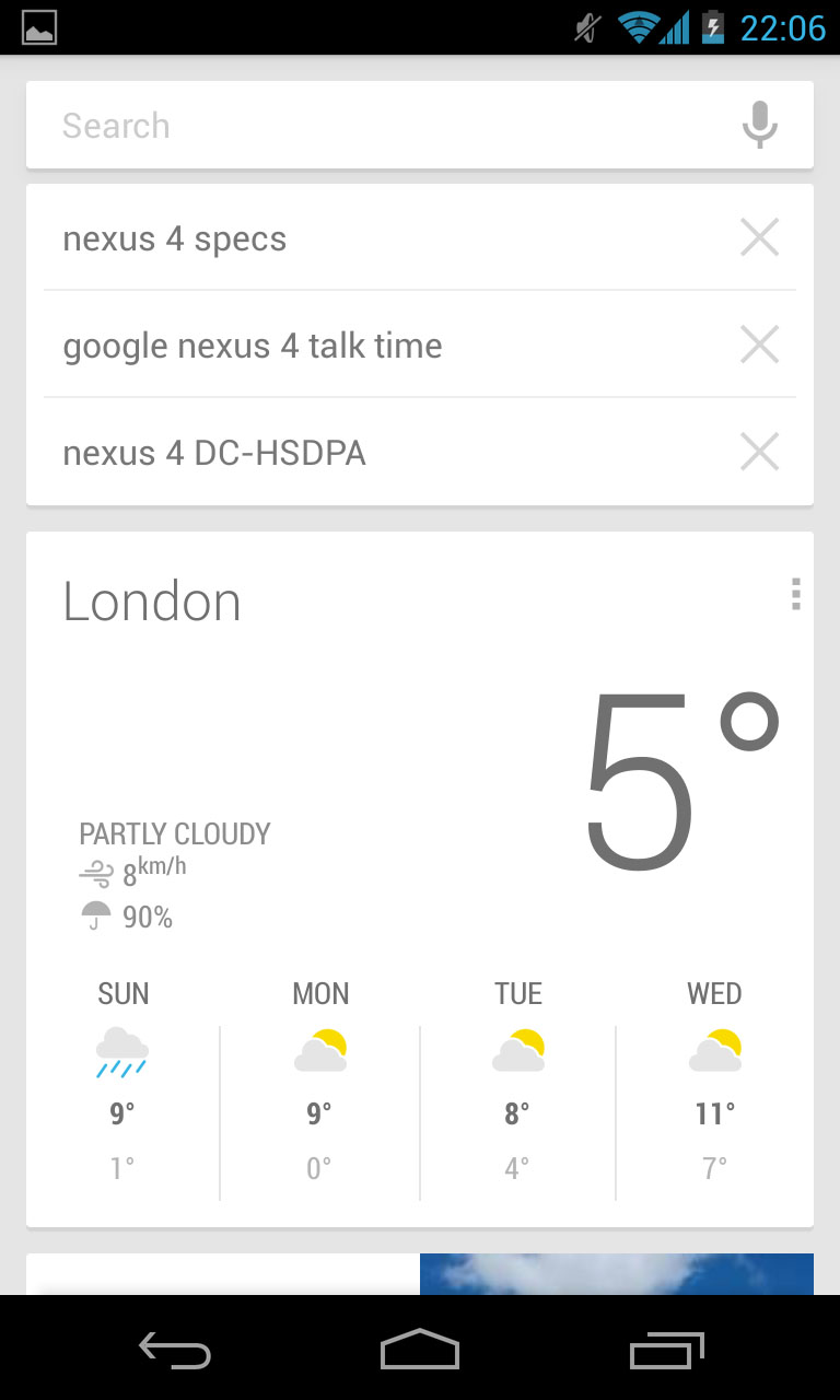
Speaking of Google Now, that's all present and accounted for. We can't work out if we're fans of this technology or not.
If you're not familiar with it, we'll elaborate. Google Now integrates with your life, displaying things like the weather and your appointments as 'cards' on a special screen.
Fire it up and your most recent search items will appear. It'll tell you how long it will take you to get home from work, show local movie times, places nearby etc.
The thing is, we've also noticed it can be a little slow at times. And this is on high spec devices like the Samsung Galaxy S3 (we've used both the official Jelly Bean 4.1 and custom JB ROMS and experienced the same on both).
Whereas searching through the phone for contacts, music and so forth on Ice Cream Sandwich was an absolute delight, on Jelly Bean, it's not been as pleasurable.
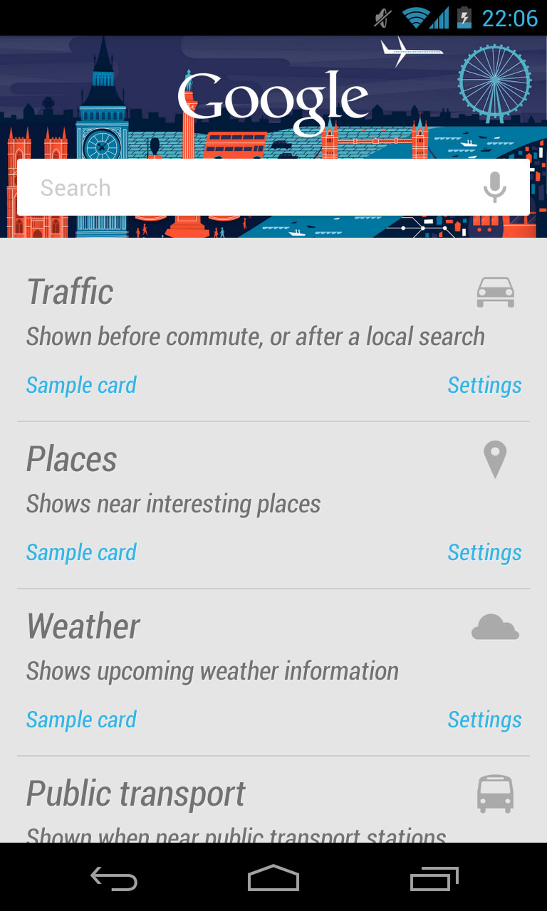
This doesn't appear to be the case with the Nexus 4 which gave us a really quick and speedy response. You can also view photos of nearby beauty spots and even track parcels online though predictably, some functionality finds its way to the US of A before getting to other regions.
Navigation is conducted via the three on screen soft keys that appear and disappear at the bottom of the display as and when needed.
This was a feature brought in on Ice Cream Sandwich as a way of amalgamating the Android phone OS and Honeycomb, which was found on tablets.
Some manufacturers like Samsung have ignored them, others like HTC have included them but as separate physical buttons instead.
Regardless, this is a Google handset so you're getting the Google experience. It's Mountain View's way. Or it's the Highway.
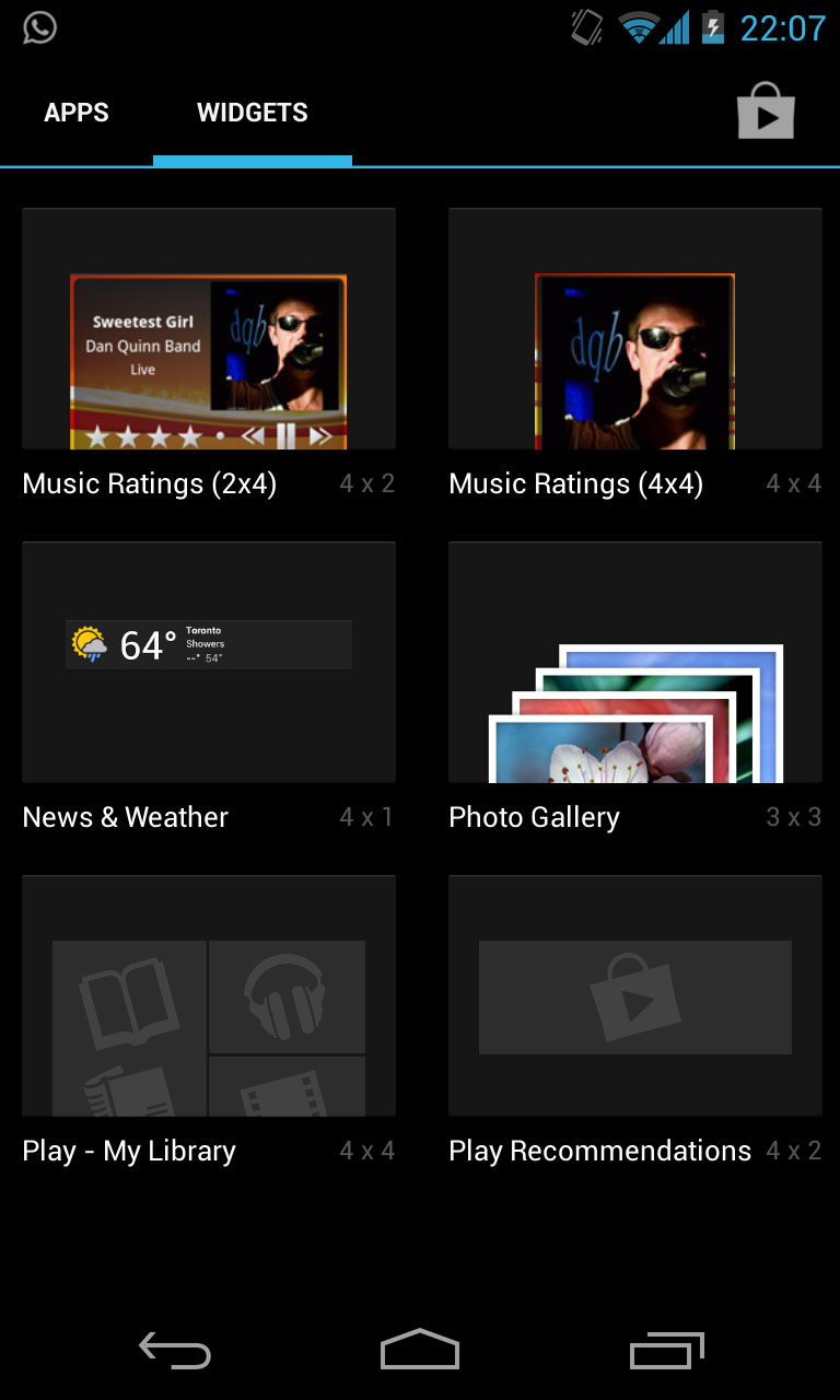
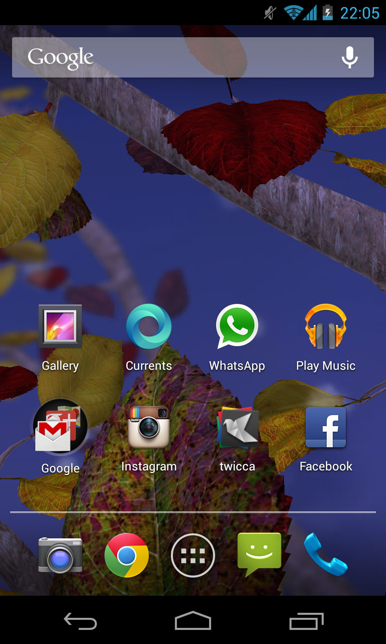
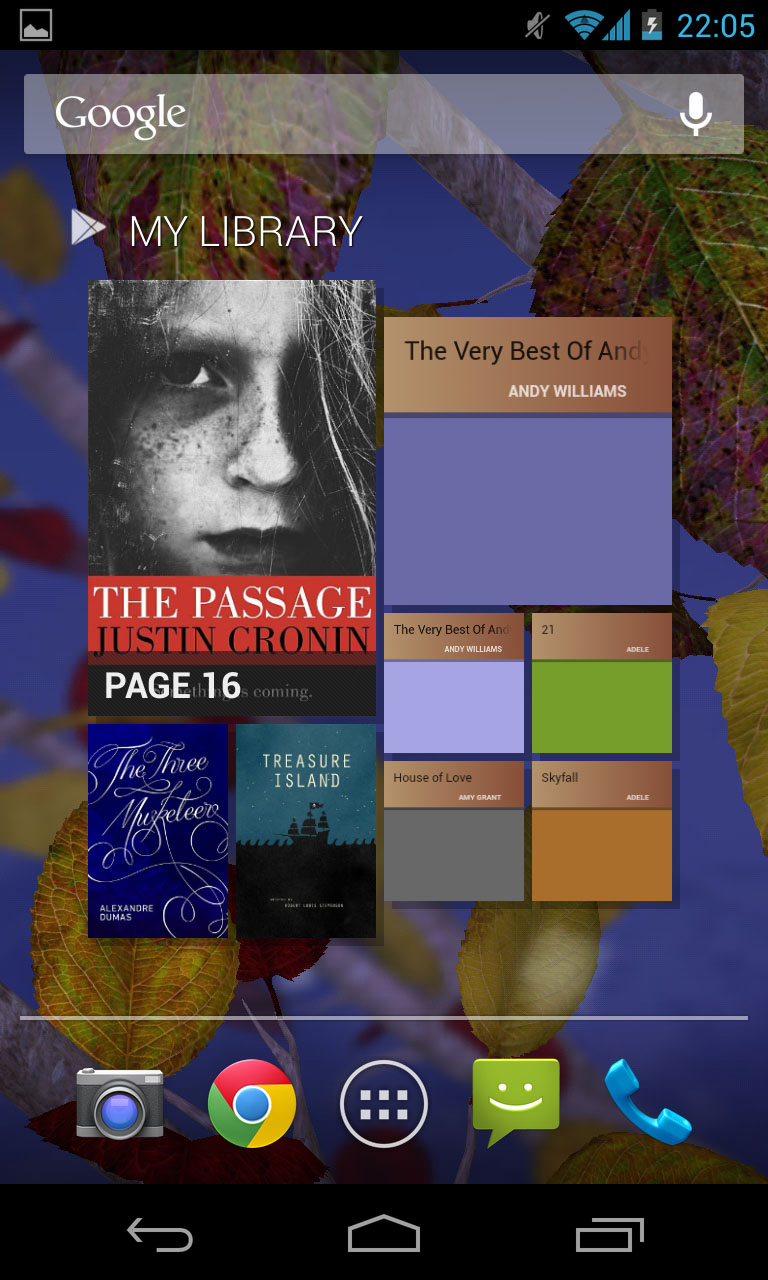
The rest of the experience is the same, standard, Android delight we all know about. You can pin apps to your home screen or widgets which will do anything from show you your calendar appointments, to display photos in frames and tell you how many days are left until Christmas.
Widgets are limited by only the developers' imagination and with the Google Play app store now having hit 700,000 offerings, that's a lot of widgetry in there.
Apps can be added to folders in the same way that they can with the iPhone – you just simply drop one or more on top of each other and it allows you to seamlessly pop together all different genres of programmes.
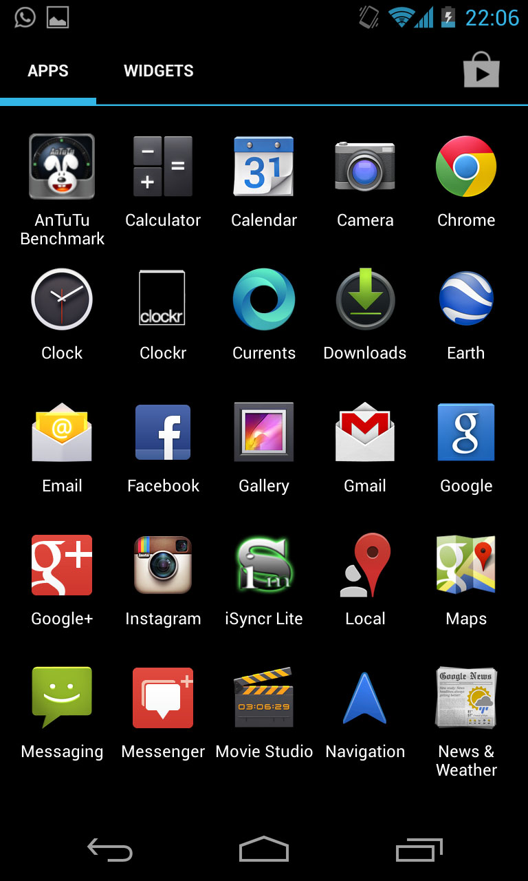
The main app selection, though, is through the traditional app drawer where everything you own is kept and beautifully displayed.
You swipe right to left to go through however many pages of apps you own and there is also a tab which allows you to preview widgets before you install them.
It may sound like an obvious idea, but before this was introduced in Ice Cream Sandwich 12 months ago, it used to drive us bonkers. Now, it's a real pleasure.
And don't forget the Android notification centre, which has always been this operating system's killer feature. So much so, that even Apple copied it when iOS 5 came along.
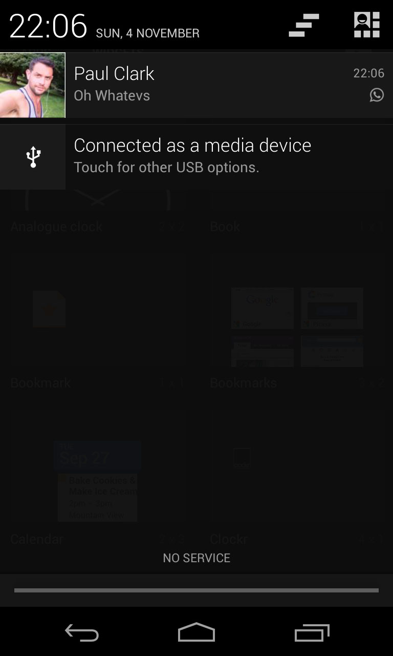
A simple pull down from the top brings down a screen giving you easy access to all of your important info – like texts, emails, notifications, missed calls and so forth. Jelly Bean extended that even more by allowing pinch and zoom to give more or less, depending on your preference.
All in all, it's an intuitive, fluid, beautiful system to use. Yes, Android is a little easier to get lost in because of the various menus which is also its strength. But it's also incredibly simple if you don't want to dig around too much.
And because Jelly Bean also includes the Project Butter element (which just makes things even faster), there was little – if anything – we could find fault with.
In fact, the only quirk we encountered was that despite having a full mobile signal which worked for calls and over 3G, when we pulled the notification bar down, it said 'No Service' where the network's name should have been.
But it's hardly anything to lose sleep over and we are sure it'll be corrected with a software update.
Anyway, 'No Service' is a much better name than 'Everything Everywhere'.
