Why you can trust TechRadar
It's no secret that the Symbian S60v5 OS is an acquired taste. Yet, millions have acquired it, and swear by it, so we won't debate all of the merits and demerits here.
Suffice to say, the OS does not work at all like an iPhone or Android phone. In some ways, it is akin to the Windows versus Linux debate, and Symbian is definitely more like Linux, where you can perform some functions that are not possible or difficult with other phones.
For example, when you install an app, it is easy to see how much memory it will use and the version number.
While this is a perk for an advanced user willing to pay more for the Nokia N97, it is a problem on the Nokia 5230 – intended for new smartphone users or at least those who do not want to pay big bucks for a phone that has every bell and whistle.
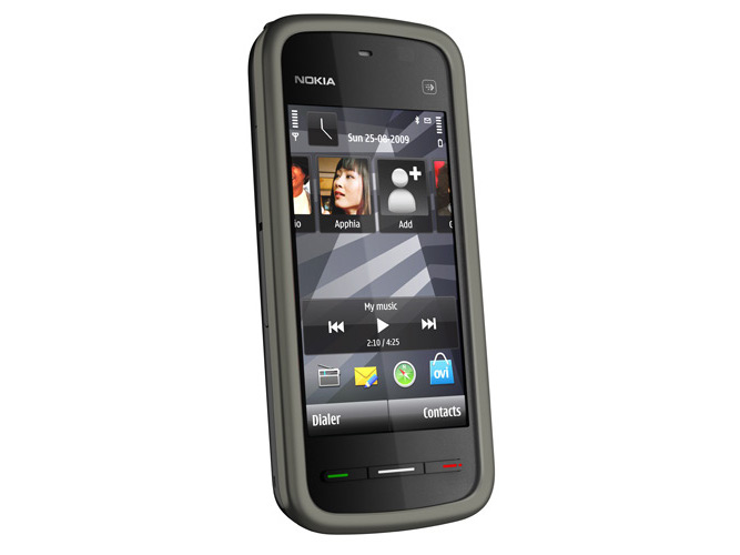
The Nokia 5230 interface does require a learning period. For starters, there are three hardware buttons along the bottom of the phone: a green Call button, a Menu button that shows you the installed apps and an End Call button.
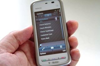
At times, you might wonder if you should press the End Call button to back out of an app (in most cases, you should) or press the Exit or OK button on screen.
It's fairly inconsistent – you have to pay attention to what's on the screen a bit more than with other phones.
You also can't move apps around on the screen, hold down on one to see an option to delete it, or add widgets for, say, adjusting screen brightness quickly. What this means initially is some fumbling around to find basic options.
The Nokia 5230 is also not a tremendously speedy phone, at 434MHz, so there are times when you might press a button and the Nokia 5230 fails to register the click.
This can seem like a touchscreen quality problem, but the touch sensitivity is quite adequate – it is just that the phone is too slow to keep up with simple finger presses at times.
Navigating on the phone is a bit tough, but you quickly get used to basic operations. It's easy to fire up the GPS app (Ovi Maps 3.0) or press the green Call button to access the phone dialler.
There are a few cool tricks to using the phone. For example, there's a dedicated camera button you can use to start the camera app (which shoots photos and video).
This button is positioned on the lower right side of the phone (when in a vertical orientation) to encourage horizontal use.
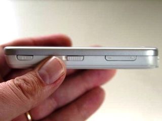
Another perk is that the Nokia 5230 happens to have a well-implemented lock button on the right side of the phone. You just slide the button down.
This makes it hard to accidentally power up the phone when it is in a laptop bag or in your pocket, which saves on battery power. It also avoids the 'press this on-screen button to unlock' annoyance.
Anyone who is used to an iPhone or Android device knows you can easily flick on the screen to move down to see additional apps or more content on a website.
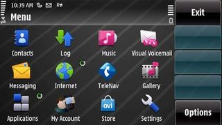
However, on the Nokia 5230, you have to drag a slider down to see more of the screen. You might find yourself swiping on the screen, only to realise you have started an app.
And, adding insult to injury, because the phone tends to run slow, this induces some frustration as you wait for the app to start and then close it. This is one of the 5230's most annoying quirks.
Current page: Nokia 5230: Interface
Prev Page Nokia 5230: Overview Next Page Nokia 5230: Calls, contacts and messagingJohn Brandon has covered gadgets and cars for the past 12 years having published over 12,000 articles and tested nearly 8,000 products. He's nothing if not prolific. Before starting his writing career, he led an Information Design practice at a large consumer electronics retailer in the US. His hobbies include deep sea exploration, complaining about the weather, and engineering a vast multiverse conspiracy.




Nvidia is planning post-copper 1.6Tbps network tech to connect millions of GPUs as it unveils photonics networking gear at GTC 2025

The ultimate AI search face-off - I pitted Claude's new search tool against ChatGPT Search, Perplexity, and Gemini, the results might surprise you

This is the largest dual-screen monitor I've ever seen, and at almost 24 inches each, it's bigger than a 43-inch super wide display
