Why you can trust TechRadar
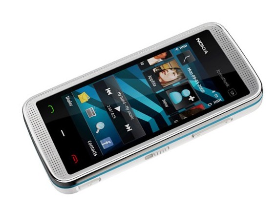
The Nokia 5530 XpressMusic is sporting the Symbian S60 5th edition interface, previously seen on the Nokia 5800 XpressMusic, the N97 and the Samsung i8910HD, which is a touch-friendly update to Nokia's long standing Symbian 60 OS.
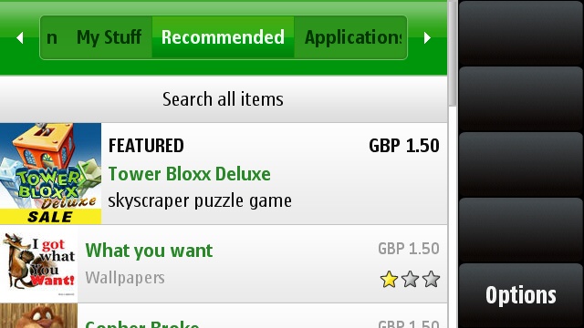
This means the Nokia 5530 is actually a smartphone, and you can install all the applications the internet has to offer for the open platform. Well, that used to be the case, but since Nokia has opened the Ovi Store to rival Apple's App Store and Google's Android Market, things are slightly different, with a whole host of paid for and free applications available for the phone.
That would be good news for the Nokia 5530 user, except the application store isn't installed on the phone. We have no idea why, as it can surely only be an added incentive to buy the phone, but perhaps the 5530 XpressMusic isn't able to run a number of the applications and therefore it wouldn't be a good idea.
However, you can download and install it yourself, and it does run more freely than on other Nokia devices. It's still light years away from the likes of the Apple App Store or the Android Market, so don't get too excited about it.
The touch interface works well, with the keys and icons all laid out nicely and in a finger friendly way. The Nokia N97 had some issues with this interface (ie the screen splitting inexplicably, certain buttons and icons not appearing) but thankfully these have been cleared up with the 5530 XpressMusic.
Touching the icons might be easy, but the screen itself (a near-VGA 640 x 380 effort) isn't as responsive as other efforts, which might be explained by the fact we're only treated to a resistive, rather than capacitive screen.
However, it's hard to get too annoyed about this when you think about the £130 price tag; although we're still smarting about the fact the higher end devices (the N97 and so on) still pack the same old school resistive tech.
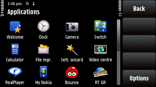
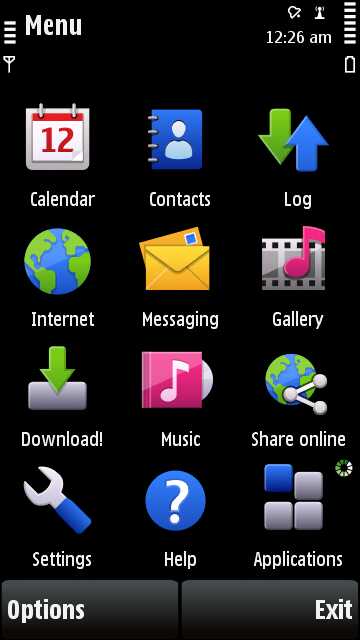
Nokia's layout has barely changed in the last few years as it has embraced the smartphone revolution, with the same menus to drill down into giving the same applications and options as before.
This is both a blessing and a curse - on the one hand consumers love familiarity, on the other, you don't feel like you're getting a huge upgrade from your older phones if you're a Nokia addict.
It's a bit plain as well, although it has the fun Finnish colours, but the one thing we like in the Nokia's 5530 XpressMusic is the menu transitions - scrolling, fading, parting; all options available to you. While it's nothing new, to see it in a budget smartphone without lag (in most cases) is a really nice touch.
Speaking on the subject of lag, the 5530 does suffer the standard Nokia slowdown we're treated to from previous efforts - but it's happily severely reduced compared to the snooze-a-thon that was using the N95 or N96 at times.
The home screen is a pleasant affair once more, with the contacts bar increased to 20 places, rather than the boring four on offer from the 5800 XpressMusic. Scrolling through these is meant to be as simple as swiping left and right, but in practice this is bizarrely near impossible, with each swipe often leading to accidentally pressing the contact itself.
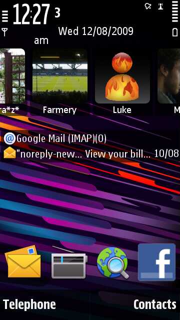
We were excited when we first turned on the 5530 XpressMusic, as there's a link to your email in the middle of the screen - which works well and is a nice touch.
But there's no way to add other elements to the same section of the home screen - we were hoping for something like a web feed or similar to be popped there instead of our last read email.
We did find it annoying that sometimes we had to double tap a menu item to access it, whereas at other times a simple touch would suffice. It makes it hard to feel like you're in charge of the phone, which creates a kind of barrier between you and your device. And that's not good, seeing as you're going to spending the next year or so with it.
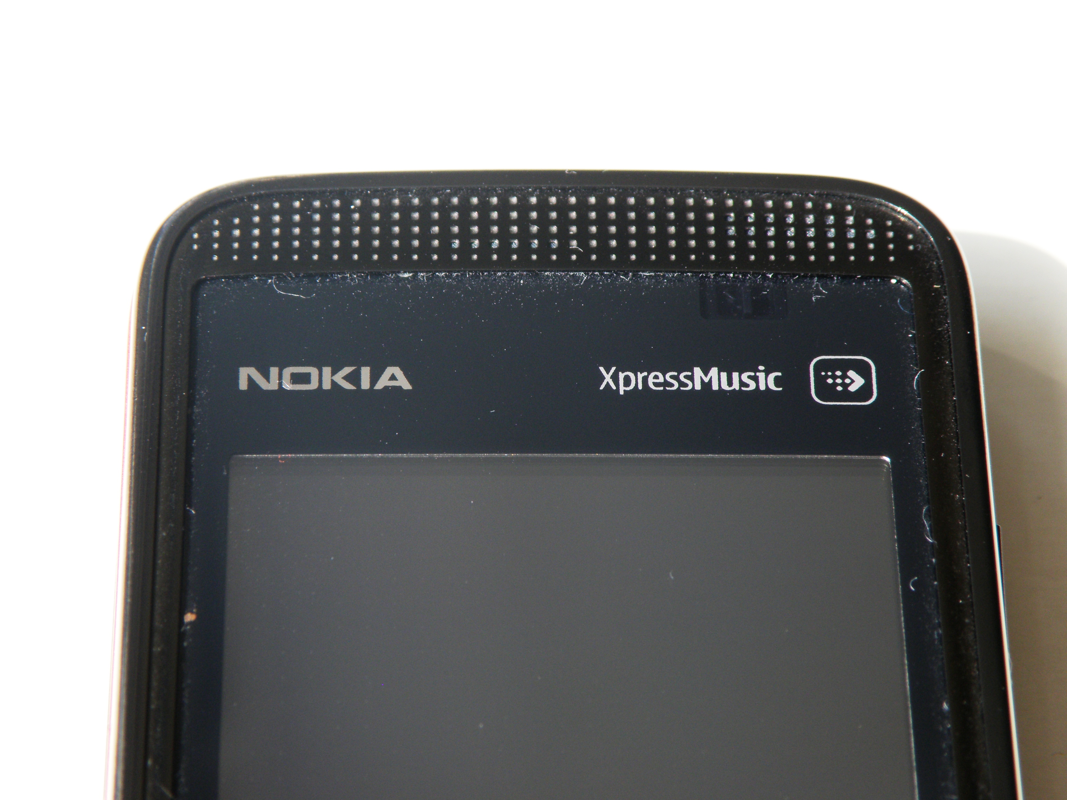
DUST MAGNET: The frame of the phone easily attracts and stores dust in the pocket
The media touch sensitive key at the top of the phone is the same as seen on the 5800 XpressMusic, and gives access to elements like music, photos and video. It's a nice idea, but we found we rarely used it for navigation except when trying to quickly get to a photo to show a friend, and pressing it was a little tricky at times as it has a pretty small strike zone.
But overall, it's a good implementation of the S60 OS on a budget phone. Perhaps at times it's trying to do too much, and perhaps could have done with being a 'lite' version of Nokia's smartphone interface, but we certainly didn't hate it.
Current page: Nokia 5530 XpressMusic: Interface
Prev Page Nokia 5530 XpressMusic: Overview, design and feel Next Page Nokia 5530 XpressMusic: Calling and contacts
Gareth has been part of the consumer technology world in a career spanning three decades. He started life as a staff writer on the fledgling TechRadar, and has grew with the site (primarily as phones, tablets and wearables editor) until becoming Global Editor in Chief in 2018. Gareth has written over 4,000 articles for TechRadar, has contributed expert insight to a number of other publications, chaired panels on zeitgeist technologies, presented at the Gadget Show Live as well as representing the brand on TV and radio for multiple channels including Sky, BBC, ITV and Al-Jazeera. Passionate about fitness, he can bore anyone rigid about stress management, sleep tracking, heart rate variance as well as bemoaning something about the latest iPhone, Galaxy or OLED TV.
