Why you can trust TechRadar
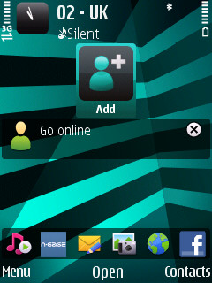
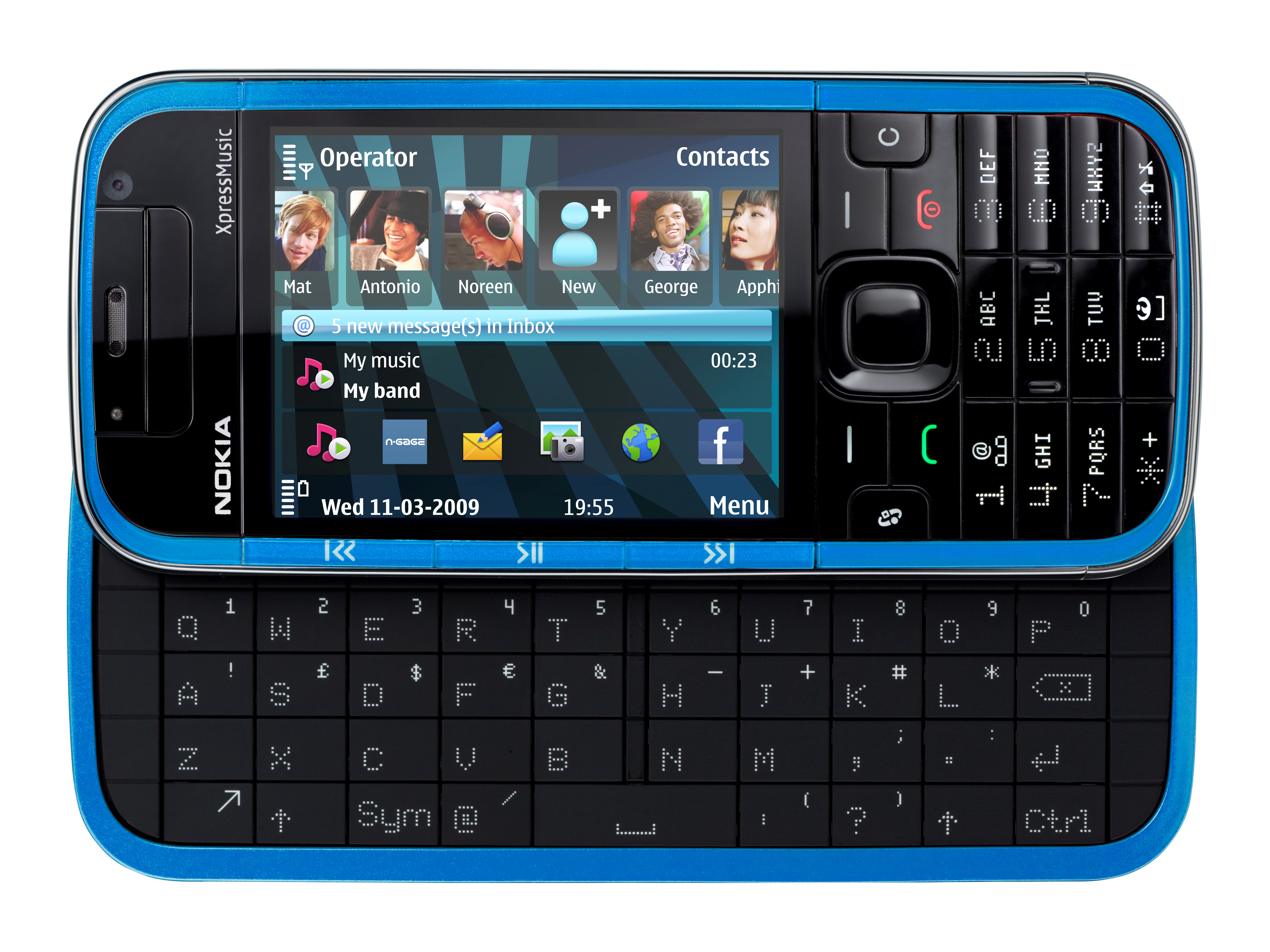
The home screen look has been tweaked slightly from Nokia's usual mid-tier S60 standard, but running on S60 3rd Edition Feature Pack 2, the structure of the user interface underpinning the device is very familiar to previous non-touchscreen Nokia smartphones.
The home screen set up isn't quite the same as Nseries or Eseries phones, though – with a Contacts bar for phonebook favourites introduced to go with the usual app shortcuts and application plug-ins for info (such as calendar and Wi-Fi status).
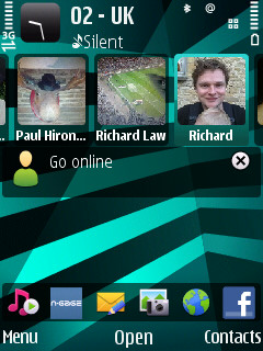
The Contacts bar running across the top of the display is similar to the setup on the Nokia 5800 XpressMusic, albeit with a non-touch control interface. You can add a selection of contacts from your phonebook, and if thumbnail images are assigned to these, they appear in a row across the display.
These can be scrolled and selected with the navi-pad, just like the other shortcut options. When selected, you're presented with options to call or text, plus options to edit or associate web feeds with the contact – something you may want to do to keep up with social networking sites or blogs.
A call and message log appears too, so you can keep track of the last half dozen recent communications with that person.
The home screen plug-ins add some useful information with calendar updates and email message alerts, music player info and Wi-Fi status. You can also get Contacts on Ovi instant messaging displayed with contacts' presence status displayed.
The 5730 XpressMusic has an accelerometer built in which switches the screen between landscape and portrait orientation, depending on how you're holding the phone. This can be switched on or off, as can the slide option for opening certain apps.
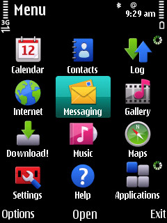
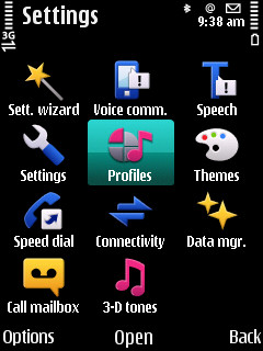
The main menu grid, which can be opened with a softkey or by the dedicated 'squiggle' key, is the same sort of S60 setup we've seen many times before – a 3x4 grid of icons representing applications and sub folders. Select one of these and further grid of icons appear, offering more features and sub menu options.
Although this is relatively straightforward to follow and get to grips with, with so many applications and options packed in, there is the danger that this sort of structure can get too unwieldy, and some options (such as the keyboard activation choices and navi-pad notification lighting options) can get buried.
Still, Nokia has kept the structure logical on the main menu, so your apps are in the right place on this device.
The familiarity of Nokia S60 on this device may feel comfortable for Nokia stalwarts, but with many touchscreen user interfaces introducing new and more user-friendly ways of operating phones, it's not particular fresh – even with that home screen contacts tinkering.
Current page: Nokia 5730 XpressMusic: Interface
Prev Page Nokia 5730 XpressMusic: Design and handling Next Page Nokia 5730 XpressMusic: Calls and messaging